

5 Elemente - all about the Winning Design
30-07-2013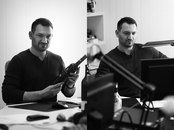
Frank Scott (FS) the editor from DesignPRWire did not stop at single interview, and asked me to talk about how exactly the design for 5 Elemente was implemented:
FS: What is the main principle, idea and inspiration behind your design?
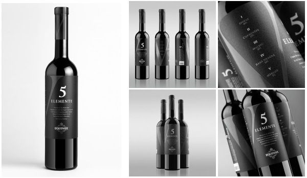
VS: The main inspiration for my design was the wine itself named “5 Elemente”. Dry red wine produced under this trademark is unique in many ways, including taste, flavor and décor. This product is rather unique for the market because it is made out of five different wine varieties: Shiraz, Merlot, Carmenere, Rara Neagra and Malbec. Usually a blend is comprised of two-three grape varieties, the final balance of which in the product is the result of numerous experiments and refinements. This makes the product in question even more unique, as it is a result of a production experiment that was undertaken by the company Equinox in rather harsh conditions.
FS: What has been your main focus in designing this work? Especially what did you want to achieve?
VS: When creating this design I wanted to communicate the concept of exclusiveness, refinement and status, which corresponds to the positioning of this product. The wine was produced in a limited series of 1150 bottles in the high price segment, and it could only be purchased in upscale and expensive restaurants. That was my main focus when working on this design.
FS: How long did it take you to design this particular concept?
VS: It took me about two weeks to create the main concept, including the accumulation of information and creation of three different directions. Afterwards, the concept was refined from the technical point of view. The project itself took about 5 month to complete, starting with the initial inquiry to its final production in the printing house.
FS: Why did you design this particular concept? Was this design commissioned or did you decide to pursuit an inspiration?
VS: Initially, I have developed three design concepts for this wine. Each of the concepts was heavily based on different symbols that communicated different traits of the product. However, all three were based on laconic, even minimalist aesthetic. For the final version, the client has chosen the concept based on the Roman number “V”. The Roman number V serves as the main stylistic element and delivers a rather refrained tone to the whole design of the label. The color scheme comprised of black, grey and white emphasizes the strictness and moderation of the selected style. A unique solution was to create a label that covers the entire circumference of the bottle in contrast to the traditional approach of using only one or two segments. As a result, the label is drawing attention regardless of the side you’re looking at.
FS: Is your design being produced or used by another company, or do you plan to sell or lease the production rights or do you intent to produce your work yourself?
VS: This design was successfully produced and printed by one of the best European printing houses. The product was produced and successfully sold by Equinox Company.
FS: What made you design this particular type of work?
VS: For more than 10 years I’m primarily engaged in designing wine labels. That’s why I have plenty of experience, knowledge and skills mainly in this domain of design.

FS: Where there any other designs and/or designers that helped the influence the design of your work?
VS: The main reference point for my work was the neat European design. I can’t say that any particular works or designers have influenced my work. However, the global trends and the neat European approach have certainly influenced my vision of the project.
FS: Who is the target customer for his design?
VS: The visual décor of the bottle communicates the emotions and ideas that were laid into the product. This wine implies slow consumption in a restaurant, with a good meal and a group of people who can appreciate the diversity of this dry red wine. Every sip of “5 Elemente” opens a new layer of sensations, while the rich flavor is constantly playing with different nuances that you want to enjoy for a longer period of time. The temperate and elegant label corresponds to this concept perfectly.
FS: What sets this design apart from other similar or resembling concepts?
VS: When the company contacted me for creating the design for “5 elemente” I got very enthusiastic about the mere idea of working on such an interesting product. That’s why I offered the company the concept of “designer wine”, which implies that the agency acts as a partner and takes full responsibility for the visual aspect of the product. The result of this initiative is the unique concept of wine label, which communicates the character of the product and draws attention to the bottle the moment you see it. And is also a 100% realization of the design thinking.
FS: What is the role of technology in this particular design?
VS: Technology plays a very important role in the segment of premium wine design. The use of quality artistic paper, high quality printing and post-printing processing –everything is very important. That’s why we have chosen a high class European printing house for printing this label.
FS: How did you decide to submit your design to an international design competition?
VS: While working on this design I felt that I’m doing something unique. I felt the desire to let the global design community to judge this project. To get feedback, comments, opinions. It’s much easier to do when you take part in competitions, because you get independent and expert opinion. That’s exactly why I’ve decided to send this design to the competition.
SHARE: