

Complex rebranding "Сяброука"
03-09-2014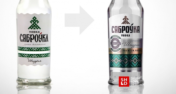
TASK
“Syabrovka” vodka is produced by the Belorussian company “Slavproduct”. It’s worth noting that the “Syabrovka” vodka is traditional Belorussian vodka of excellent quality. A few years ago, when the product was being launched, the main emphasis in its design was the traditional Belorussian origin. The design was primarily based on the cheap popular style that is characterized by the use of folk elements in a simplistic manner, dominated by a limited choice of visual methods, including rough strokes and vivid colors.

At the time such a marketing solution was justified. The product has only made it to the shelves and it was necessary to make it stand out from the rest by emphasizing its individuality. But as the time passed, the sales growth has slowed down. This was the factor that made the producer rethink the product’s positioning and the brand’s development policy.
 After a while it became apparent that the product’s positioning doesn’t correspond to its manufacturer’s financial and business goals. This vodka was priced as a middle class product, while its design was perceived by the consumer as something cheap and budget. Correspondingly, the consumer didn’t see the product as something living up to its price.
In order to correct this dissonance the producer has decided to undertake a complex rebranding. The essence of the task set by the client can be described by the following terms:
1. The business and financial goal of the producer is to keep the current loyal consumer of “Syabrovka” and maximize profits by attracting new clients.
2. Push the product to a higher pricing segment.
3. Create a design that will correspond to the product’s new positioning.
4. The product’s new positioning: traditional Belorussian vodka, the production of which involves the use of modern equipment and latest technologies.
5. The new design has to maintain continuity with the old one, the product should still be perceived as a traditional Belorussian vodka that the consumers know so well.
SOLUTION
SHUMI LOVE DESIGN has decided to perform the complex rebranding in three steps.
Step #1: Competitive environment analysis and trademark development.
Based on the product’s new positioning, the agency has identified the main competitors in the target price segment of “Syabrovka” vodka. The agency has analyzed the competition environment, outlining the positive and negative points of each competitor. This has served as the base for the report that presented the main recommendations concerning the rebranding of “Syabrovka”.

The agency’s efforts were also aimed towards finding the visual depiction of the brand “Syabrovka” that would reflect the product’s new positioning. This task has involved 4 separate designer and font specialist teams. All the developed variations were included into a comparative table where each variation would be rated from 1 to 5 in 3 categories:
- trademark continuity (maintaining the Slavic style and recognition of the existing trademark)
- modernity (actuality towards existing trends, communication of the “modern technologies” idea)
- status (respectability, suggestion of respect, perception as something solid and reliable)

The agency has conducted a survey, after which the variation that has been rated the highest was recommended for use by the client. The survey involved people ranging from everyday consumers to the administrative executives of “Syabrovka” and distributors. Three main groups of people have contributed to the results: consumers, the producer and the distributer. The survey’s results were presented to the client in the form of report and scan-copies of all the filled out questionnaires. Thus, the result with the highest rating was chosen.


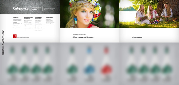
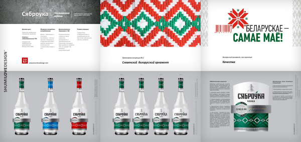
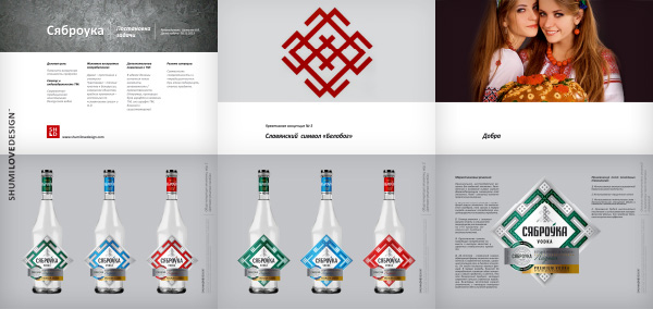
Step#2: Development of creative concepts for the packing design of “Syabrovka” vodka.
As a result of the competition analysis and according to the task set, the agency has presented three creative concepts, each corresponding to the marketing factors involved. Having complete presentations of creative concepts, each containing a design with a corresponding support base, the client could select a variation that, in his own view, would work best in terms of market expectations and at the same time the product’s positioning.
Concept №1:
Concept №2:
Concept №3:
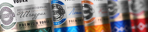
A little about the approved design and the solutions that served as its basis.
The client has approved the concept based on the renowned Belorussian belt and national ornament. There were several reasons for creating namely such a concept.
First, such an element was used in the label’s previous iteration. The old designed employed it as a secondary element, a color marker. The element served as a ranging marker with different colors for different products. Second, the Belorussian belt, as an image, has been actively used in the first advertising campaigns of “Syabrovka” vodka. Namely in printed and P.O.S. materials, which also had a quality photo shoot undertaken. Third, this is one of the most recognized Belorussian symbols. We’ve decided to use it in the design and make it one of the most important element, and eye-stopper, which would attract the consumer’s attention.

Due to this, the agency has devoted a lot of attention towards printing this particular element during the first run. The unique combination of several techniques has led to the desired effect. The element has retained its national identity, at the same time working as a color marker that ranks the products in the line, and, more importantly, employed the application of modern printing techniques, which corresponds to the goals of complex rebranding of “Syabrovka”.
Step #3: Technological development, pre-press, test printing.
The third step includes all the technical solutions concerning the realization of the design in the printing house. The choice of paper, selection of techniques, post-printing processes, selection of the printing house itself and the first test run. The last stage is very important, since it affects the success of the entire project’s realization. A beautiful design printed as a sketch is not what a client wants. It’s very important that the initial approved design would be fulfilled in the printing house and would fully correspond to the designer’s idea. Due to this, we’ve initially chosen a printing house for a test run.
Specialists representing the three parties involved – the agency, the client and the printing house – have spent several lucrative days right at the facility while the run was being done. The result of this work is the label that was approved for further mass printing.

SHARE: