

The chosen concept for "5 ELEMENTE"
05-07-2013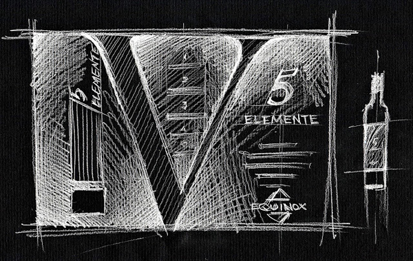
Initially I’ve created three label concepts. Each of the concepts was focused on particular symbols, associated with particular traits of the product. However, all the three have featured a rather neat, even a minimalistic aesthetic. The final version was picked in the form of the concept, based on the Roman digit V.
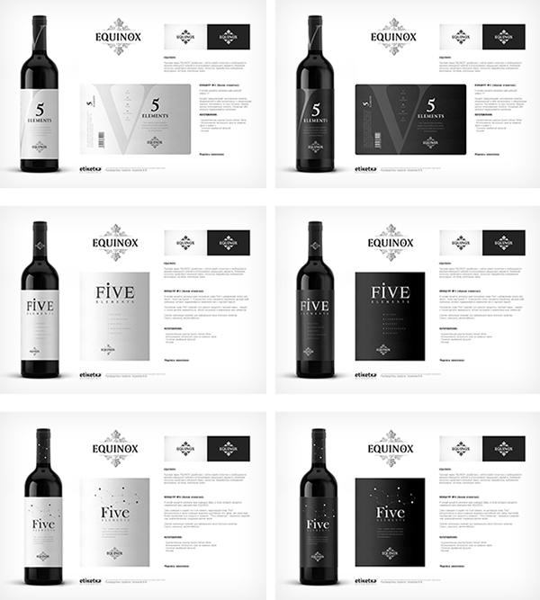
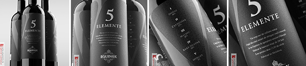
The Roman digit V is the main stylistic element and delivers a rather temperate feel to the entire label. The selected color scheme, based on only black, grey and white, further emphasizes the strictness and pithiness of the chosen style. The unique trait of this label is the fact that it wraps the bottle around its entire circumference, while traditional labels only use one or two segments of the bottle’s surface. As a result, the label draws attention no matter which side the bottle is turned to.

Photos from the award ceremony:

Frank Scott, the editor at DesignPRWire has conducted an interview with me on the topic of inception and creation of the Platinum award winning design for 5 Elemente:
Design for the exclusive wine "5 Elemente":
The agency as a partner for the project::
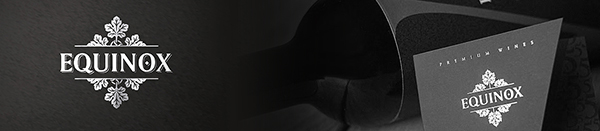
Redesign for the "EQUINOX" trademark. Creation of corporate identity and advertising materials:
SHARE: