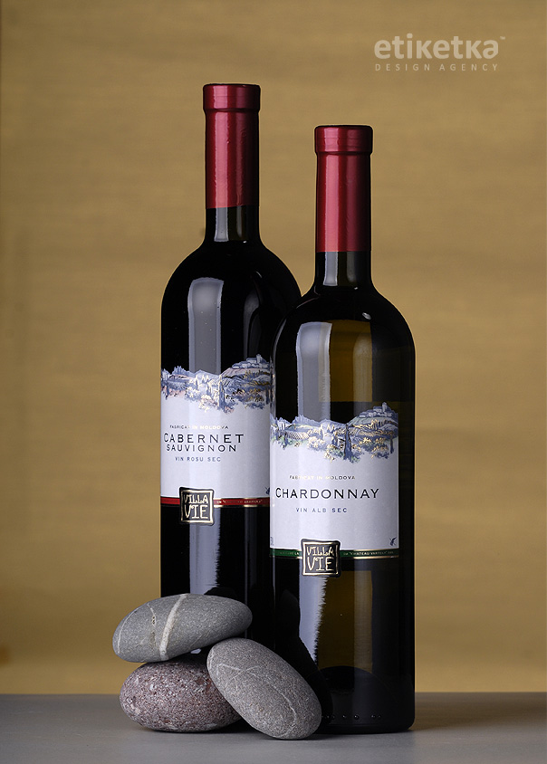
The task was to create trademark and label design for a series of dry wines "Villa Vie"(Chateau Vartely)
SOLUTION
The project involved the creating of a design concept that would make the product stand out on the product shelf and correspond to the fresh take on dry wines. Meanwhile, the overall temperance of the packing had to be maintained without drifting towards ultra-modern design solutions.
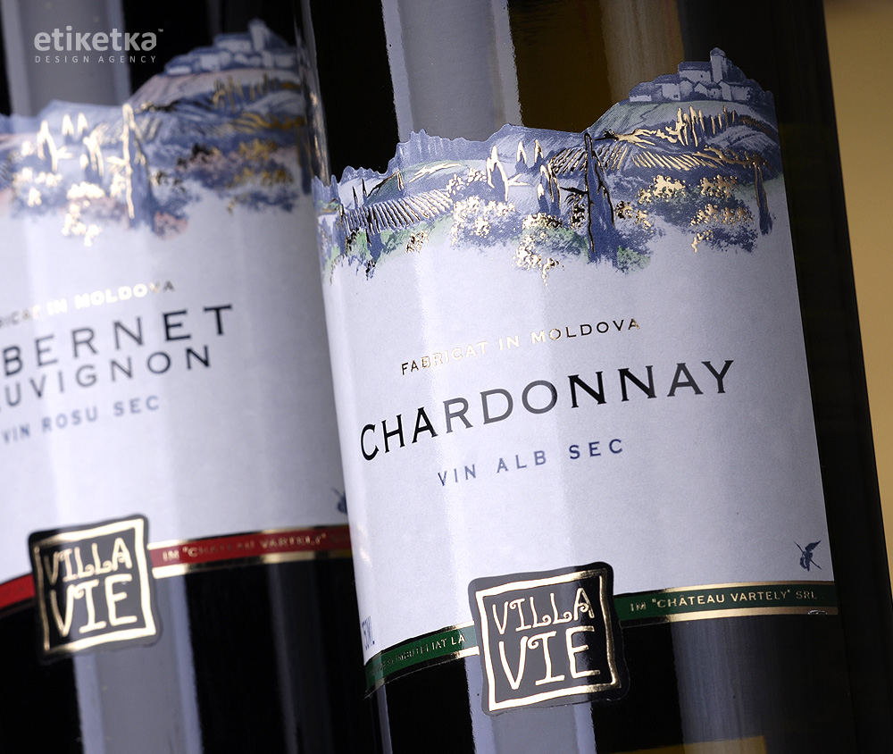
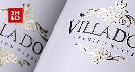
The presented design concept is based on the interaction between two main elements of the composition. On one hand there’s the stylized font type work applied to the stylized trademark logo. The final version of this element can be characterized as ethnic, archaic, which refers to the deep roots of winemaking and the producer’s adherence to traditions and history.
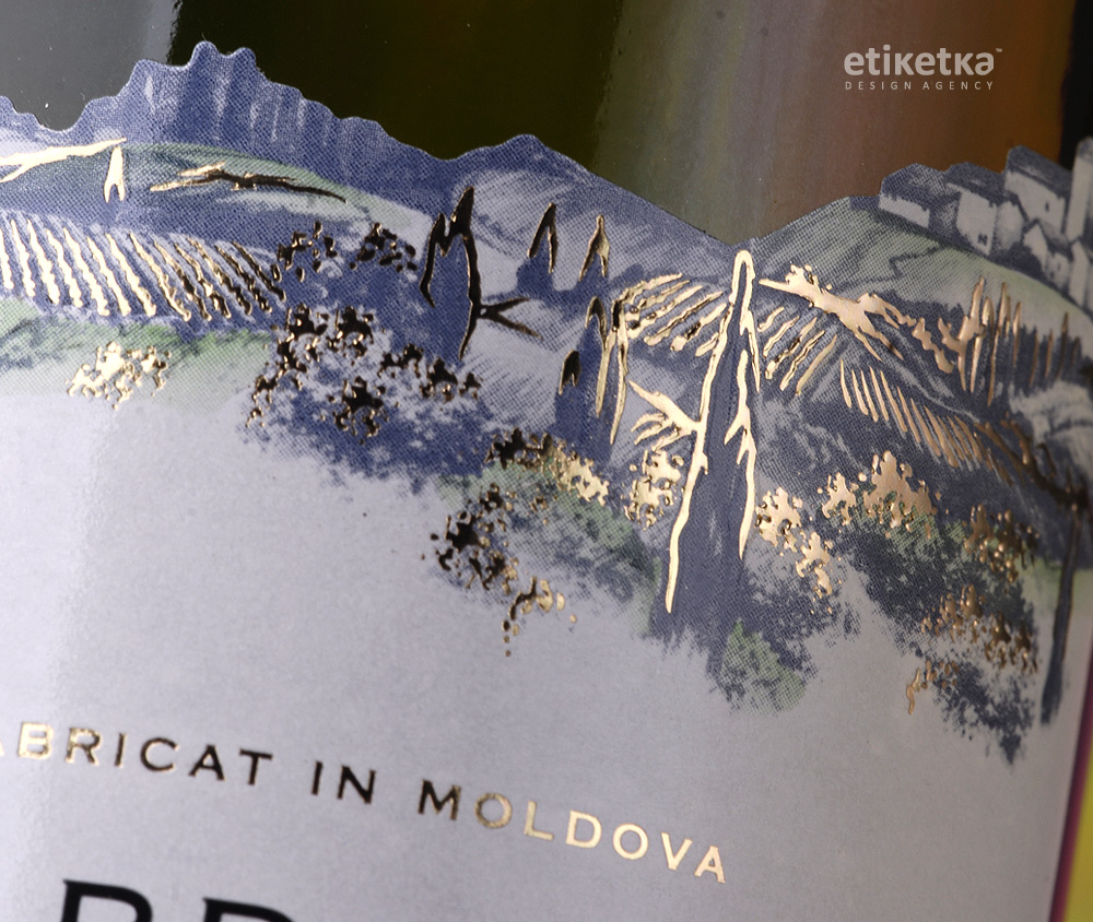
On the other hand, the upper part of the label represents a stylized illustration depicting hills, vines and a vineyard. All the while, the hills and the building are cut out and serve as the upper fringe of the label, which delivers a degree of dynamism to the label and attracts the customer’s attention. Certain elements in the landscape were additionally processed with gold foil stamping to enhance the volume of the illustration.
SHARE:
Previous Project
SATIR CLUB / Il Cammino a Roma
Series of Italian wines
Next Project
CHATEAU VARTELY / Villa D`or
Label design for a range of dry wines "Villa D'or"