The agency was set with the task of creating a complex design solution for Tokaji wines, which would combine traditional graphic elements and modern design trends. In other words, we had to retain the national identity of the product while making it more attractive on the shelf.
SOLUTION
When we were tasked to develop the design for a line of traditional Hungarian Tokaji wines produced by WAY FINE & PROVIN KFT it was a question of professional pride to come up with the best solution possible. For even Voltaire himself described it this way: “Its sweetness and strength revive a man. This wine makes the brain gyrus work and ignites the soul with the firework of joy and wit”.
From the marketing standpoint we had to employ a complex approach, which would allow us to incorporate traditional world-known elements into the design while combining them with modern design trends that would draw the customer’s attention namely to this product.
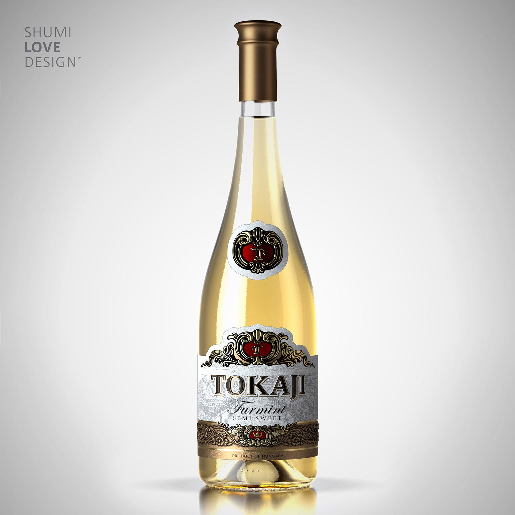
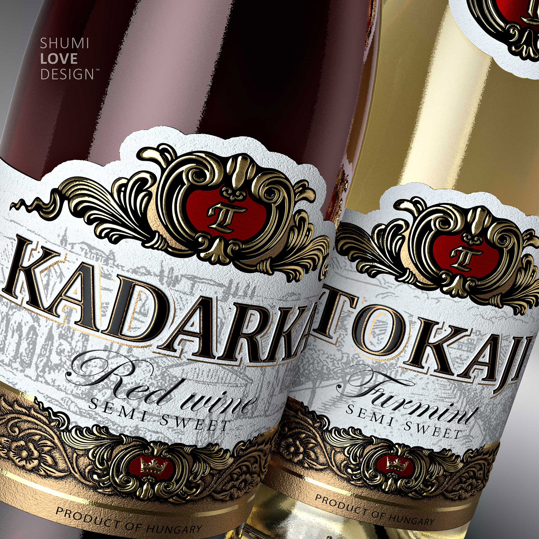
First thing we’ve decided to do was to place the original name of the wine, Tokaji, on the label, which is a legal confirmation of its Hungarian origin. Some other European winemakers are also producing Tokaji wines, but only the Hungarian ones have the rights for this trademark to be placed on the label.
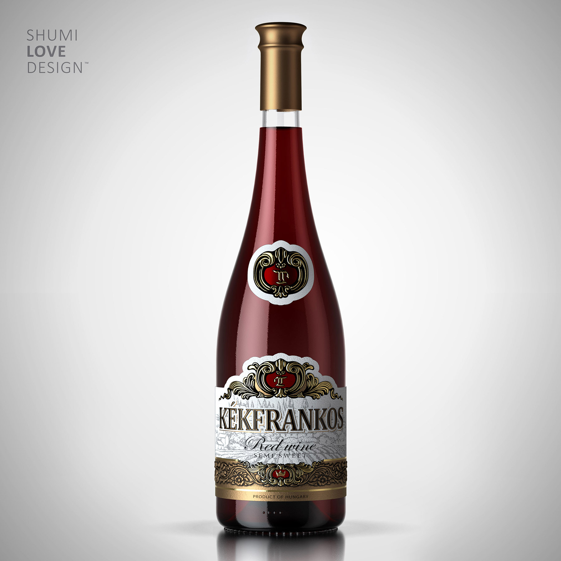
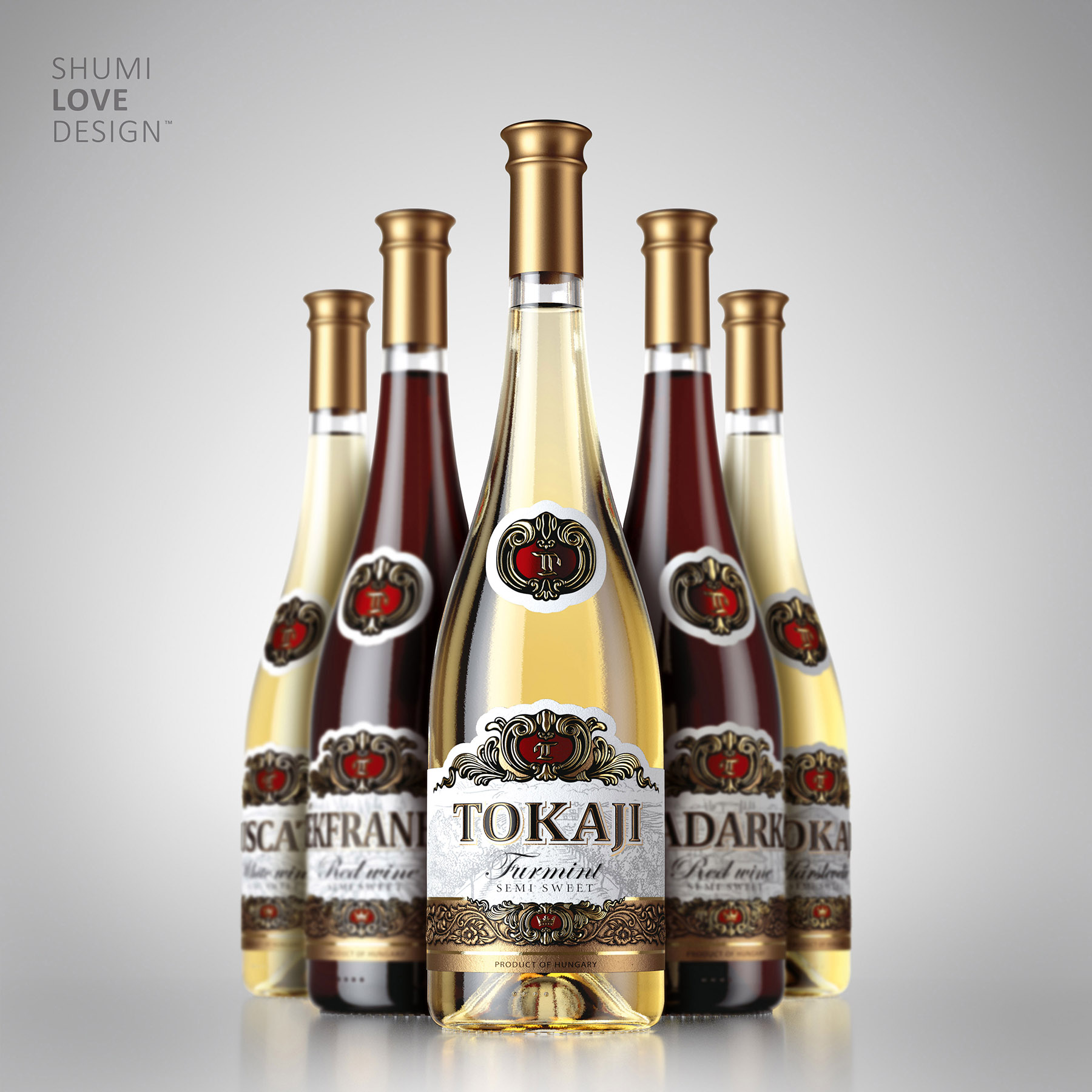
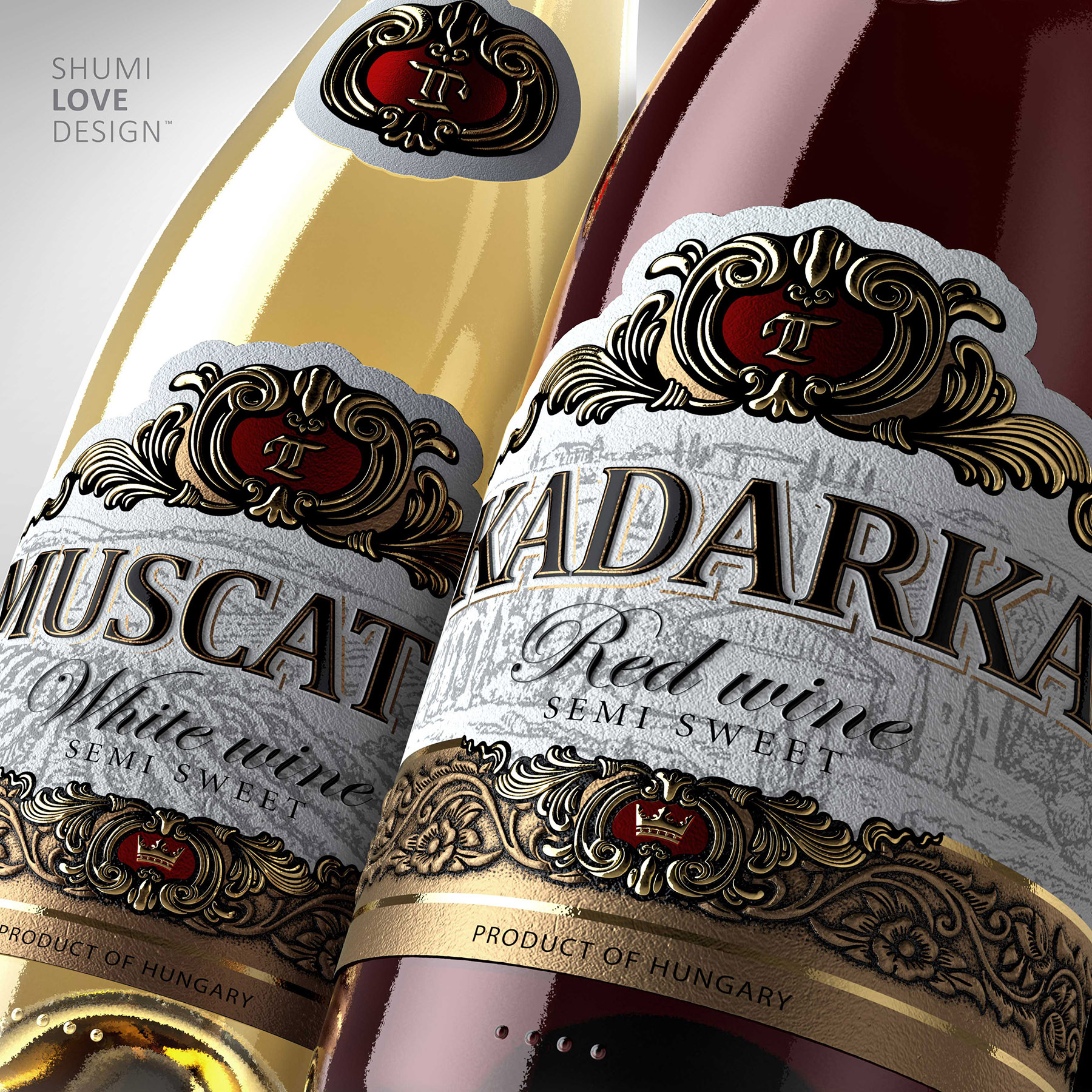
The traditional design for Hungarian Tokaji wines was always based on the correlation between the bottle’s contents and its visuals. Since 1150 this wine was known as the “wine of kings”. That’s why Tokaji wine bottles always feature a crown. We’ve decided to go along with the winemaking tradition and place this graphic element on the label: the golden crown is framed with stylized bronze elements. The color of aged bronze emphasizes the long history of the product and its status.
The title inscriptions were made in large black font with golden framing. Thanks to this color scheme the inscriptions are well seen on the semi-transparent backdrop, which features old city streets and Hungarian vineyards. The different types of wines - Furmint, Semi Sweet, Rad Sweet – are noted in italics in order to help the consumer make his or her choice.
To attract even more attention to the product, the neck label features a Gothic inscription of letter T done in the same way as the product name on the label. Such an inscription is an old tradition for labeling the “live gold” as the Hungarians proudly call their famous wines.
Copying and rewriting information, pictures, images, logo, design from the site www.shumilovedesign.ru / www.shumilovedesign.eu is prohibited .
Copyright for all texts, images, designs, logo, website design www.shumilovedesign.ru / www.shumilovedesign.eu belong to the company SC "SHLD GRUP" SRL.