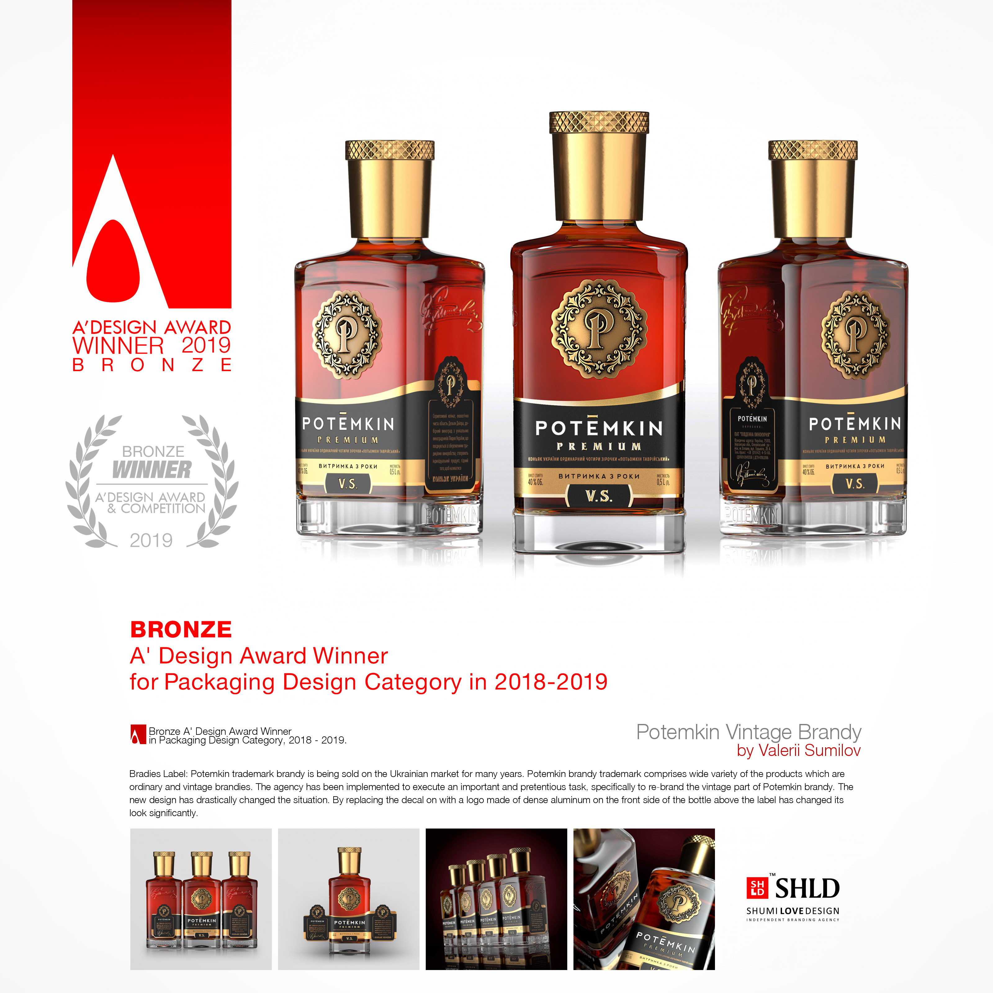
POTEMKIN PREMIUM
- CLIENT
-
TASK
Comprehensive rebranding. Brand concept development. Branding. Package design.
-
SOLUTION
BACKGROUND
The brandy with ‘POTЁMKIN’ trademark has been available on the Ukrainian market for quite a long time.
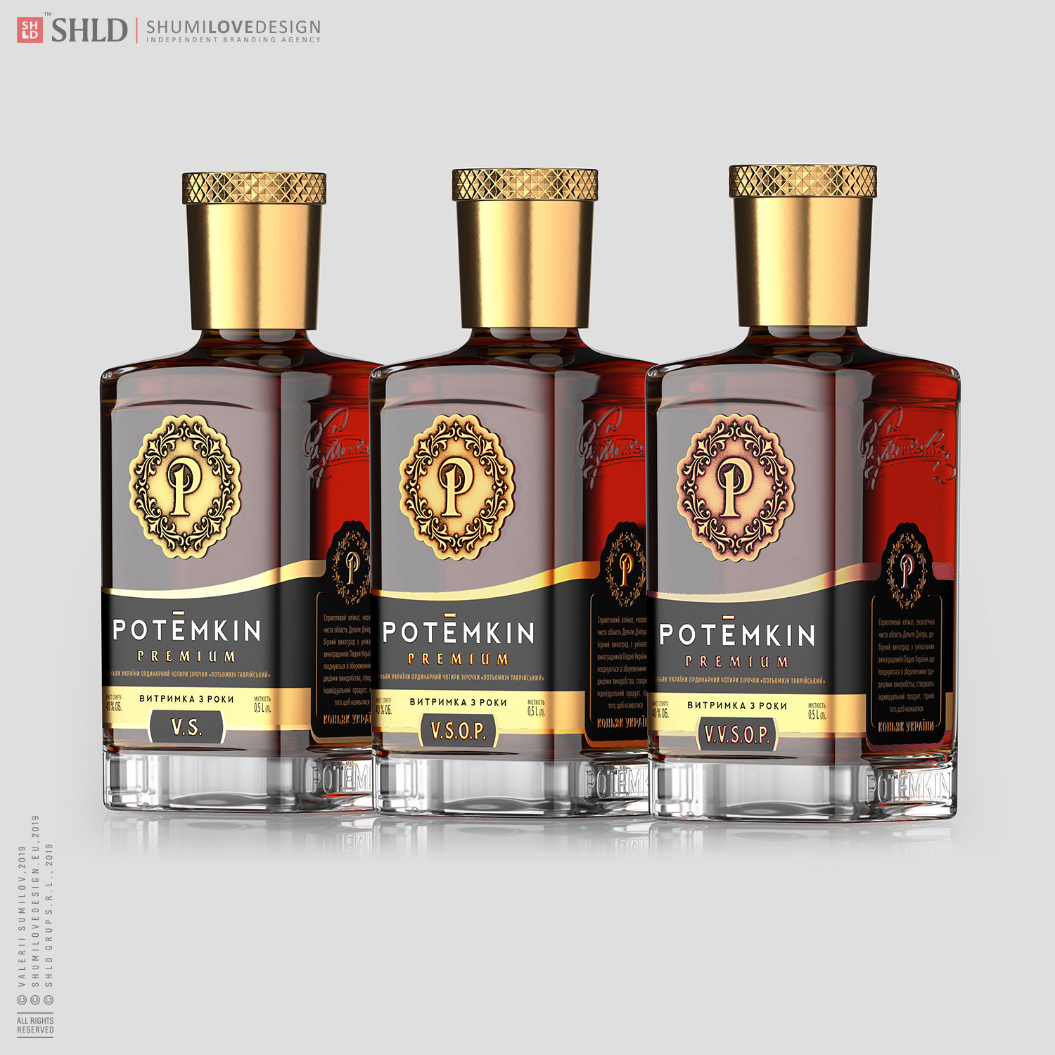
‘POTЁMKIN’ brandy has a wide product range from ordinary to vintage brandy. Our agency has been requested to fulfil a difficult and ambitious task - to comprehensively rebrand the premium segment of ‘POTЁMKIN’ brandy.
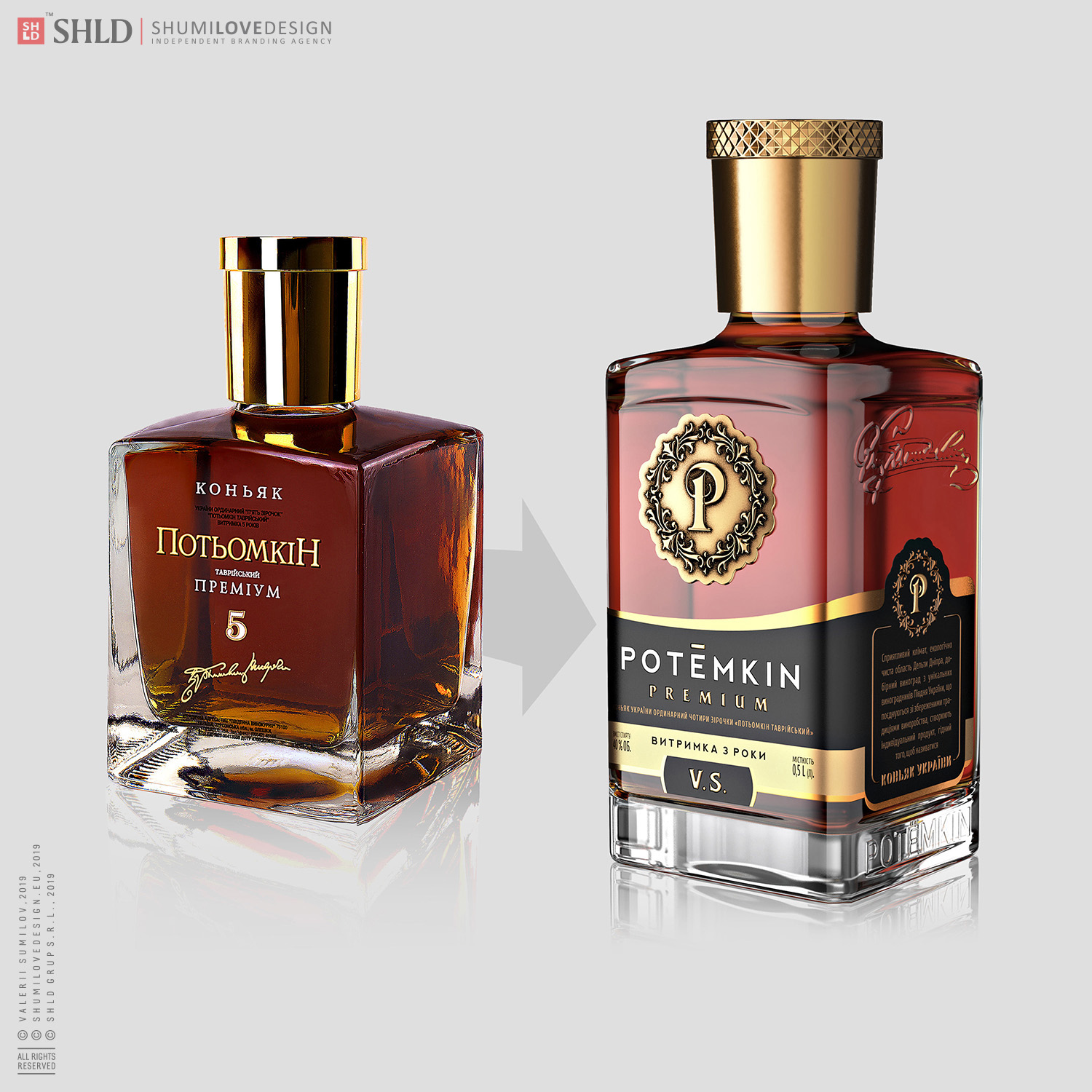
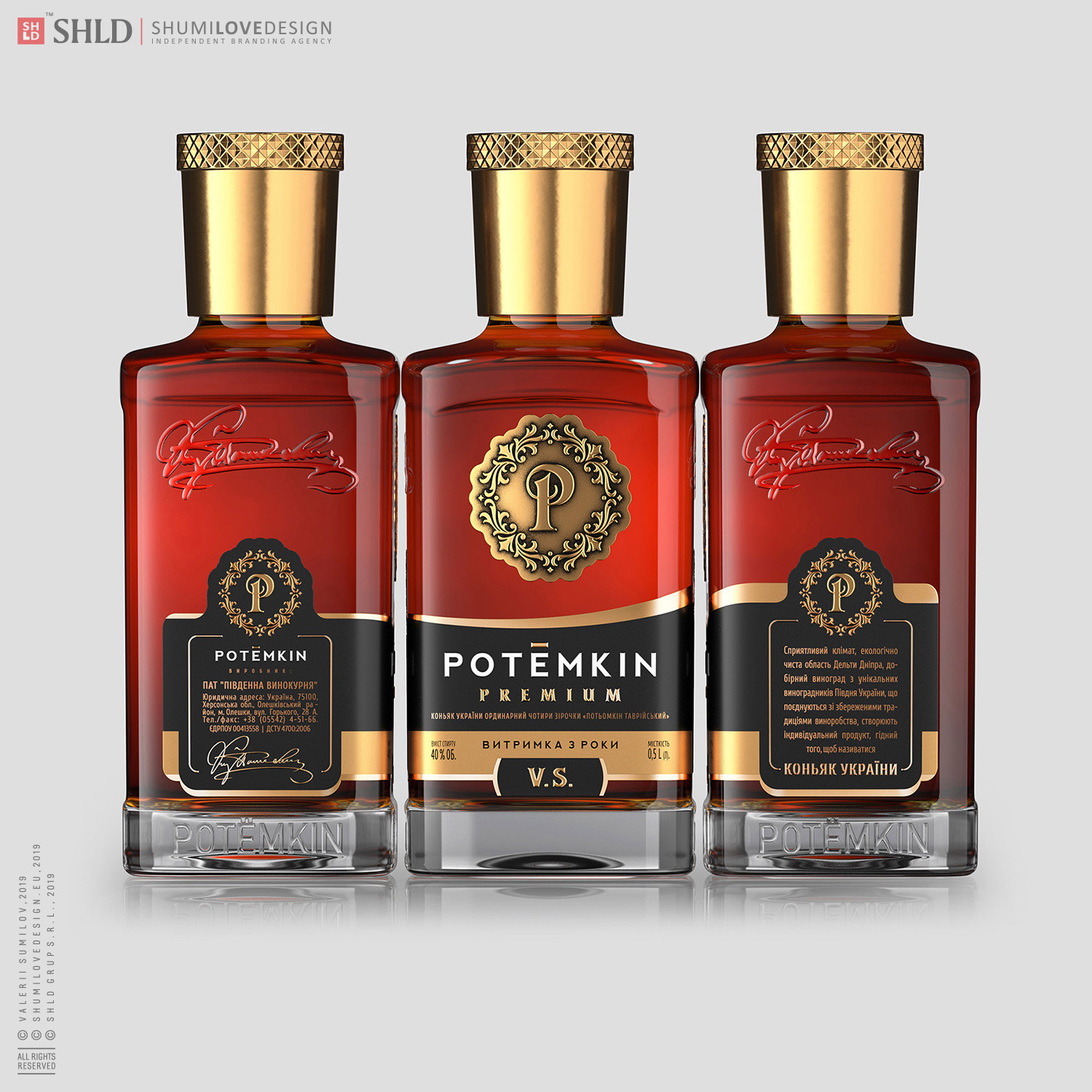
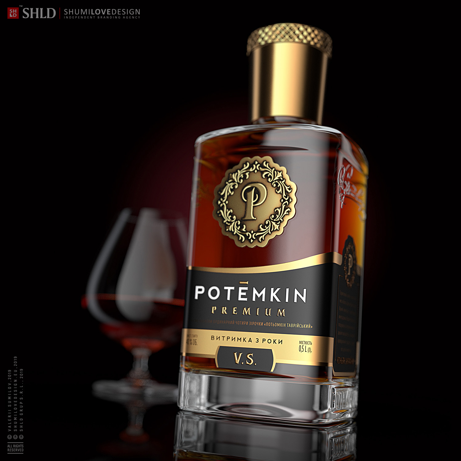
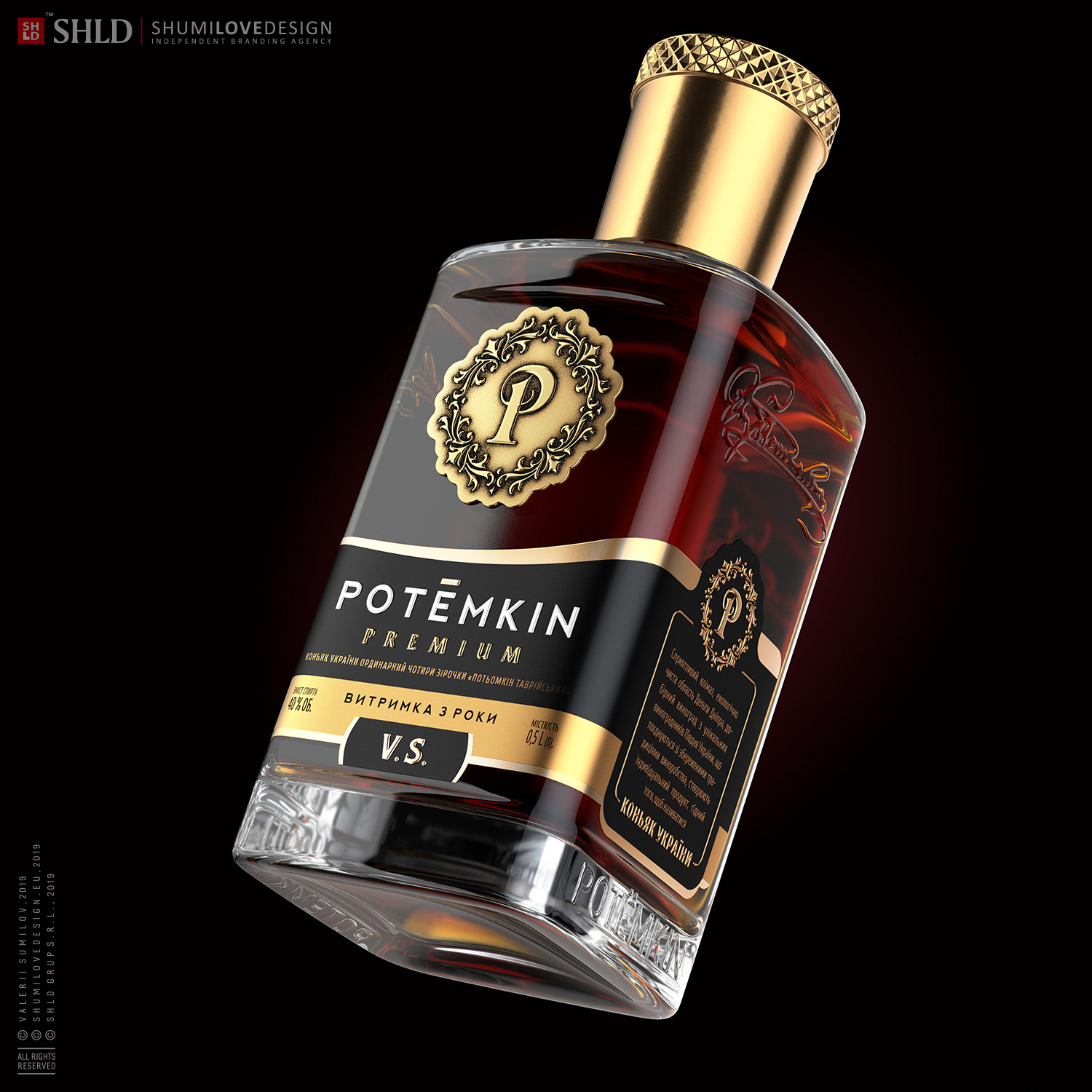
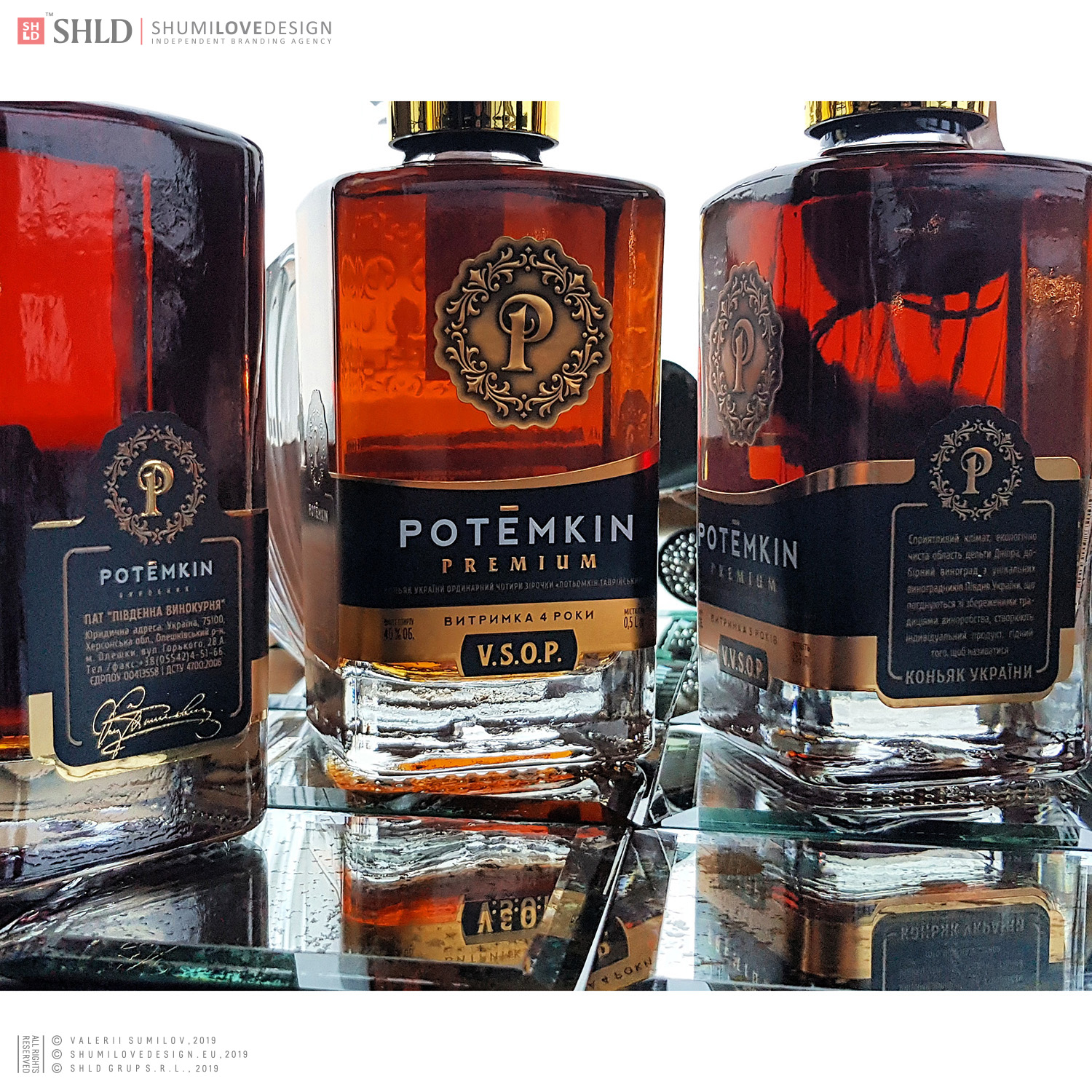
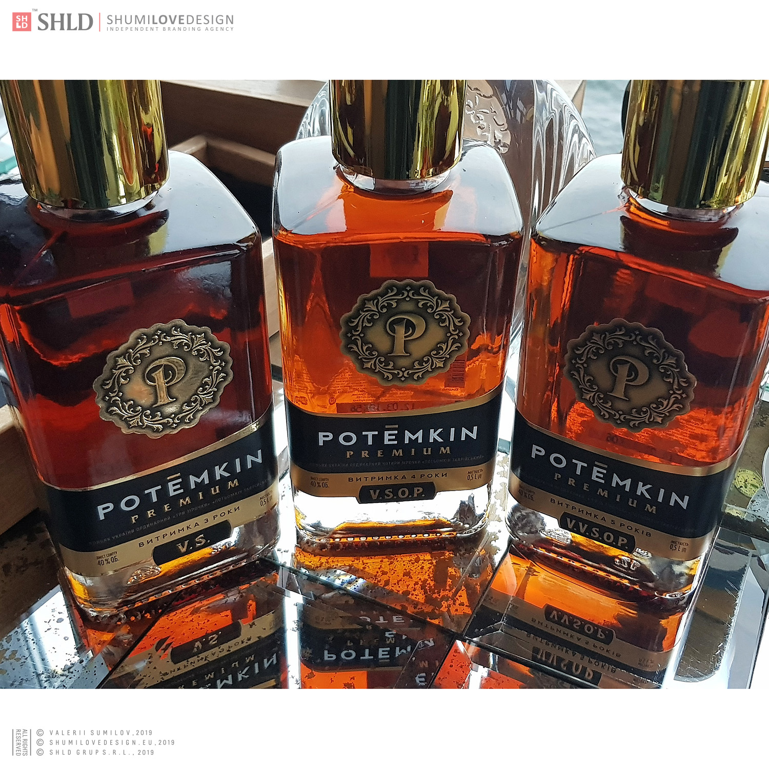
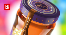
The appearance of ‘POTЁMKIN PREMIUM’ brandy had been recognizable on the market, as it has been bottled in a unique square-shaped bottle. The design of this brandy has also stood out from the general range, as it has been applied directly on the bottle by means of applying the decal + silk-screen printing.
The current design however had been quite problematic.Because of its square shape, the bottle was too low and was therefore perceived as being modest and small, being a disadvantage rather than an advantage in the opinion of the consumer. The bottle could pale into insignificance when appearing on the shelf next to its ‘higher’ competitors.
The design of the bottle and namely the application of the design directly on the glass by means of the decal technology has been another issue. The gold, which has been applied in this way, without any foundation under it except for the glass itself, completely merged under certain angles with the bottle and the product has been looking significantly less visually attractive.In addition, the current design at that moment already looked outdated, obsolete and the product was no longer perceived as a high-status and premium beverage.To change this, the Customer has independently developed a new bottle of a unique shape (with a square section) with a branded personalization. Our task has been to finalize the appearance of the product, reflecting the status and respectability of the TM ‘POTЁMKIN PREMIUM’ in the design.
ACTIONS
We have revealed the drawbacks of the current design after scrutinizing it. Due to numerous interviews and analysis of the obtained data we could set the goals and objectives of the complex rebranding as clearly as possible. At all phases of the design work, the Customer has been receptive to our suggestions, which made it possible to provide the best output.
GOALS AND OBJECTIVES OF THE REBRANDING
The main goals and objectives of the comprehensive rebranding of the premium brandy ‘POTЁMKIN PREMIUM’ may be articulated as follows:
1 / to develop a brand symbol for the TM ‘POTЁMKIN’
2 / to develop a new spelling of the TM ‘POTЁMKIN’, which will best reflect the new conceptual positioning of the product
3 / to develop a brand concept that will fully reflect the status and image of the trademark, to highlight profitably the product on the grocery shelf, to cause a positive response from the part of the consumer, and therefore to increase sales of the brandy
DECISION
The branding works carried out resulted in a brand concept, which has been approved by the Customer. It combines a number of unique characteristics that are consistent with the design objective as we have developed:
1 / the brand symbol;
2 / the unique spelling of the TM;
3 / the brand concept of the product design.
The new design allowed us to solve the issues of the previous design.
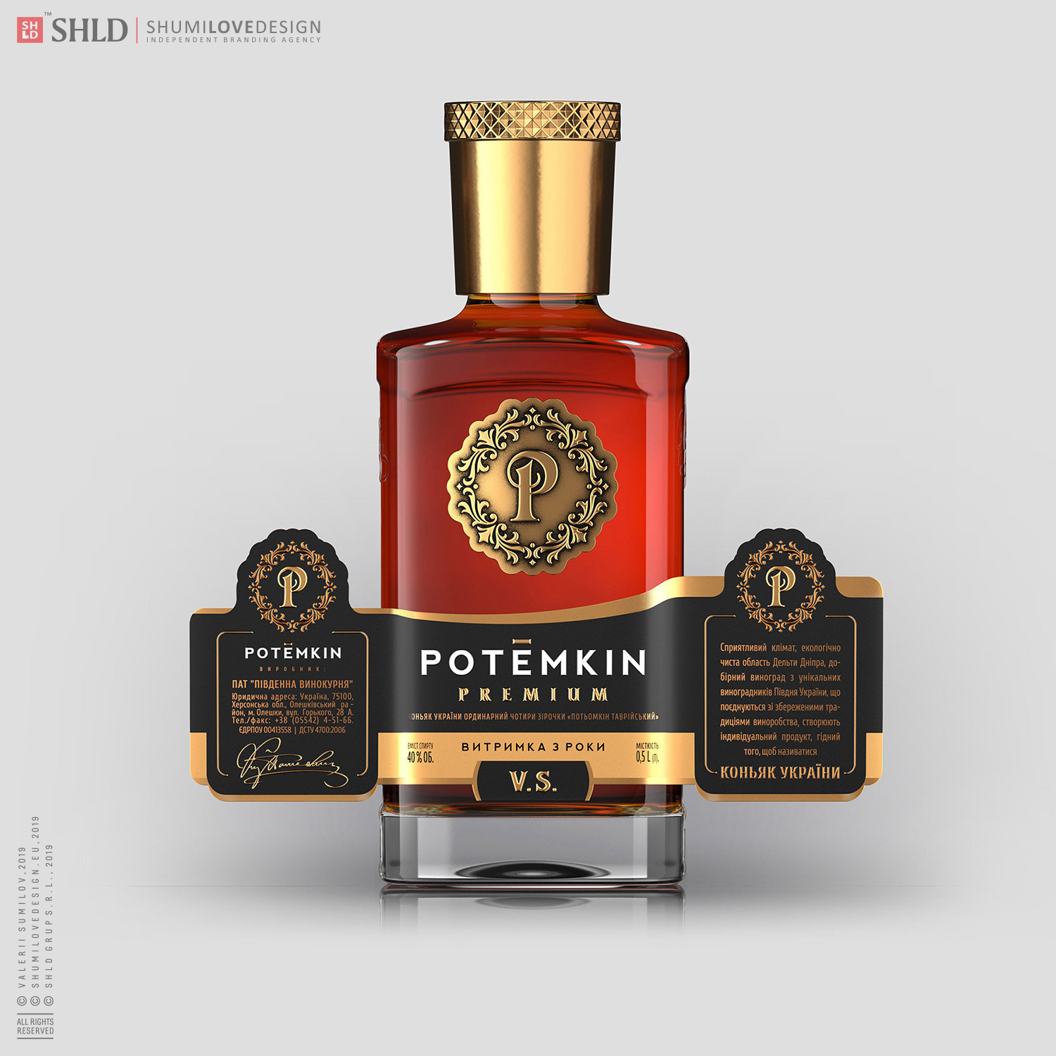
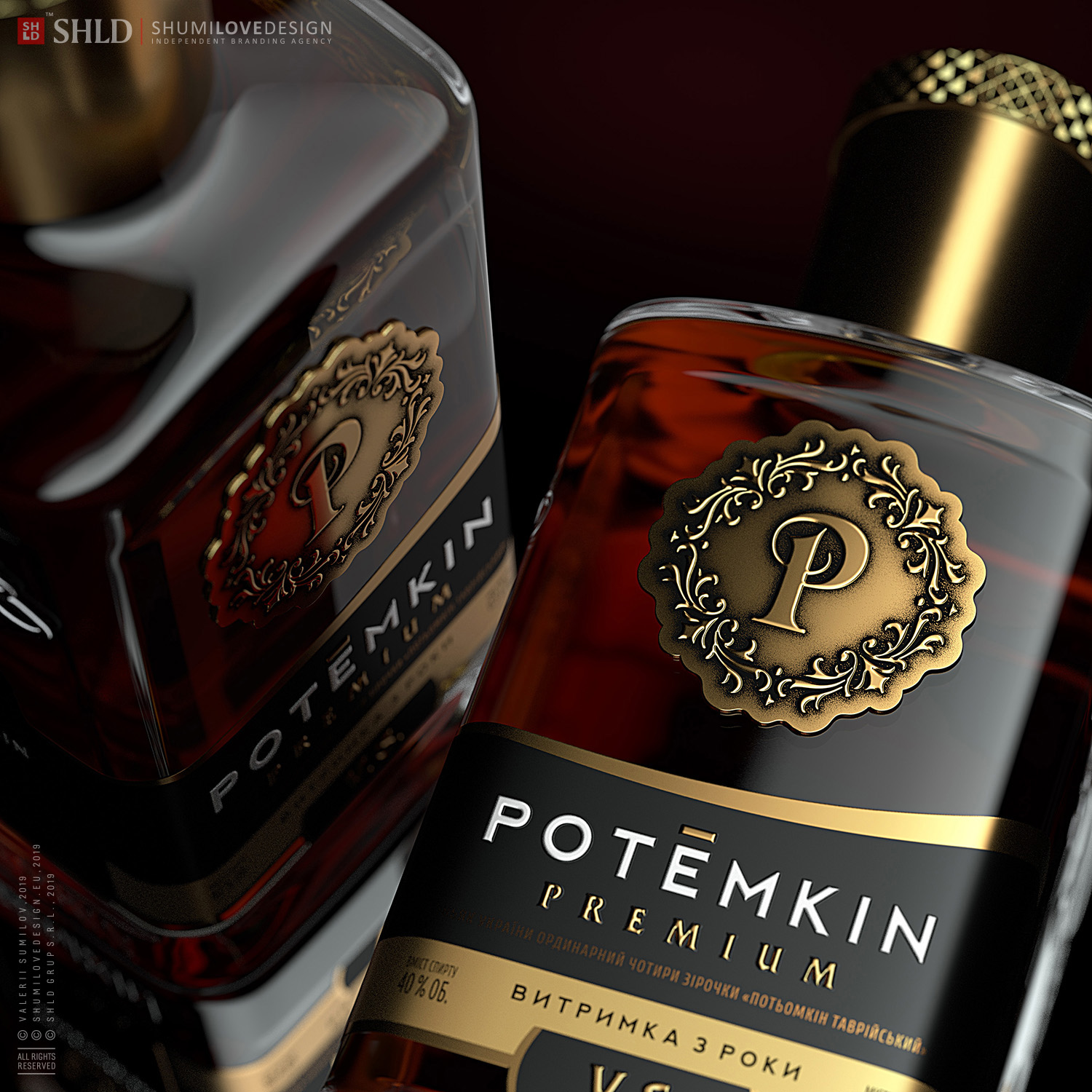
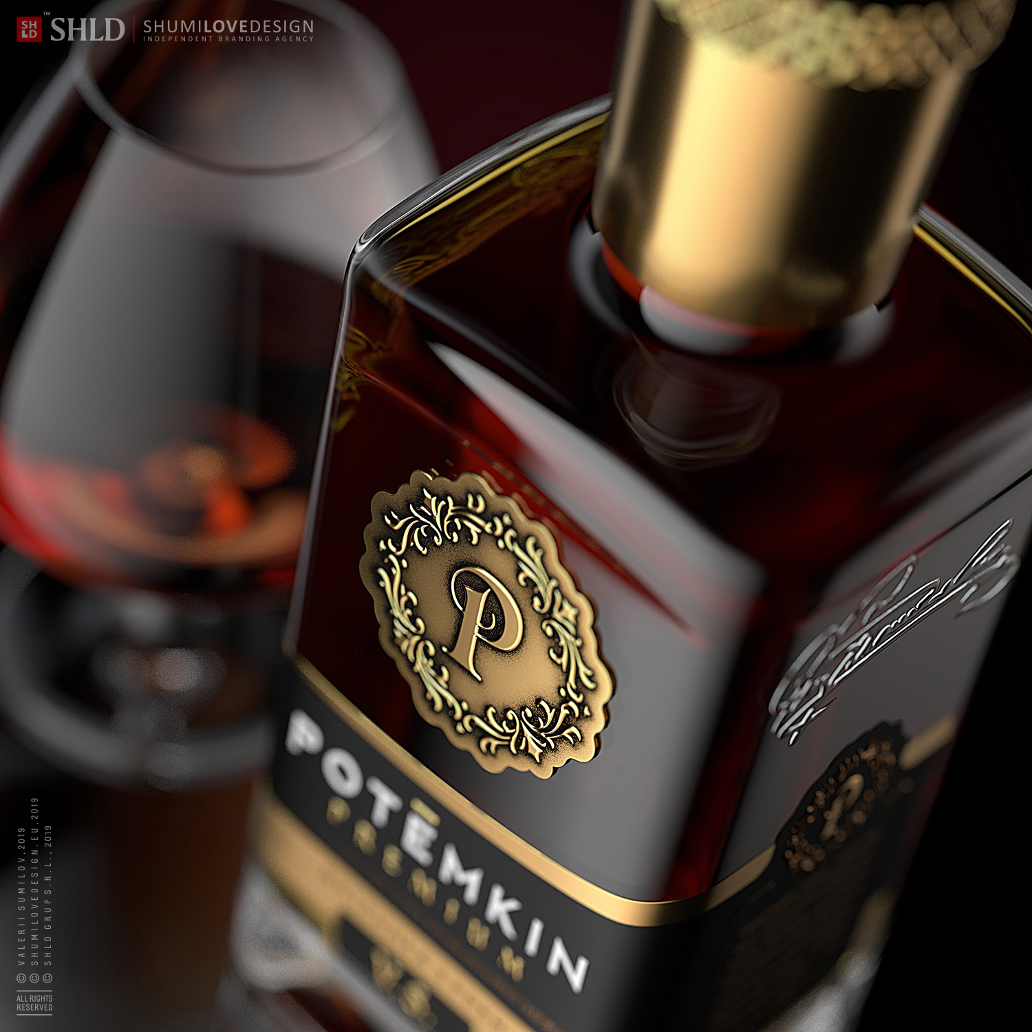
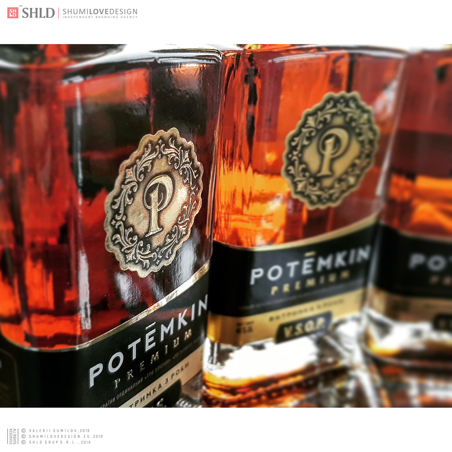
Specifically, we have replaced the decal on the bottle with a logo made of dense aluminium, which is applied on the front side of the bottle above the label. This is how several issues have been solved at once:
1 / the trademark has acquired a recognizable, unique, memorisable brand symbol (logo);
2 / the issue of readability of the brand symbol on the bottle has been solved. Now, no matter at what angle the consumer looks at the bottle, he/she reads the brand symbol equally well and sees the entire design on the bottle;
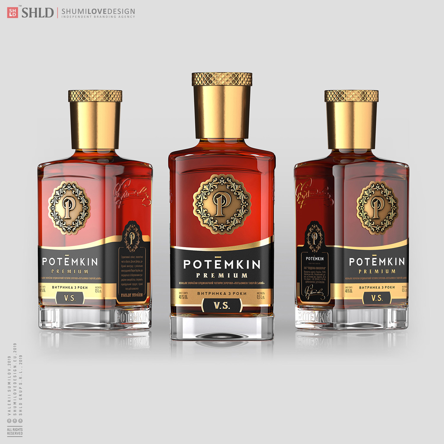
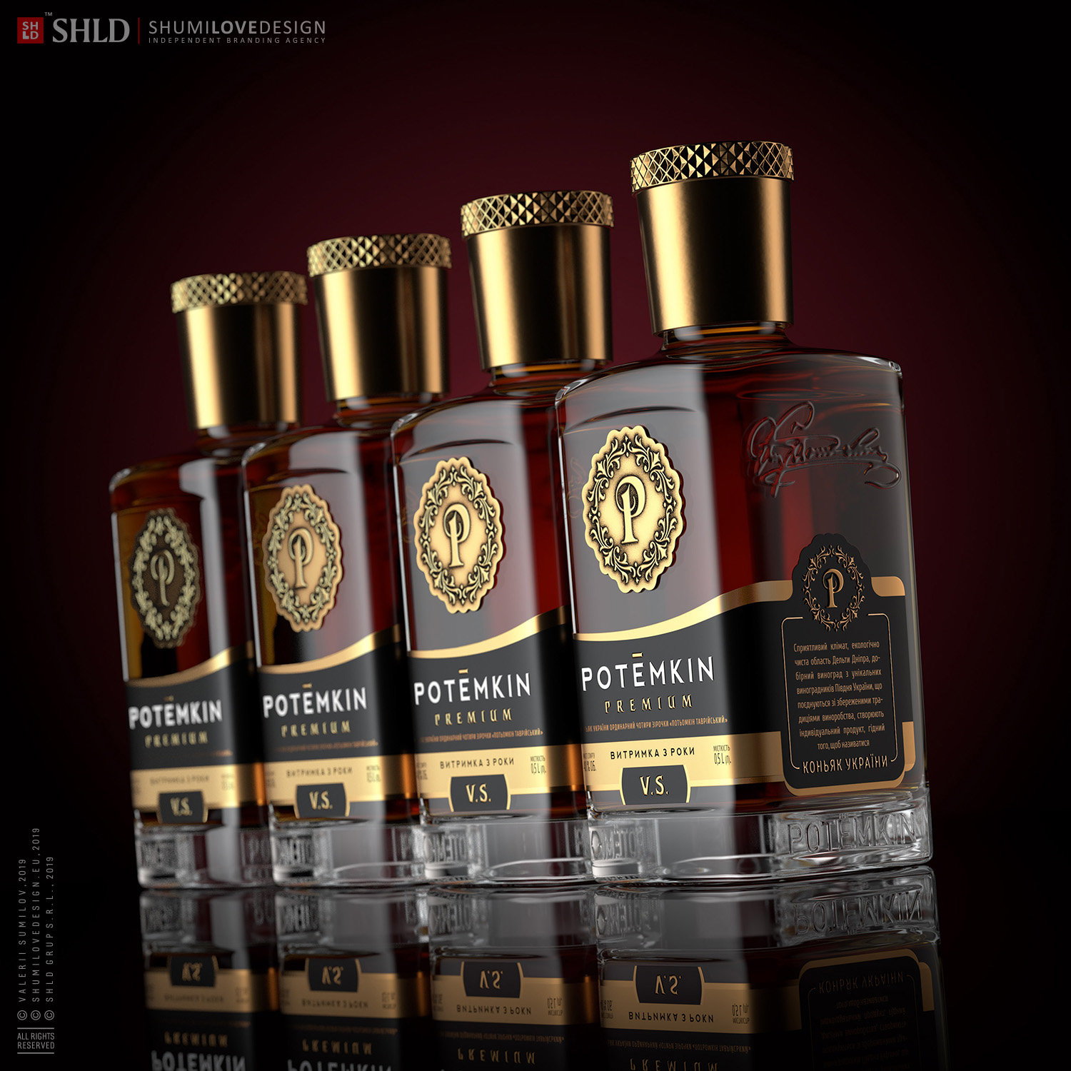
3 / we have developed a design that is equally concise, high status, respectable, ‘expensive’ in the good sense of the word.The label has a complex structure. In our search, we have found a solution that covers not only the front, but also two lateral sides of the bottle with square section.
Thus, the label that is pasted on the bottle covers three sides of the bottle. We have added an additional USP of the product on the lateral sides of the label, thus inviting the consumer not only to examine and study the product, but also to establish a communication between him/her and the brand.
Copying and rewriting information, pictures, images, logo, design from the site www.shumilovedesign.ru / www.shumilovedesign.eu is prohibited .
Copyright for all texts, images, designs, logo, website design www.shumilovedesign.ru / www.shumilovedesign.eu belong to the company SC "SHLD GRUP" SRL.
All rights reserved.
© SHUMI LOVE DESIGN™, 2019
© VALERII SUMILOV, 2019
© SHLD GRUP SRL, 2019
- In the world