Bidjo
- CLIENT
-
TASK
Implement a comprehensive branding for premium wines from Georgia TM "Bidjo"
-
SOLUTION
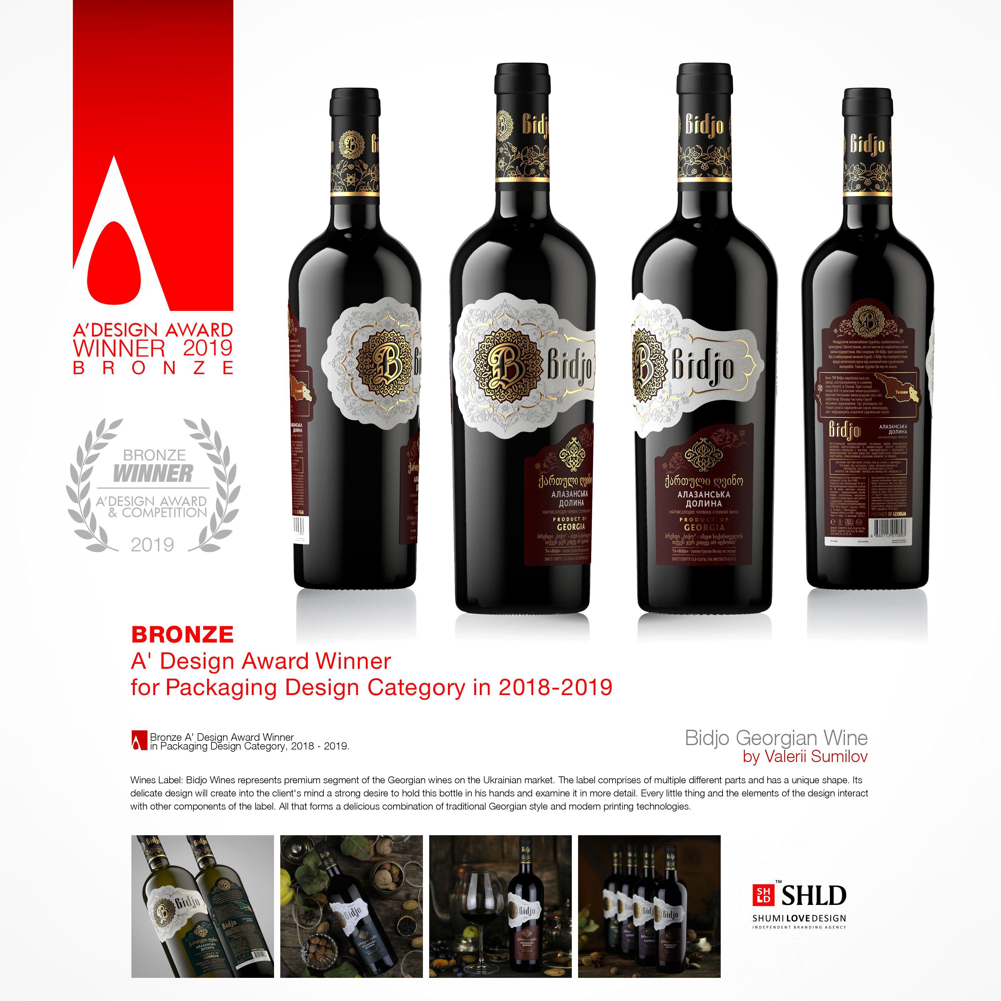
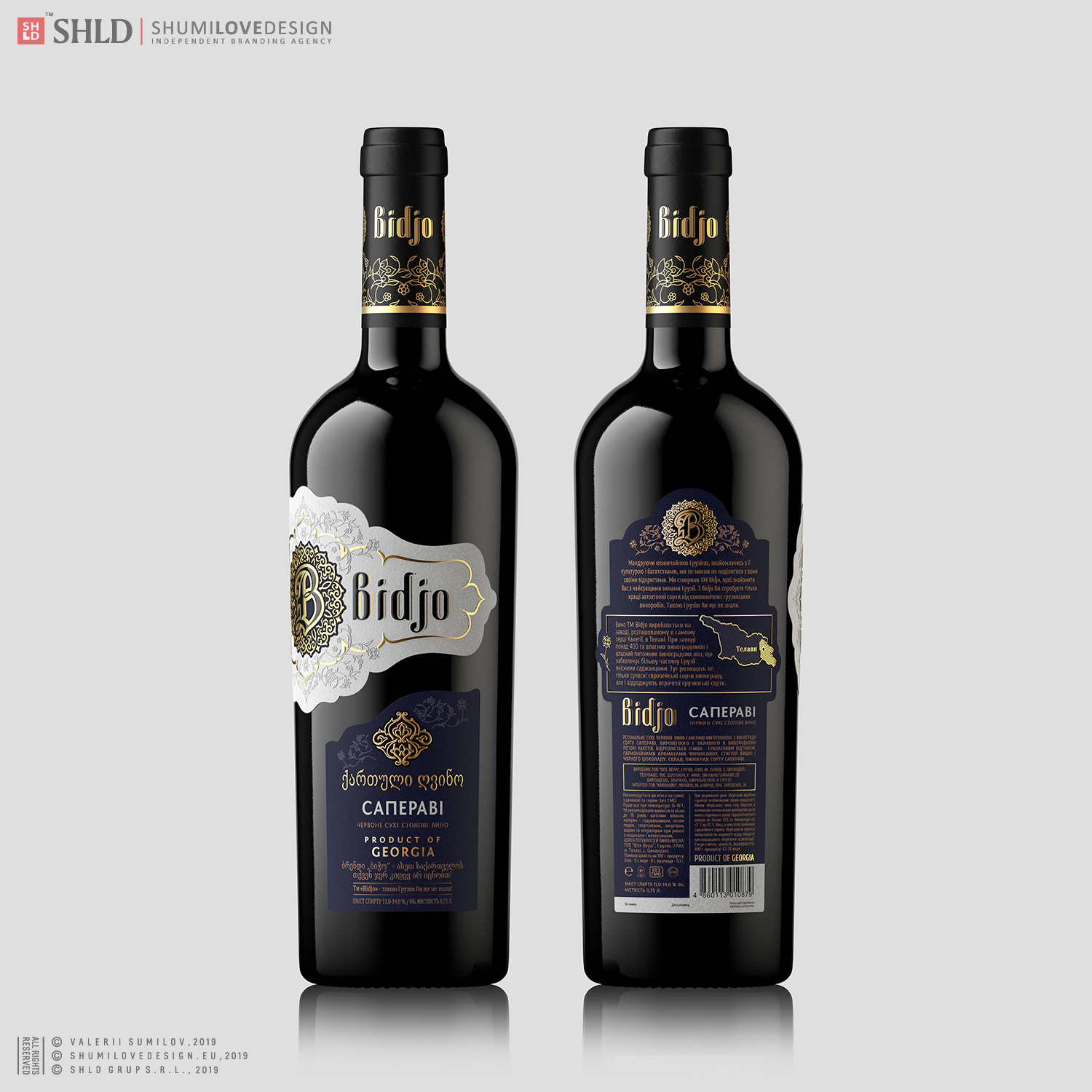
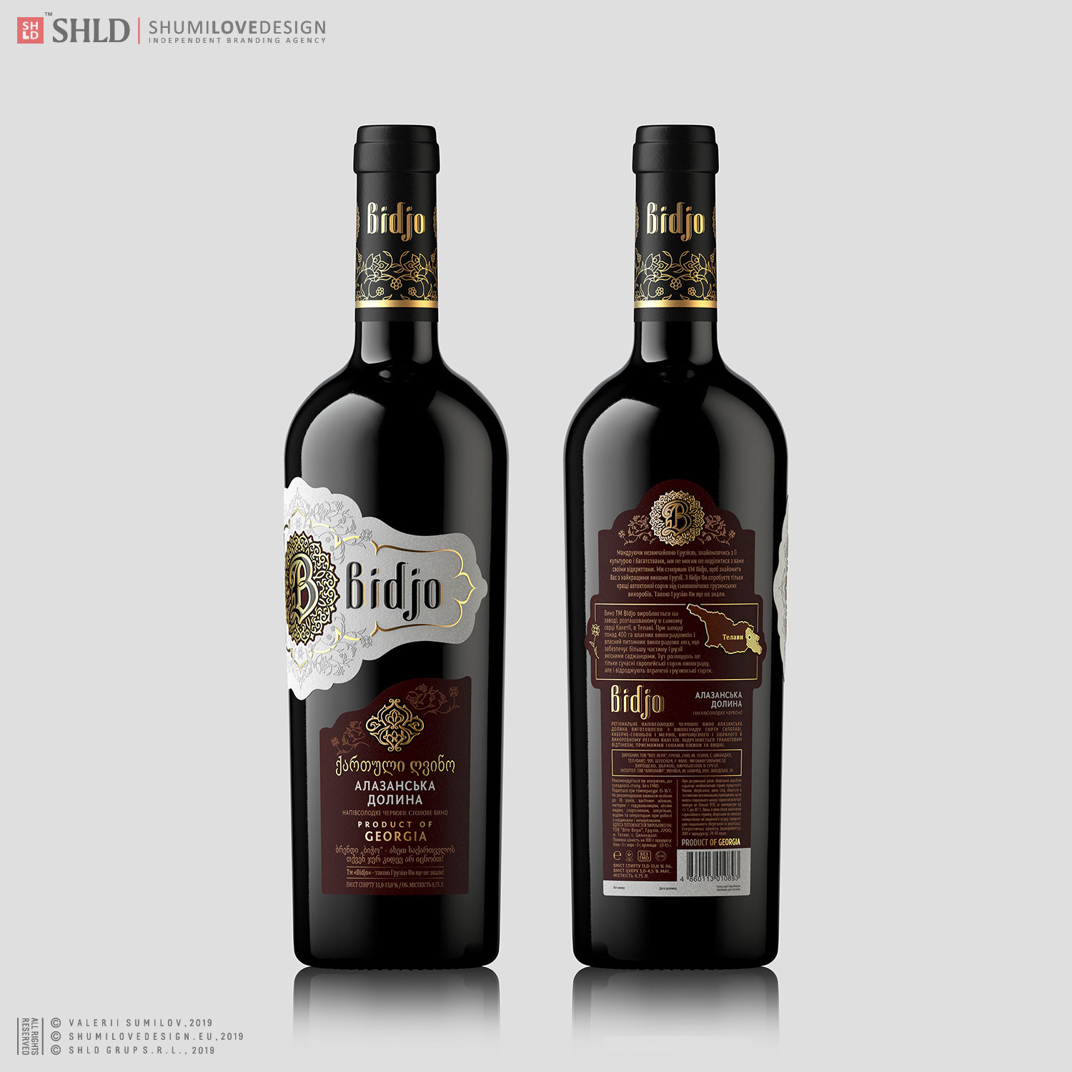
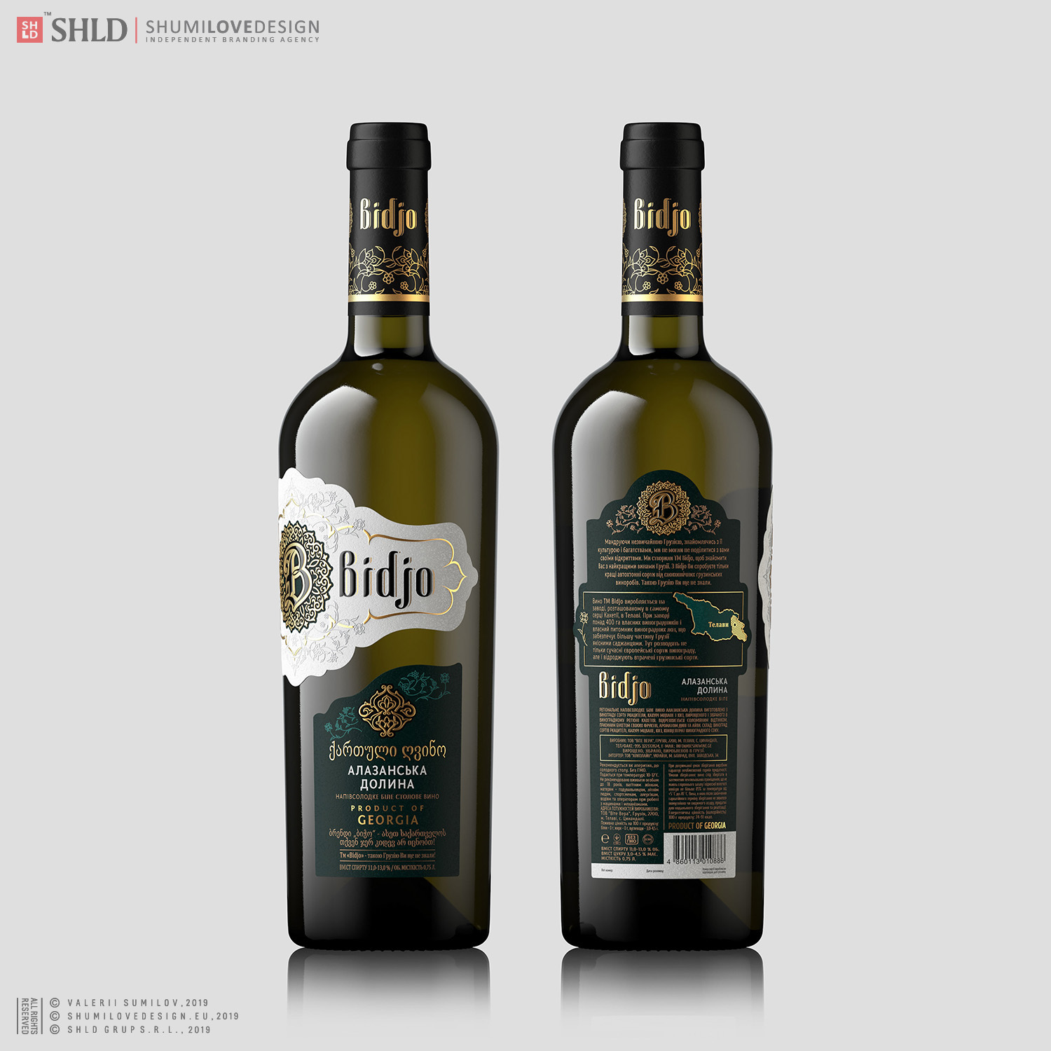
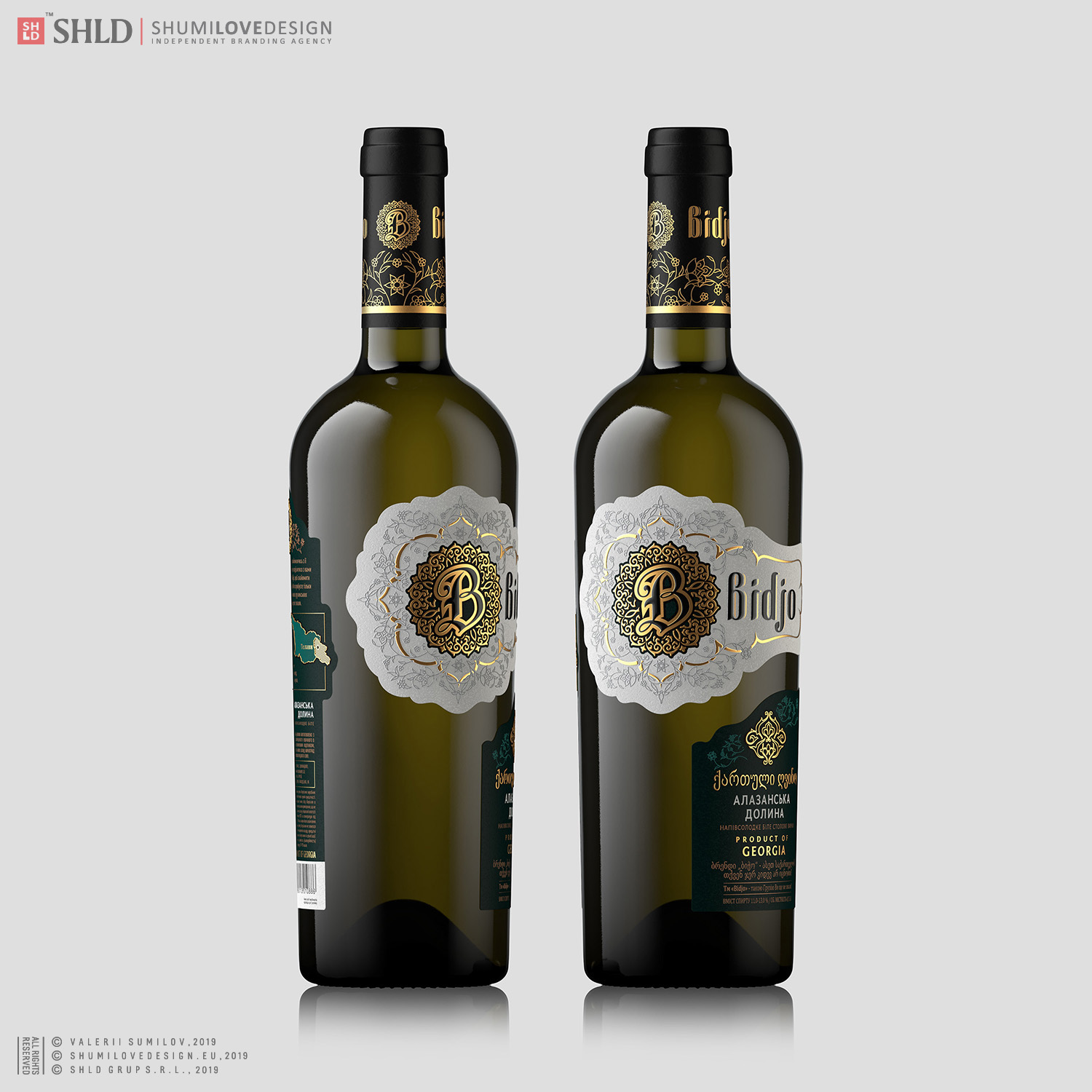
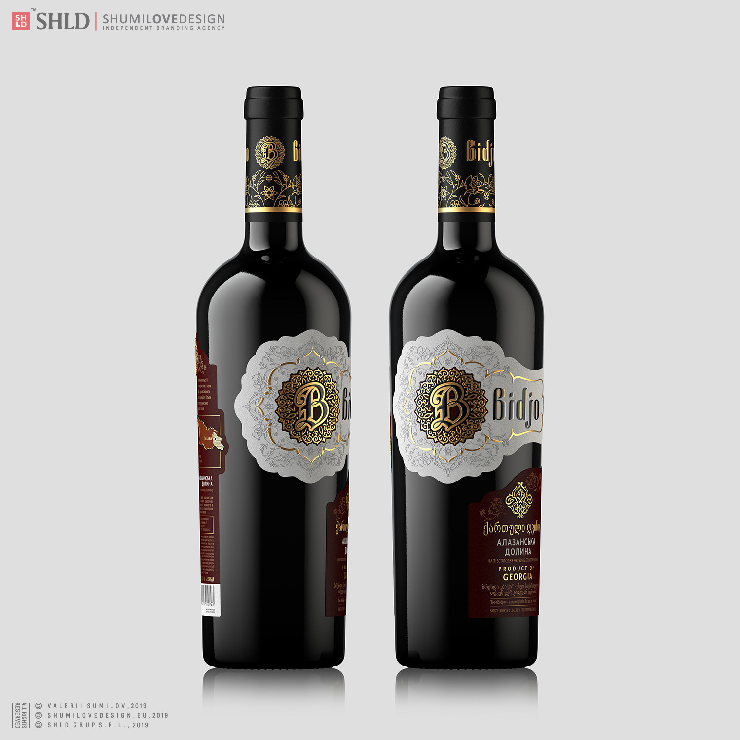
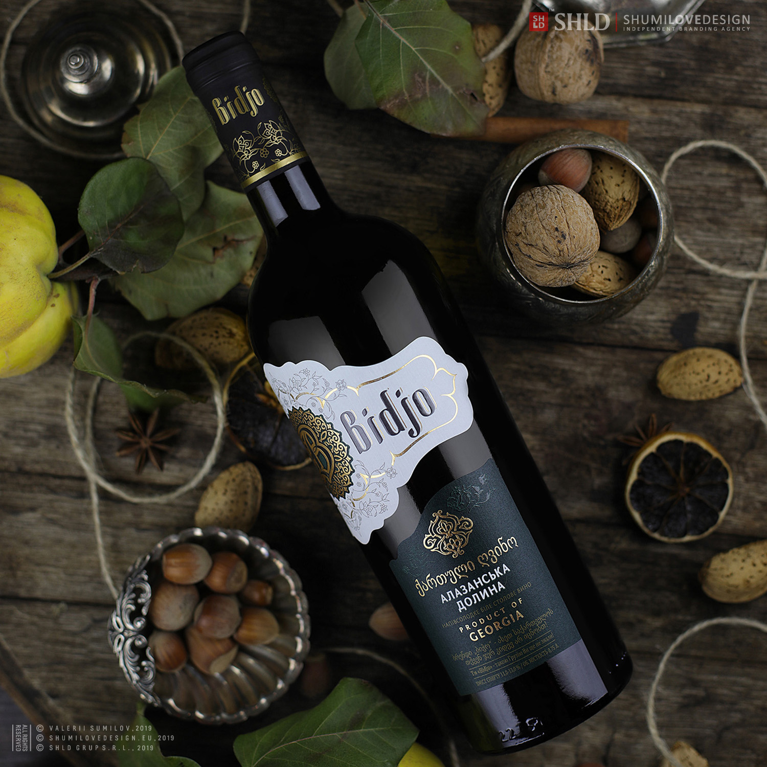
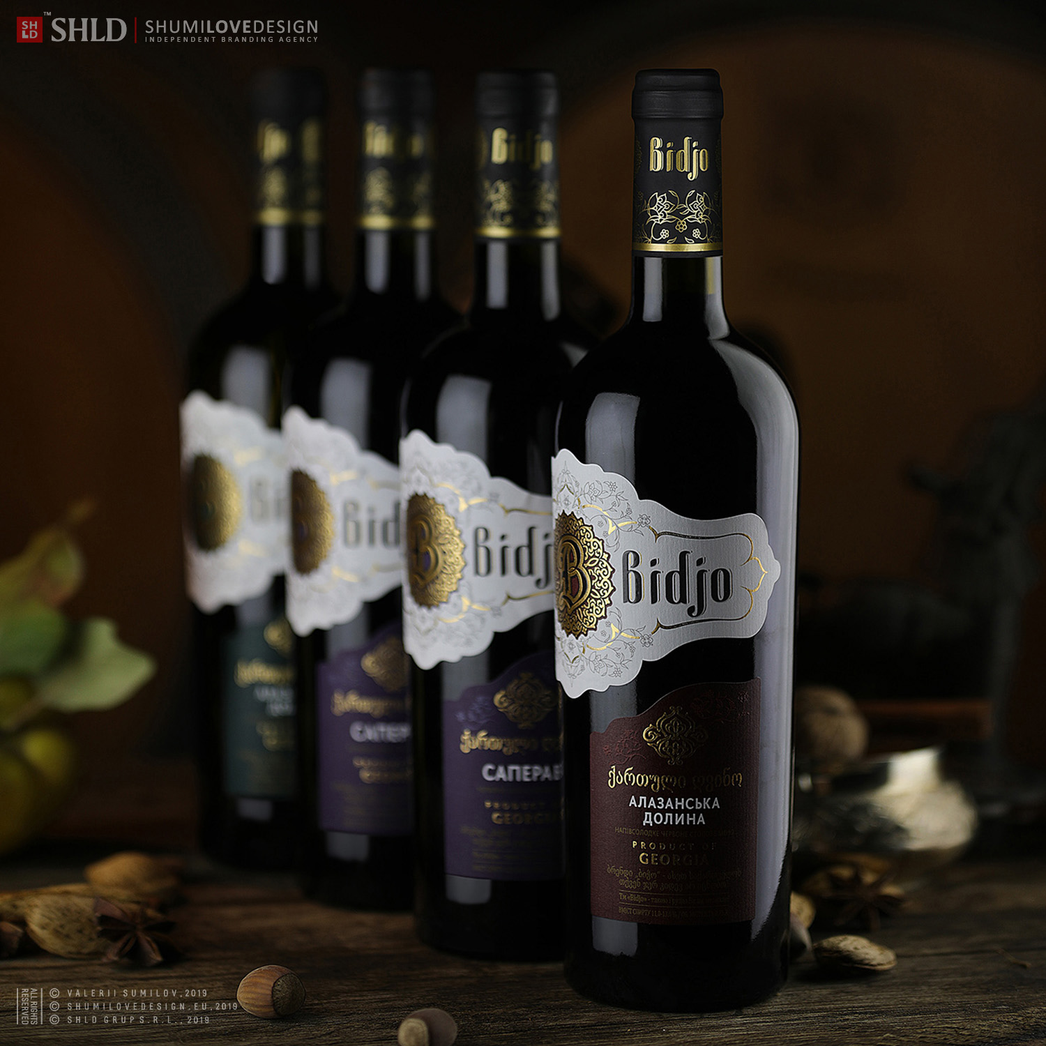
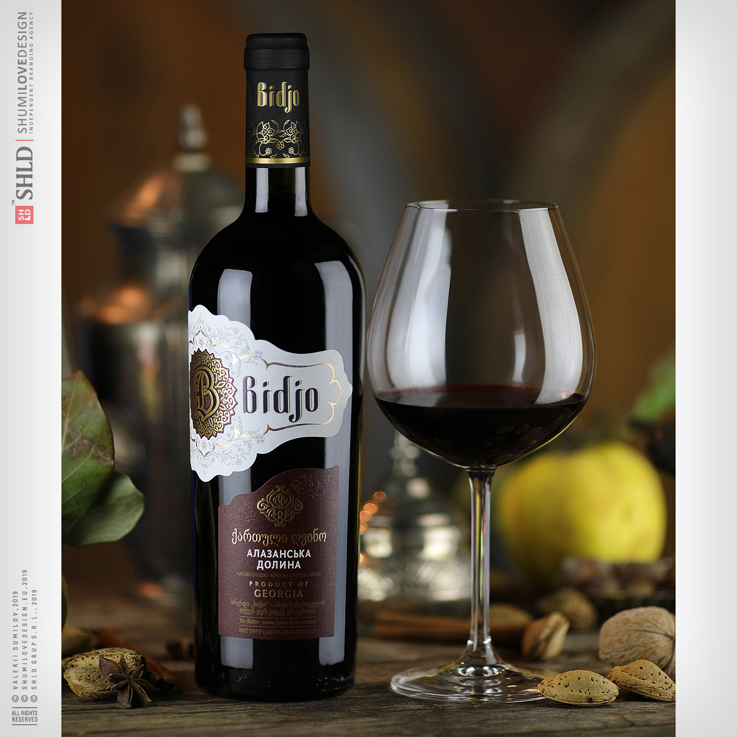
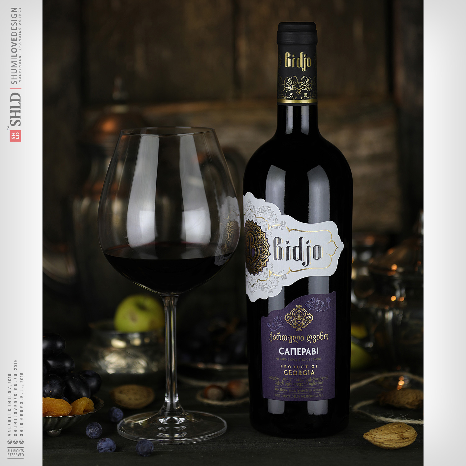
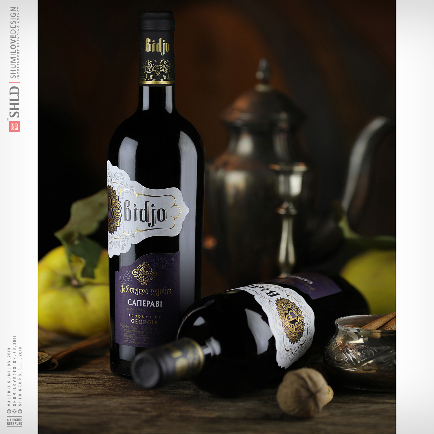
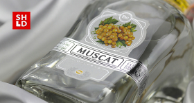
Wines Bidjo are a premium segment in the market of Georgian wines of Ukraine. A special feature of these wines is their unique position - the trademark owner finds, selects and imports to Ukraine the best authentic varieties of Georgian wines. This is a real selection of exclusive, high quality wines.
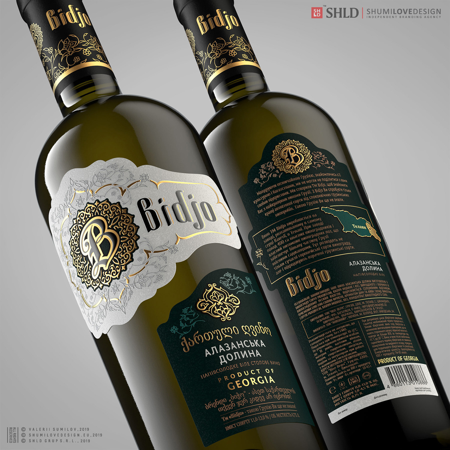
We were inspired to develop this design by a concept we created within our agency. We wanted to get away from the ordinary background. Get away from the routine. Leave behind the traditional and habitual markers of Georgian alcoholic products, which everyone is already too familiar with. Get away from the images of animals. Get away from the label images of people in Georgian clothes. Get away from the mountains, jugs, kvevri and other ethnic identifiers, such as daggers, hats, horns for wine...
We wanted to create a special atmosphere. A true oriental tale filled with magic and luxury:
 “A rare, alluring with its charm treasure, that, by chance, fell into your hands. Will you really let it go?! ... Such a rare coincidence, when something really valuable gets into your hands. Such a chance you only have once in a lifetime...Treasure. What does it promise you? What does it foretell you?
Euphoria. Pleasure. Tales....
Bidjo!»
It was necessary to create a design that would be unambiguously identified as Georgian, and at the same time, would not carry along the established, largely outdated stereotype of the design of Georgian wines.It was required to create a design that would be at times more fashionable, statutory, “expensive”, compared to other design of Georgian wines.
The product must:
1. Surprise, amaze, excite.
2. Talk about the status of the person who buys it.
3. Talk about the exceptional taste of this person.
4. Talk about the person’s real good judgment of good wines.
5. The fact that the buyer can afford the purchase of a wine that is more expensive than usual.
The most difficult task in this project was to develop a new communication strategy between the brand and the consumer. We had to restrain ourselves from slipping into banal and obvious messages.
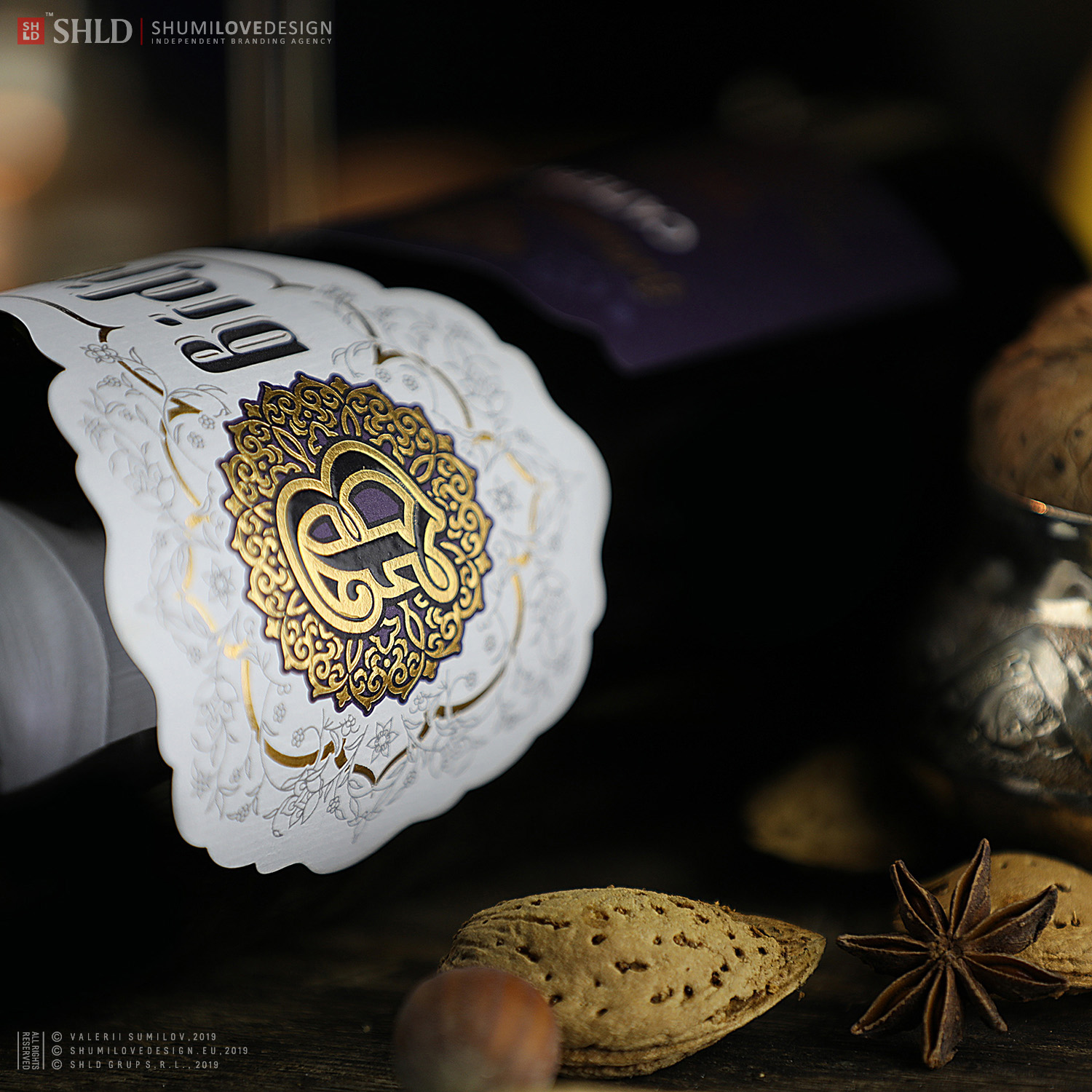
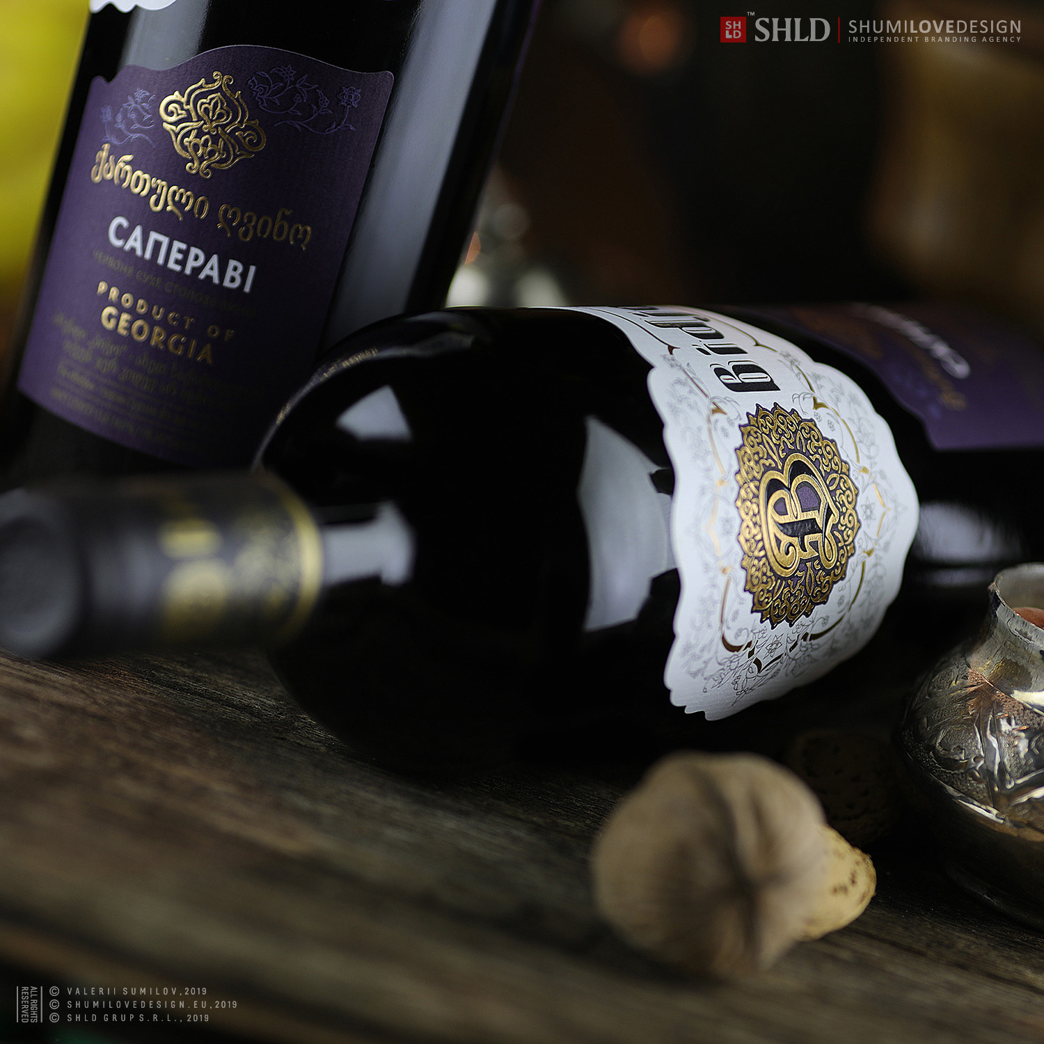
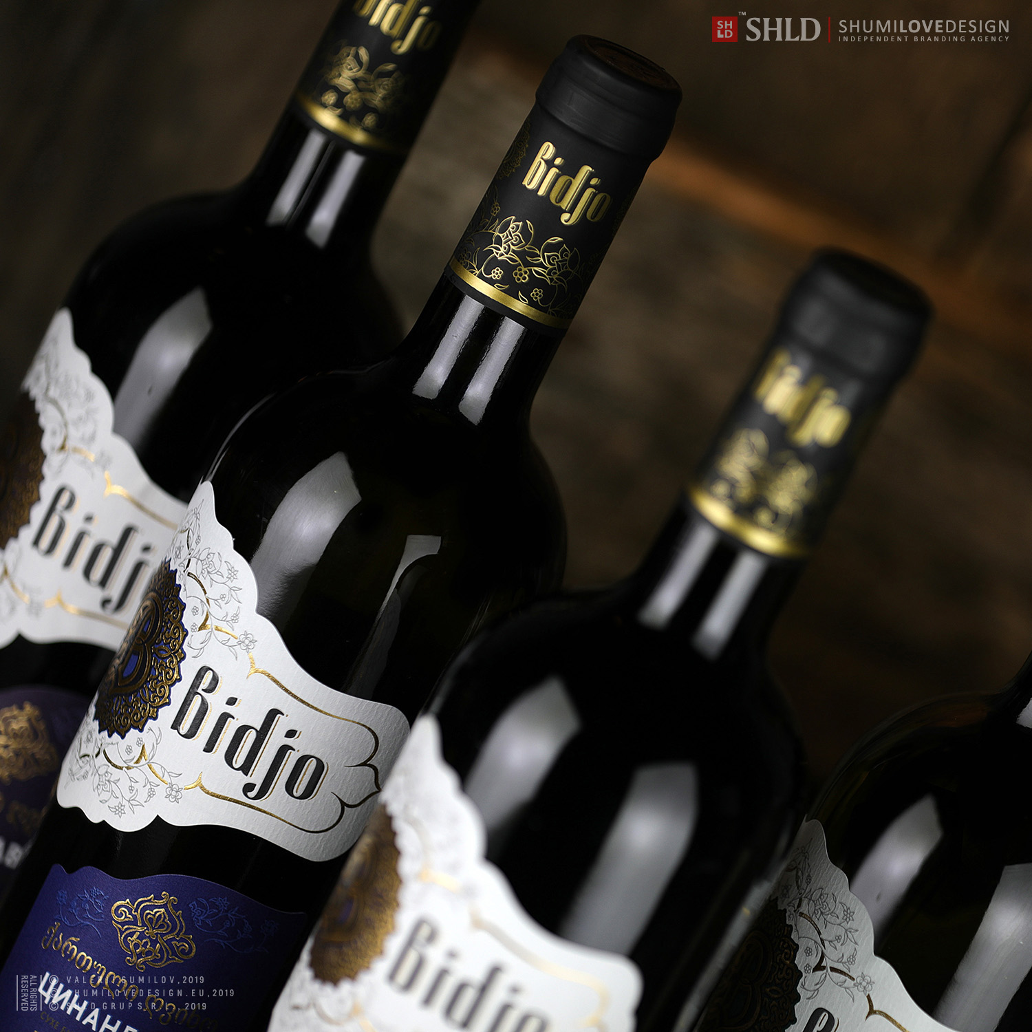
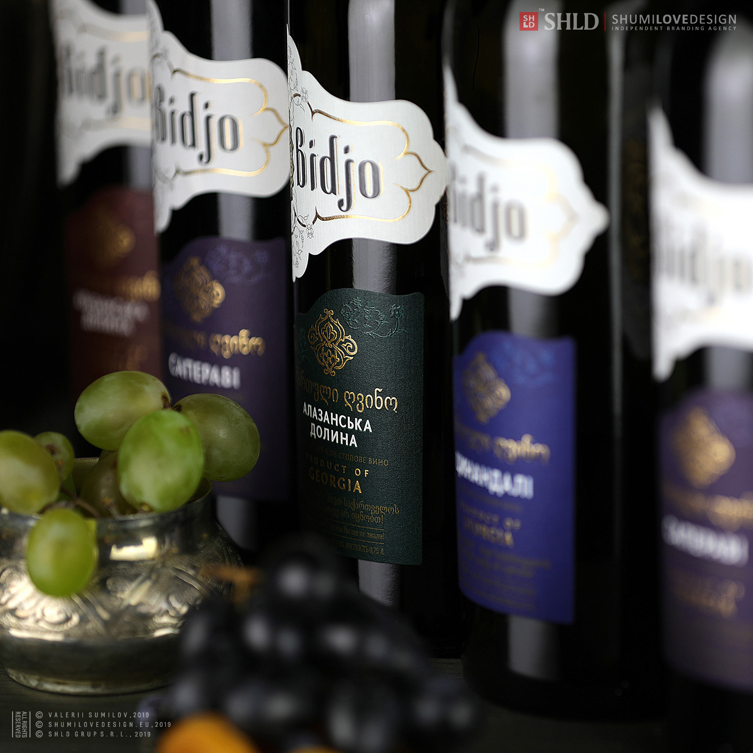
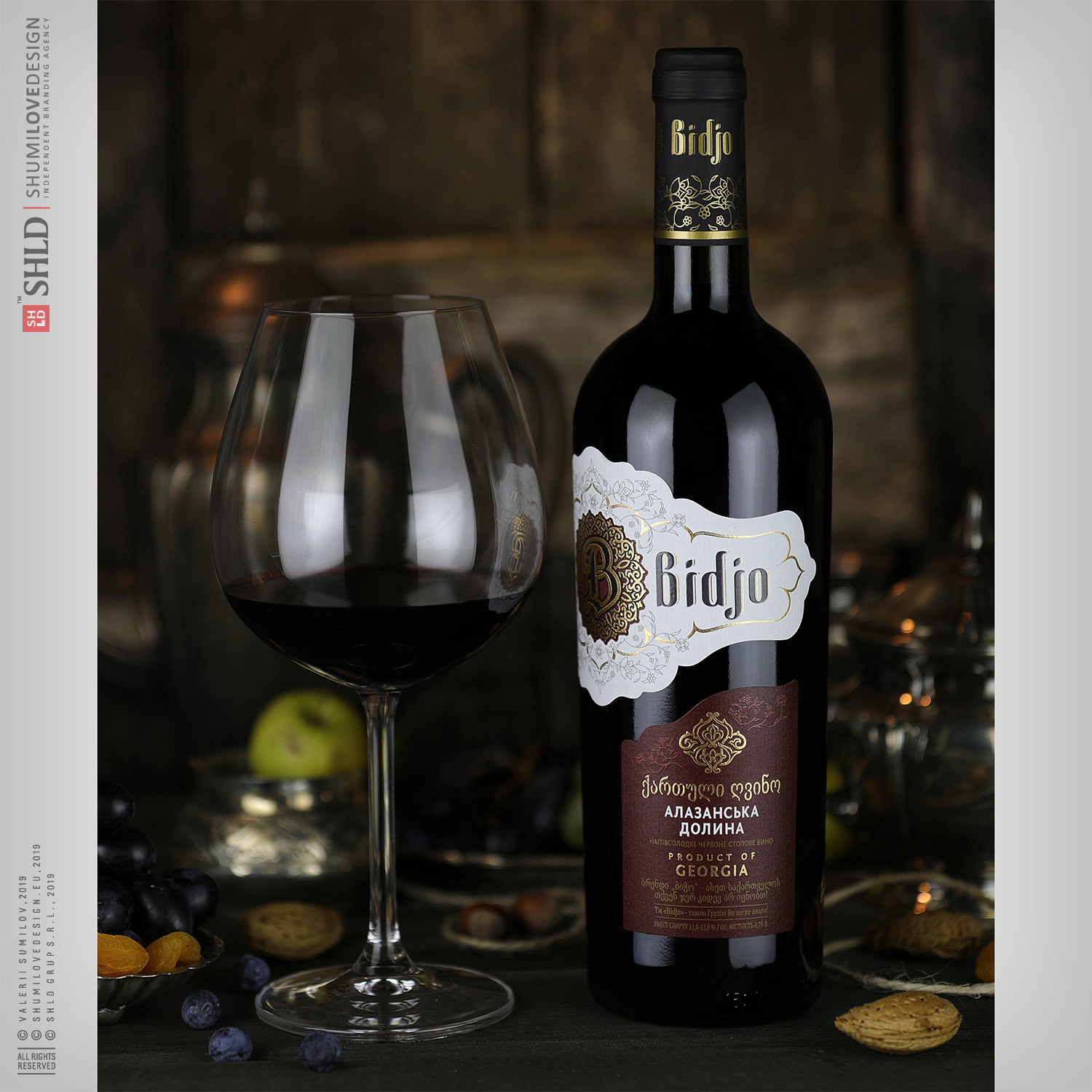
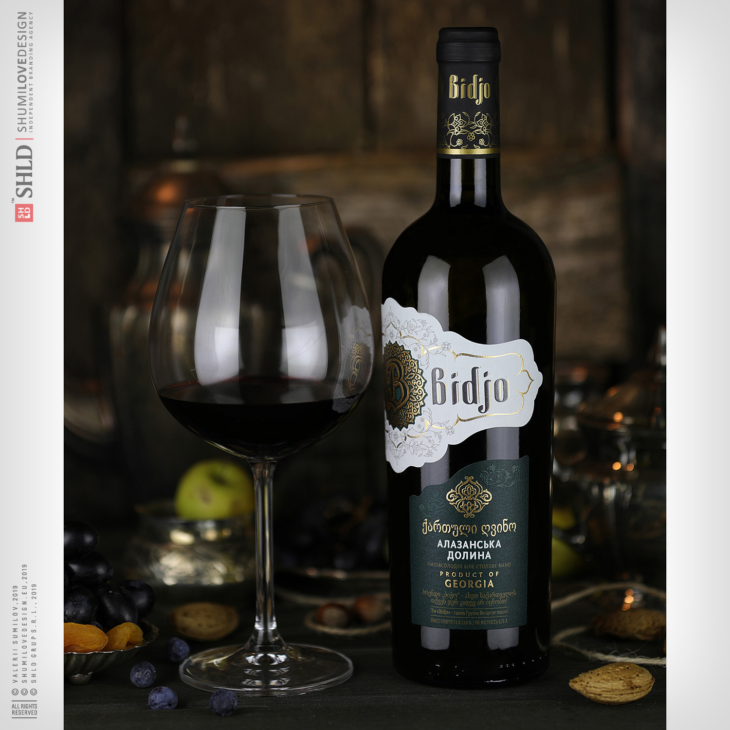
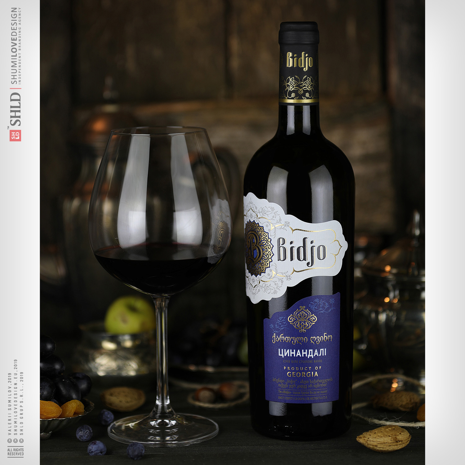
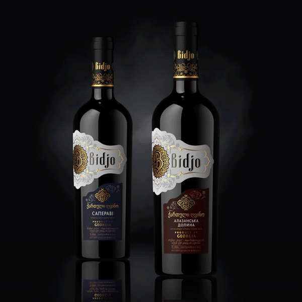
The label has a complex construction and consists of two parts with a displaced center (asymmetry). At the same time, once applied on the bottle, the label creates a single ensemble between its parts and the reverse label. Each part of the design complements and interacts with the other label components.
Copying and rewriting information, pictures, images, logo, design from the site www.shumilovedesign.ru / www.shumilovedesign.eu is prohibited .
Copyright for all texts, images, designs, logo, website design www.shumilovedesign.ru / www.shumilovedesign.eu belong to the company SC "SHLD GRUP" SRL.
All rights reserved.
© SHUMI LOVE DESIGN™, 2019
© VALERII SUMILOV, 2019
© SHLD GRUP SRL, 2019
- In the world