VLADOVLAD / Мед с добавками
- CLIENT
-
TASK
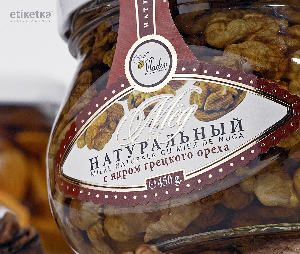
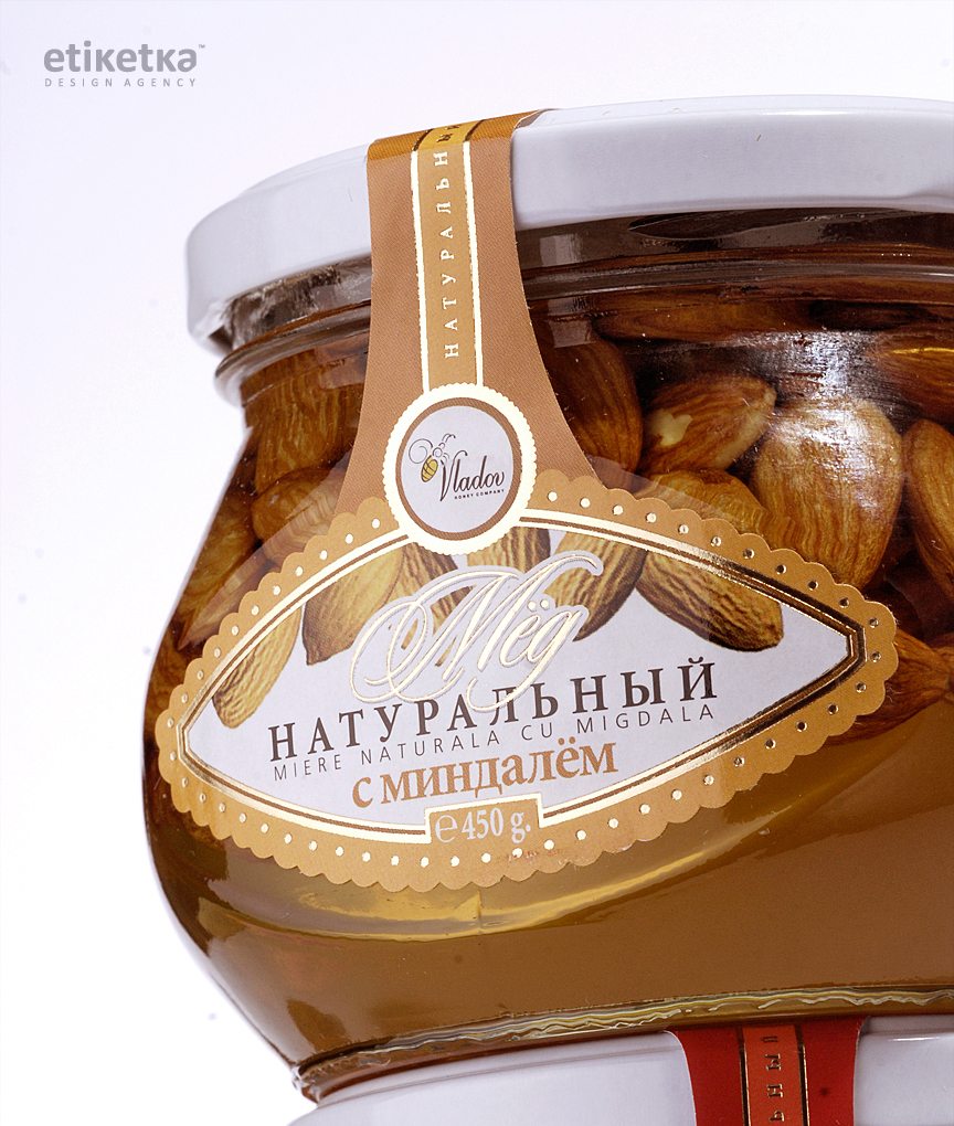
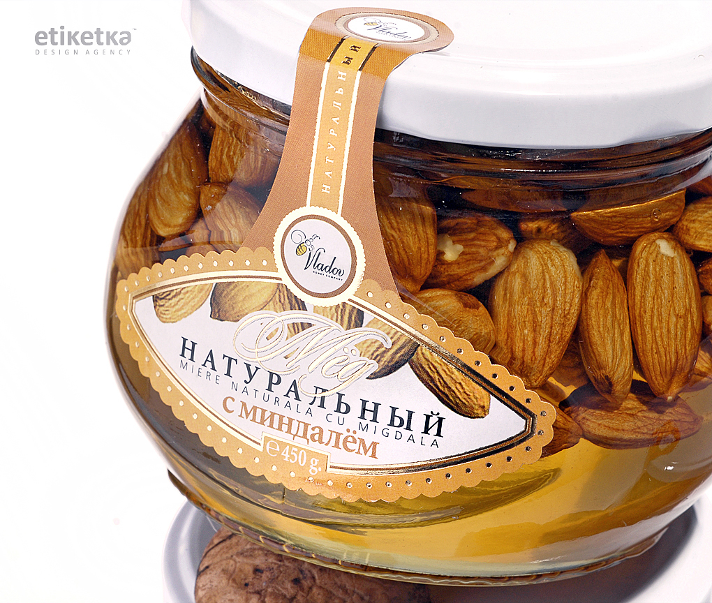
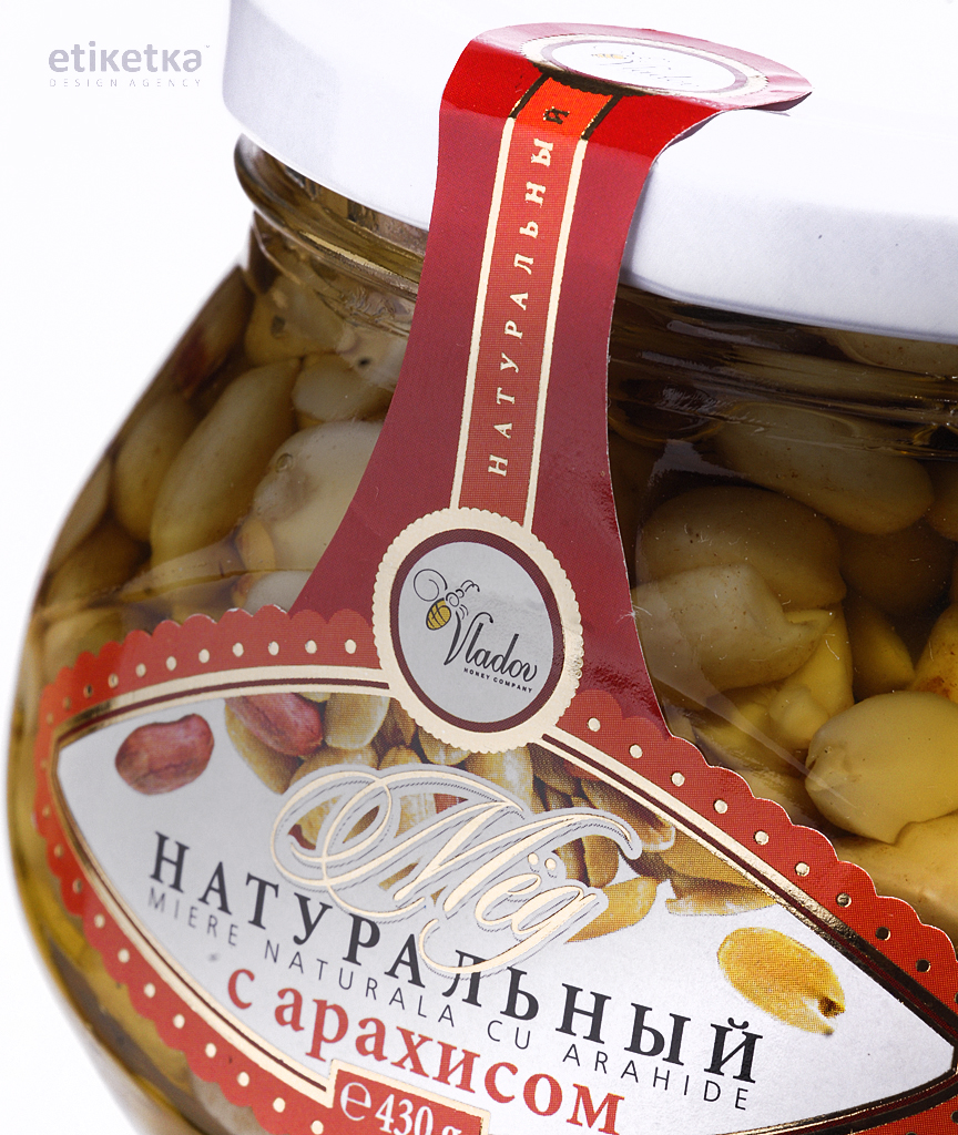
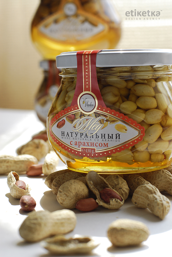
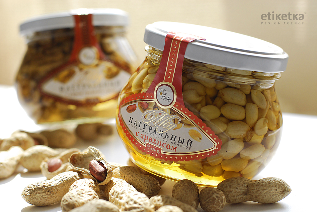
The challenge for this project was to design a series of labels for a line of honey-nut products by “Vladov” company.
-
SOLUTION
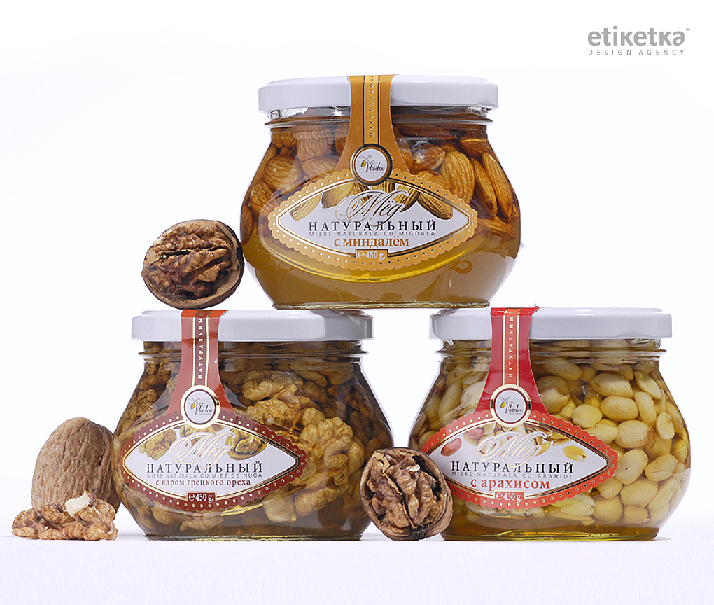
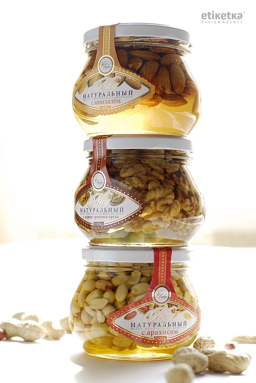
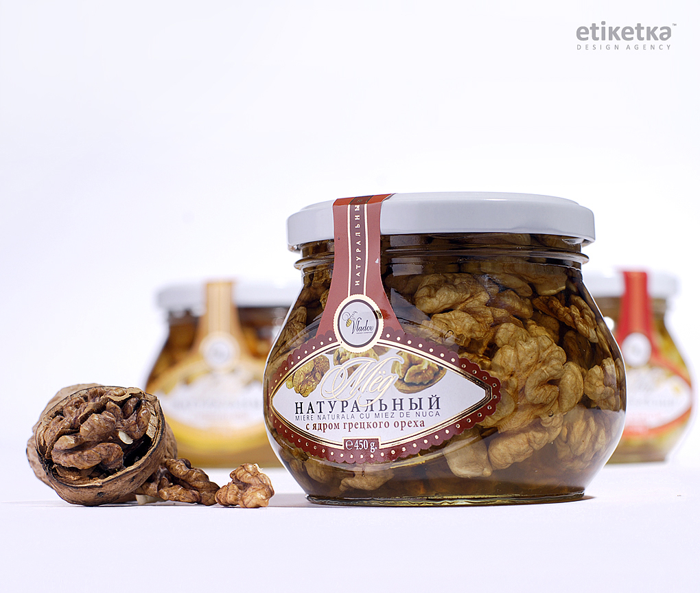
The solution to this task is a label design that emphasizes the visual aspect of the product itself. Instead of a large label that would cover a significant part of the package, the label represents a specific shape that takes up only a small percentage of the can’s frontal area. This way the label only emphasizes the visual attractiveness of the product, which in its own way is able to attract the consumer’s attention.
The label looks like it’s “dripping” off the cap to the frontal plane of the package – a clear representation of the honey essence of the product. The overall elegance of the fonts and decorative elements further outlines the product’s viscosity and sweetness, while the image of nuts, corresponding to the packing’s contents, serves both as a neutral background and an informative element of the overall composition. -
In the world
Realized project on label design for the company "Vladov" has been published by TheBestPackaging.ru which brings together the best examples of packaging design from Russia, CIS and materials for creative design packaging:
UniPack has published an item on our work for the company "Vladov". The industry portal Unipack.Ru is an information-search system, which takes a leading position among informational and advertising resources dedicated to the packing industry of the Russian-speaking segment of the Internet, both according to coverage and popularity among users: