The task was to create label design for a series of wines produced in Georgia intended for sale in Russian Federation through retail stores and supermarket chains. The consumer will mainly come into contact with the product via store shelves.
SOLUTION
Working on a design for a product with a very strong national character is a challenging and special task. Especially when talking about Georgian wines, which are intended for sale in Russian Federation.
Georgia is a very old country, which is well known for its traditions, winemaking and works of art. Georgia is always associated with style, temperament and status.
The hardest thing about this project was finding the rational grain, which would be able to hook the product’s consumer. We had to avoid corny, simple and obvious while working with the Georgian winemakers. The Georgian wine market in Russia is very saturated with different products. Quite often the consumer gets lost when choosing a particular wine. This project was challenging not only because there was a need in an effective communication route with the consumer, but also because there was a very fine balance between the ethnic design elements and the information aspect, which would be understandable to the Russian consumer.
While working on the design, I’ve tried to avoid the stereotypes, which are commonly used when decorating Georgian wines. I wanted to find a recognizable, attractive and individual image for this product line.
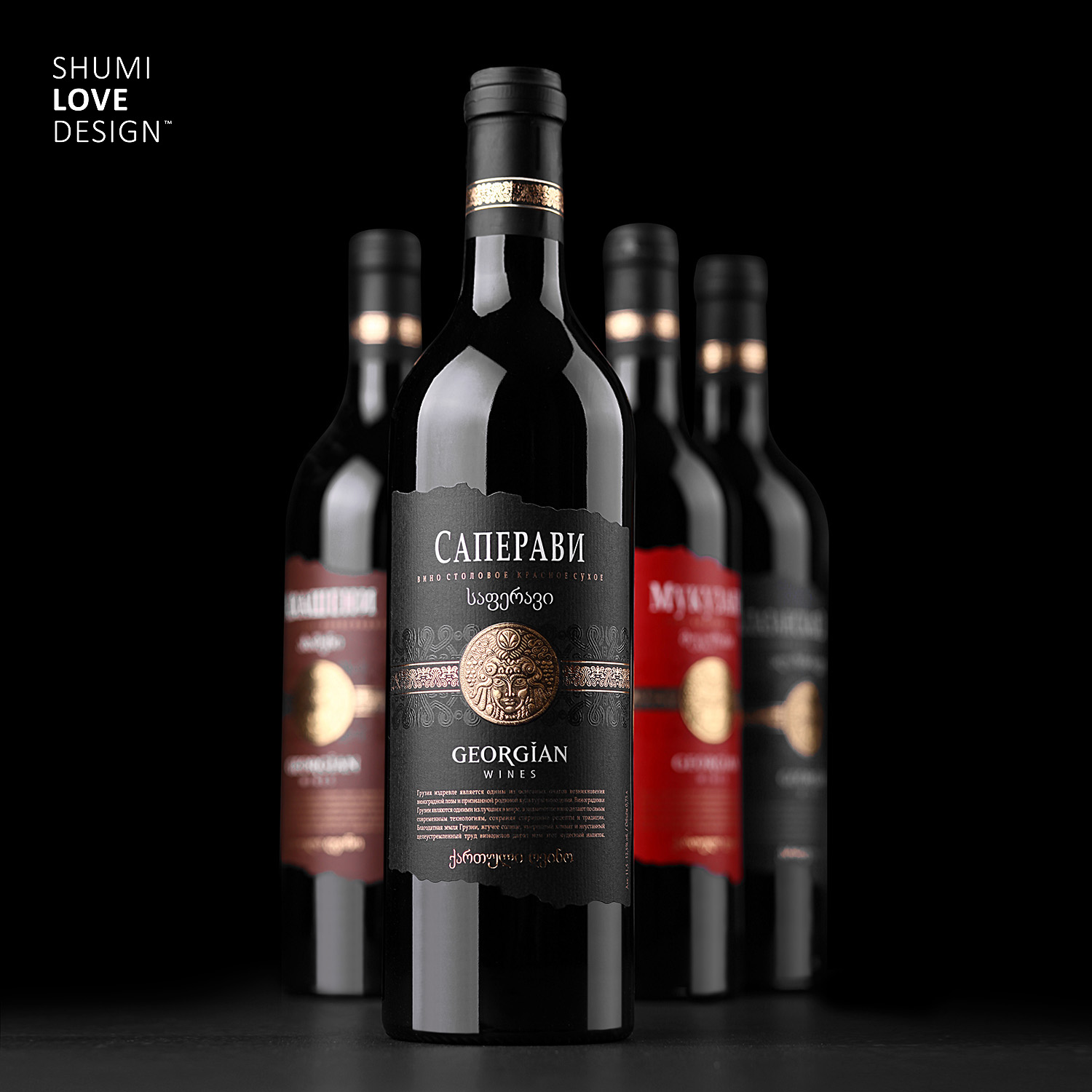
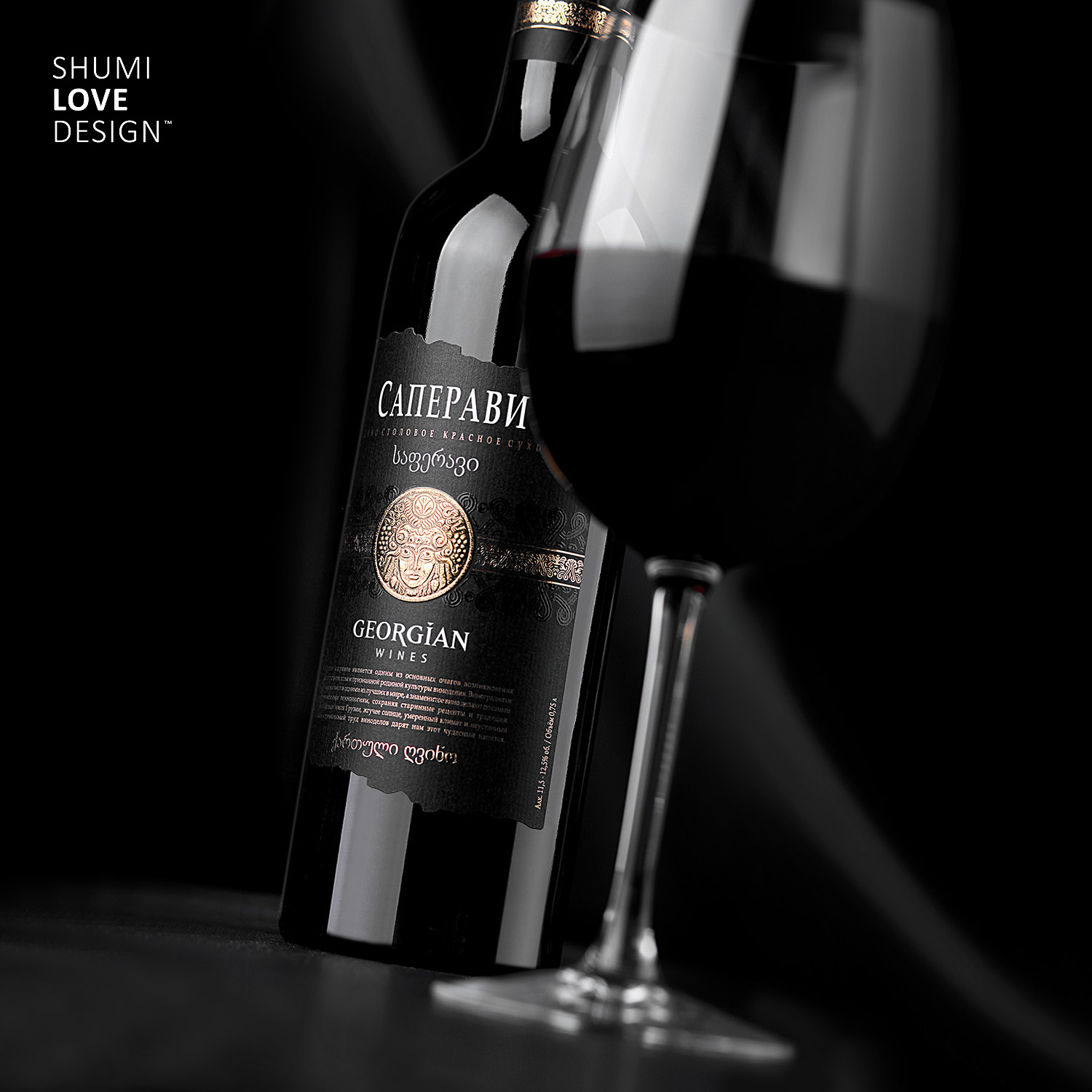
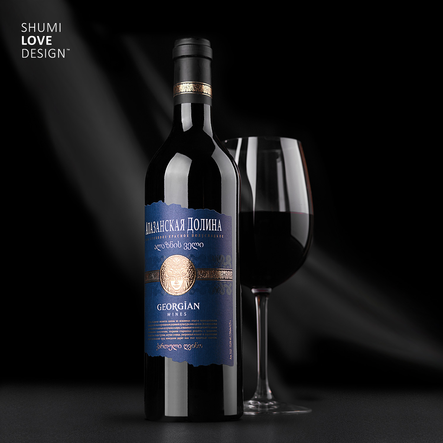
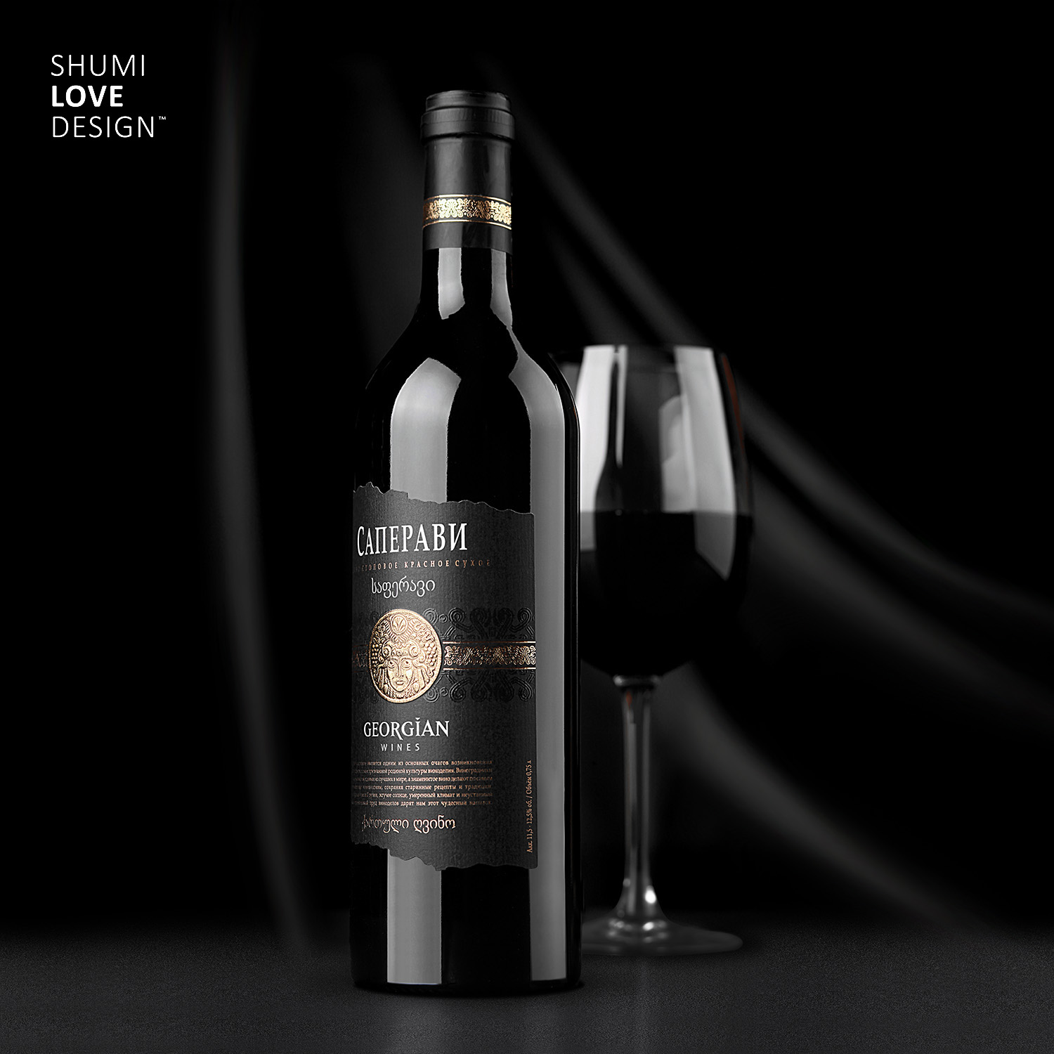
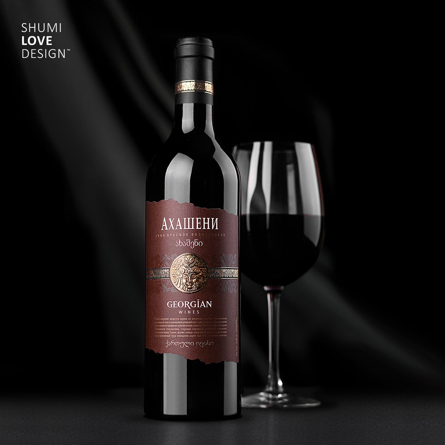
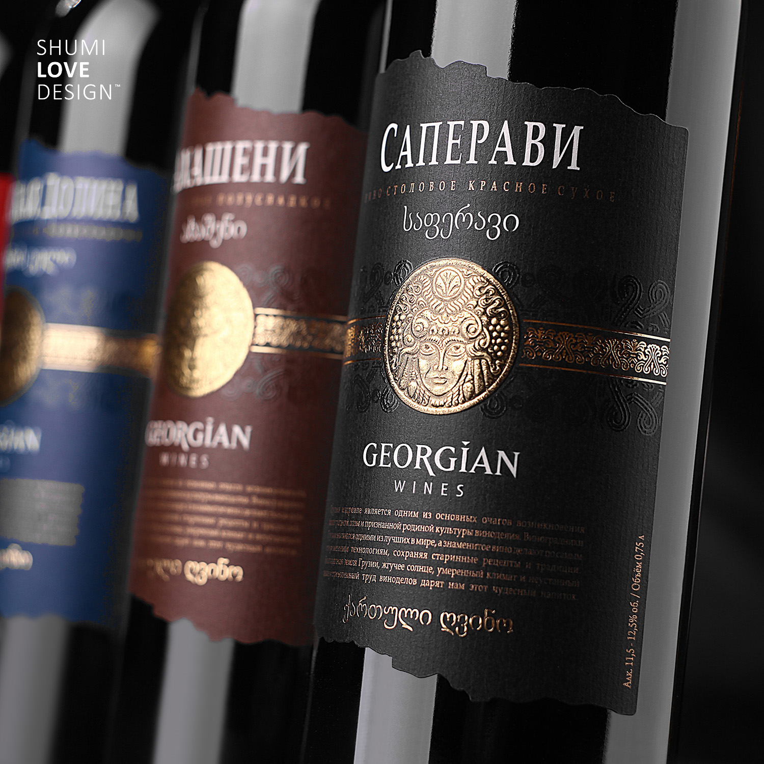
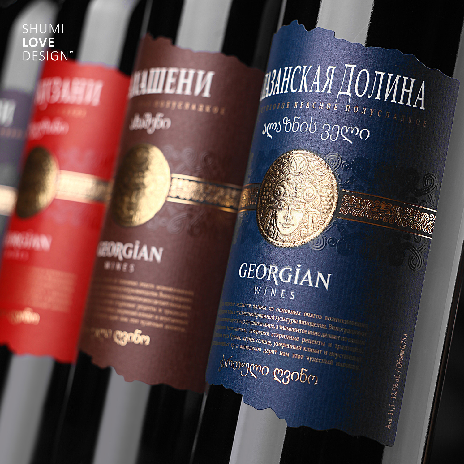
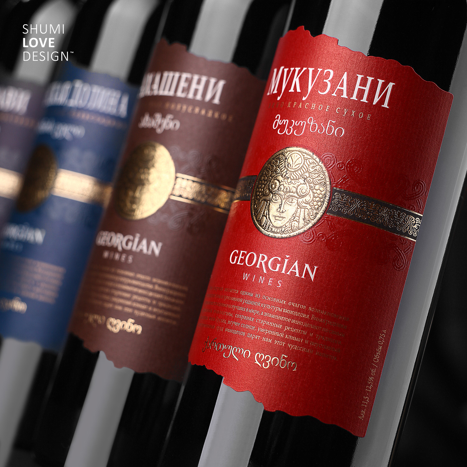
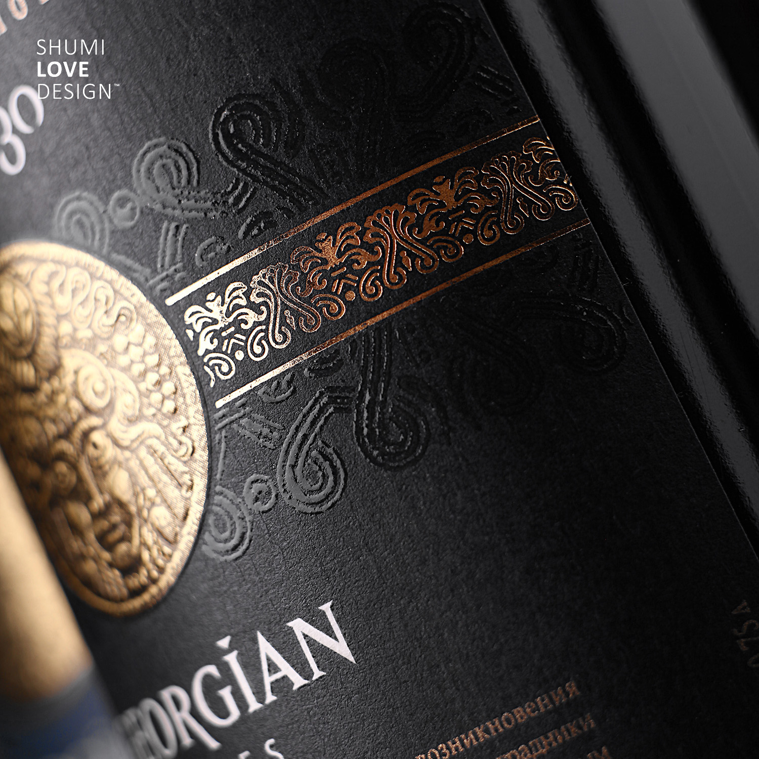
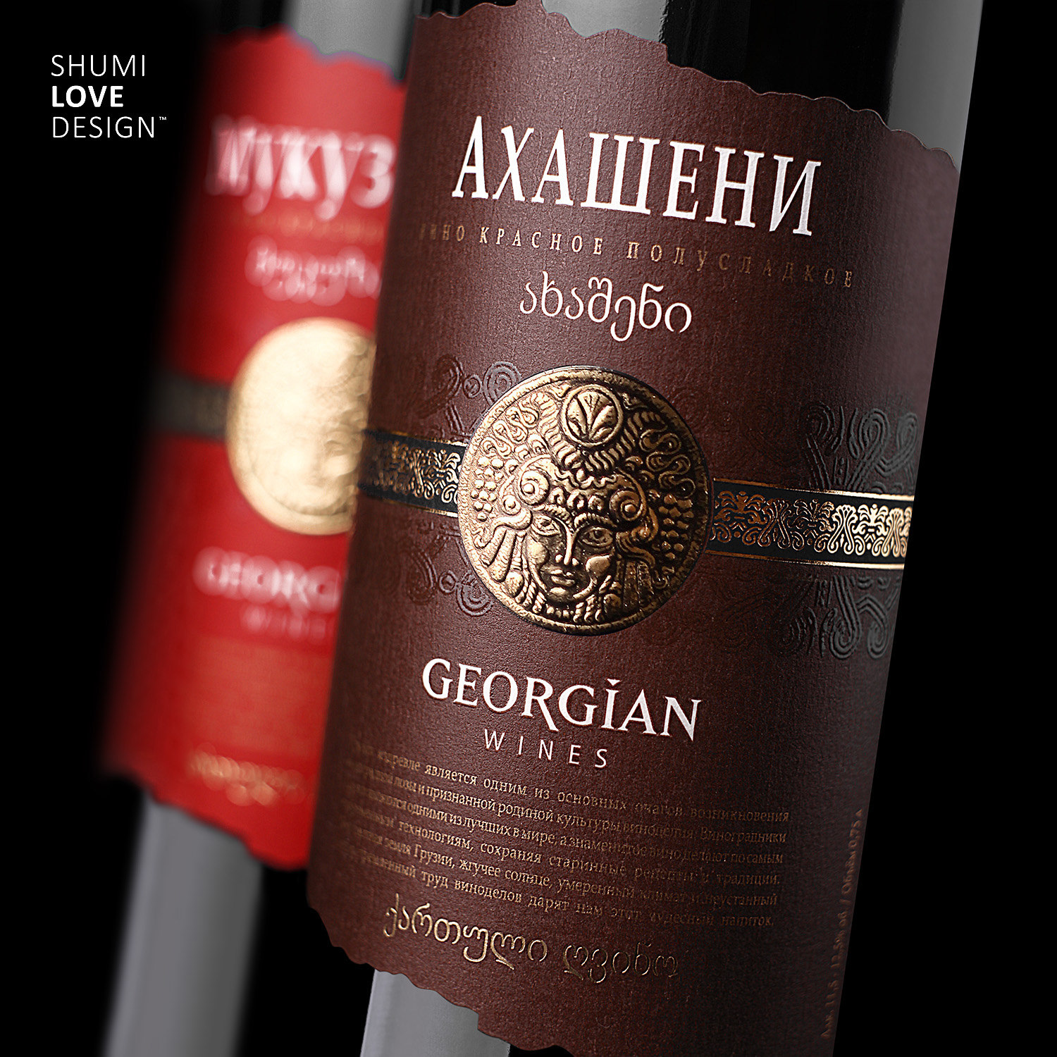
Pay attention to the main and central element of the label – the ethnic Georgian image executed in the ancient Georgian stamping style. This element is the main aspect of this label, an eye-stopper, which instantly draws the customer’s attention. It communicates the product’s main idea – it’s a wine produced in a country with very rich and ancient winemaking traditions. The delicate ethnic ornament located behind this medal emphasizes this message, enriching the label with flexible glossy lines, softening the message, and turning the label into a delicate work of art. The message is enriched further by the torn label edges, which give an idea of century-old traditions and revelations hidden in ancient manuscripts.
The project was designed and executed on self-adhesive artistic paper Antique Intensive White from Raflatac. The paper has a very distinct texture to it, which works very well with the main message of the label. Besides, we’ve also applied the unique technique of printing upon hot lettering, which creates the impression of ancient gold stamping.
Copying and rewriting information, pictures, images, logo, design from the site www.shumilovedesign.ru / www.shumilovedesign.eu is prohibited .
Copyright for all texts, images, designs, logo, website design www.shumilovedesign.ru / www.shumilovedesign.eu belong to the company SC "SHLD GRUP" SRL.