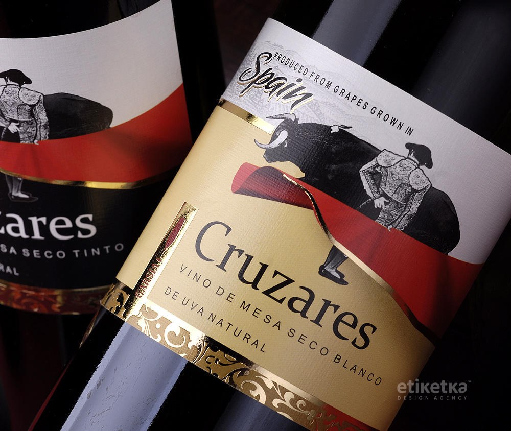
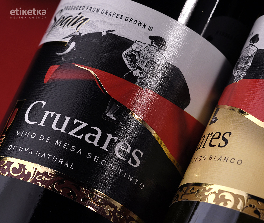
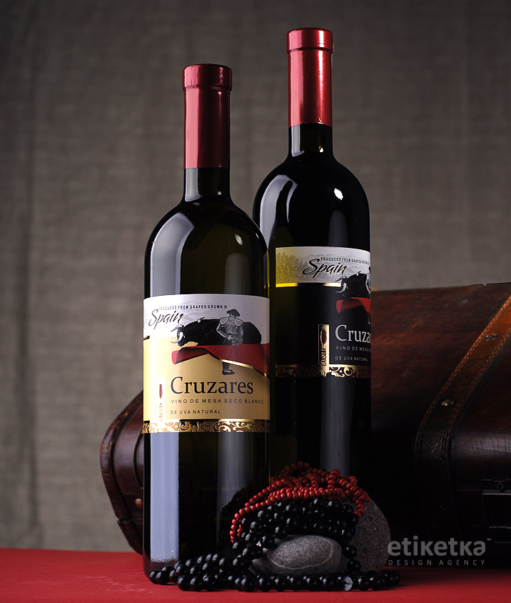
The task was to develop a series of labels for the Spanish wines "Cruzarez"
SOLUTION
Spanish wines usually have their own distinct set of stylistic and graphic elements that are employed in their packing. And since the client has set the task of creating a packing that would be immediately recognized as Spanish, the agency employed the aforementioned set while creating the design for a series of wines descriptively called “Cruzarez”.
Of course, one of the most vibrant images associated with Spain is corrida – the fight between toreador and bull. The agency decided to use this very image as the central point of the label. Moreover, the toreador illustration is applied rather inventively: the black bull storming by the man and the red cloth divide the label into two distinct parts, adding a vivid expressiveness using big bright colored spots. The additional graphic and informative elements further the theme of Spanish expressiveness, processed in some places with golden foil in order to create a vibrant and attractive image.
SHARE:
Previous Project
Wine Style / Tetra Pack
Creation of design concept, packing design, pre-press