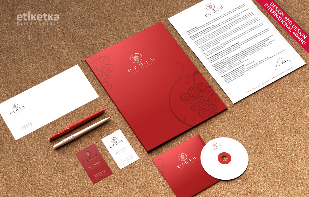
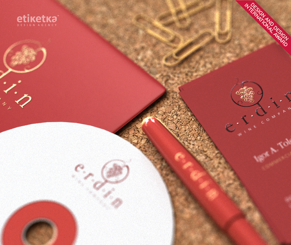
The company “Erdin” serves as a wine and alcoholic beverage distributor on the Russian market. The main reason for this work was the client’s desire to reflect their main activity in a rather accessible and elegant manner.
The client’s main request was to reflect their main activity in a graphic for. If someone would look at any element of the corporate identity, whether a business card, a file or a CD, the viewer should get instant associations with wine and accompanying concepts.
SOLUTION
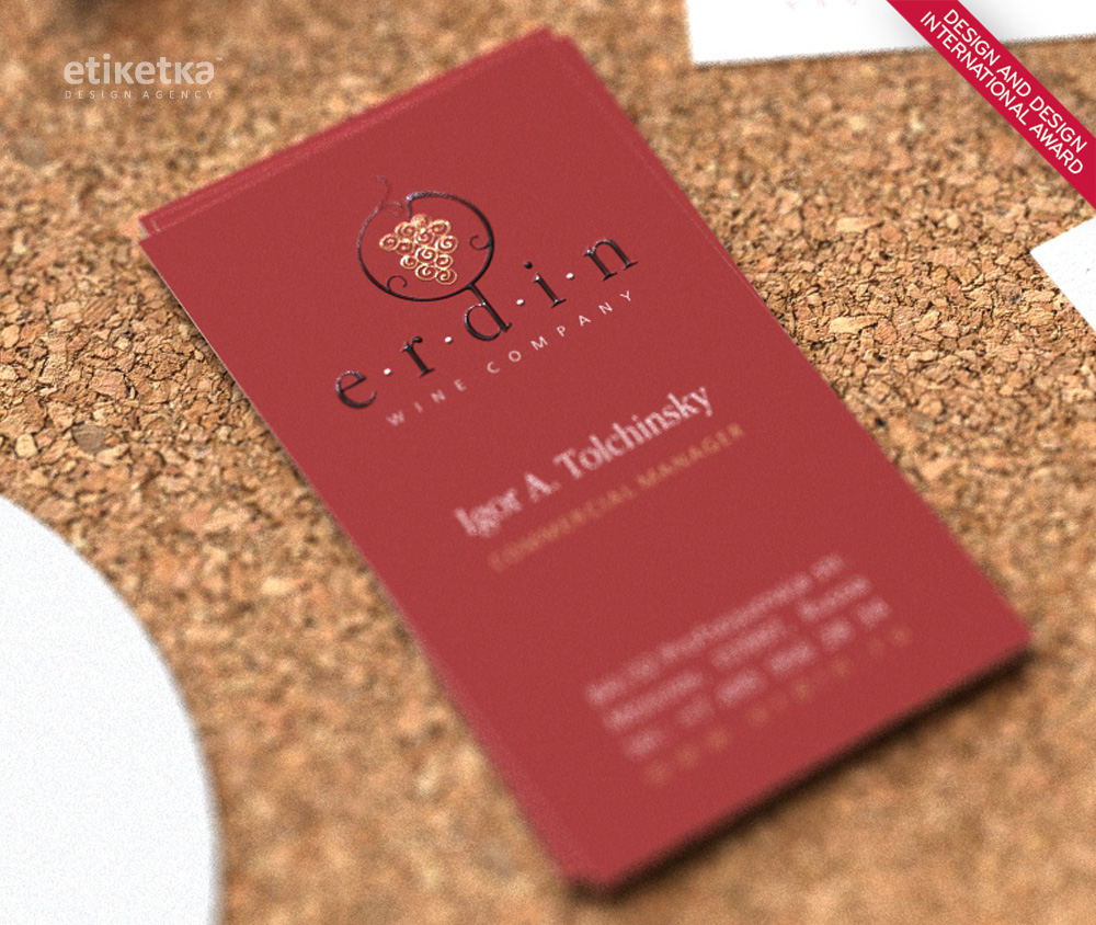
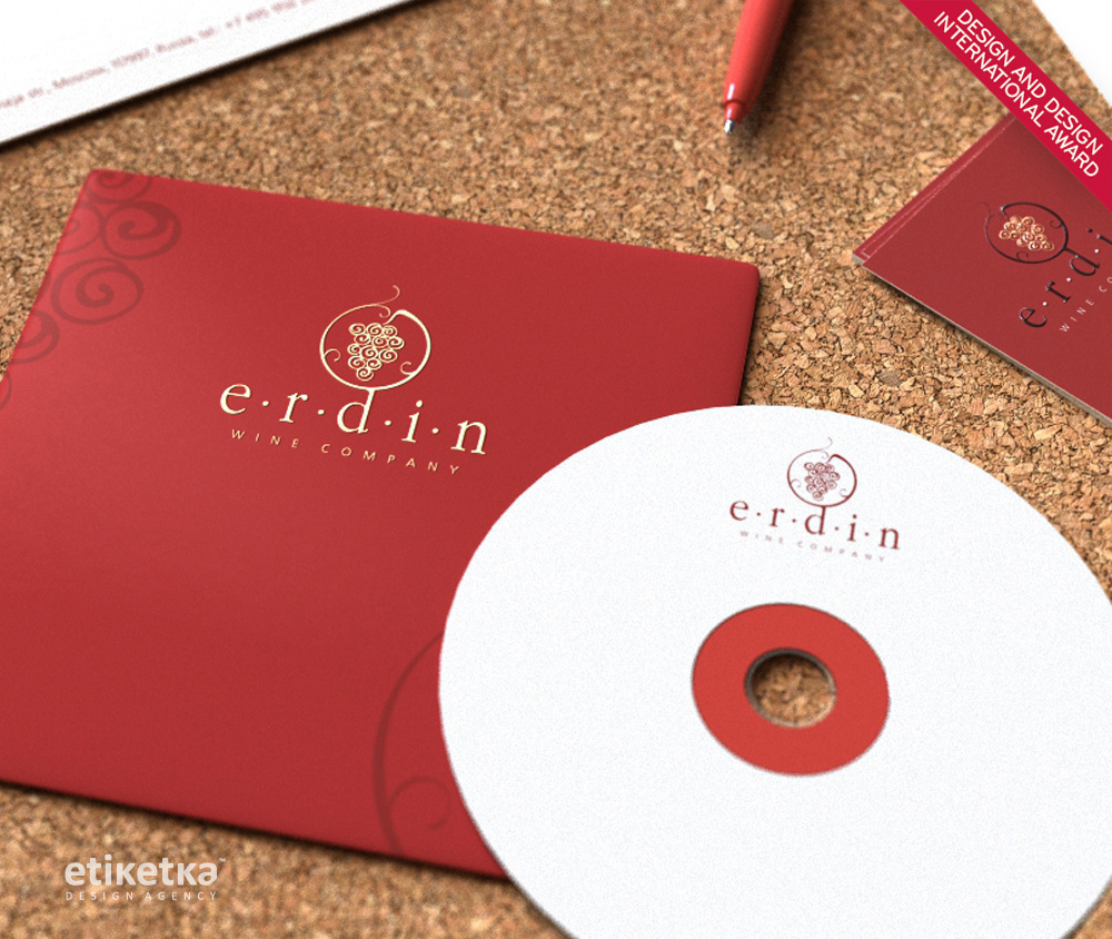
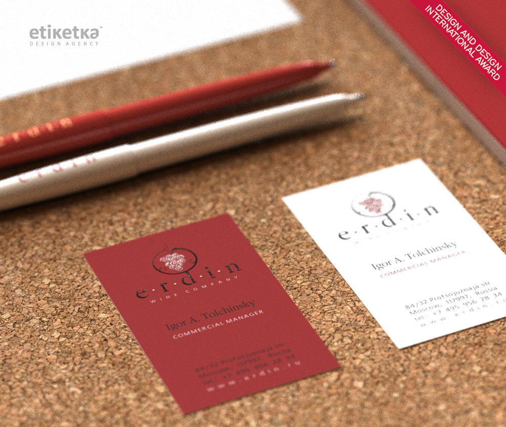
The graceful logo, which encloses a bunch of grapes into a stylized circle, clearly reflects the nature of company’s activity. Once you look at the image there’s a clear understanding that the company distributes wine products, whereas the circle reflects the fact that the products are being shipped to Russia from all over the globe. The softness and smoothness of the lines, as well as the noble palette used in all the elements of the corporate identity, enhance the image of sophistication and elegance, which is associated with wine. The printing and post-printing techniques, used in the production of brand book items, amplify the pleasant visual and tactile effect.