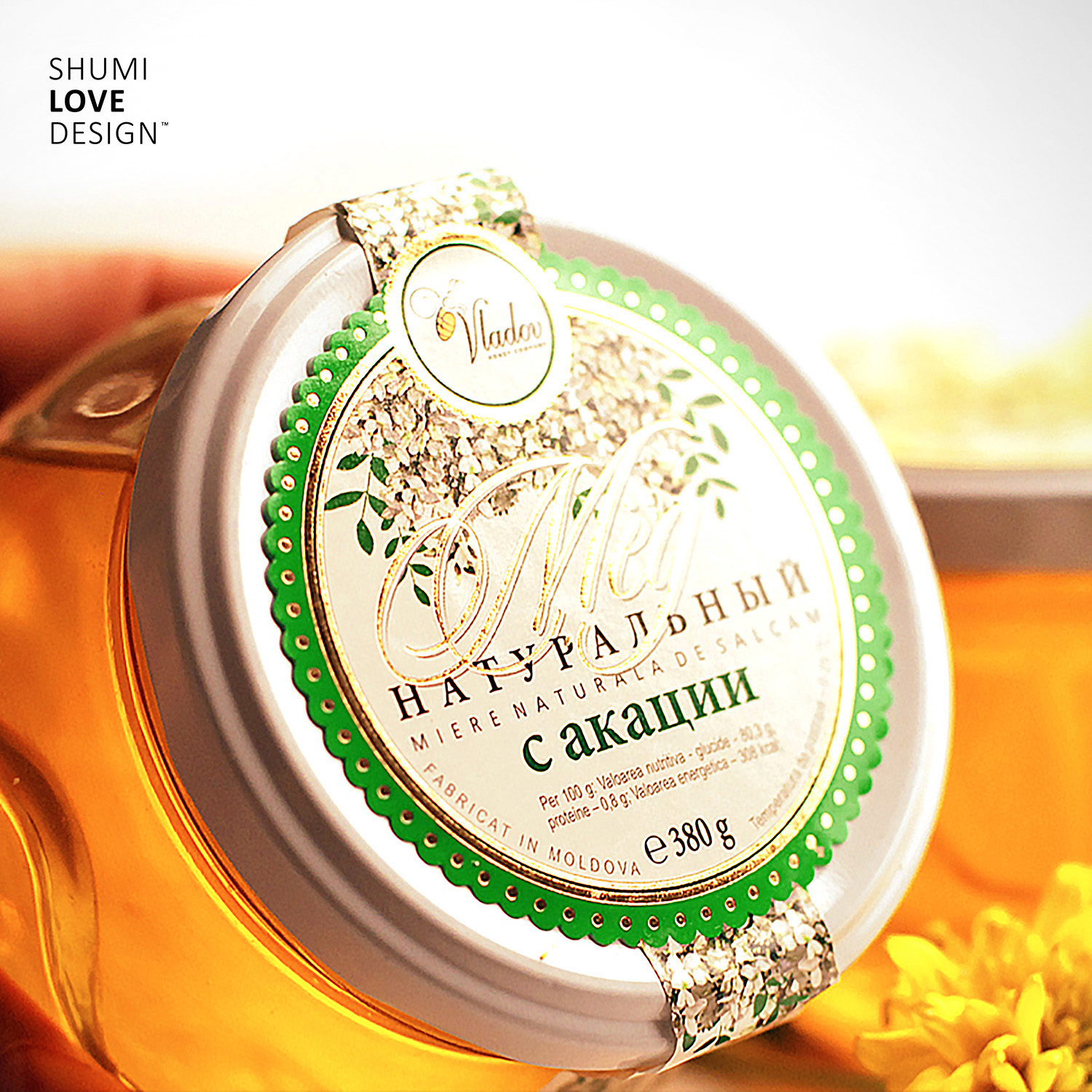
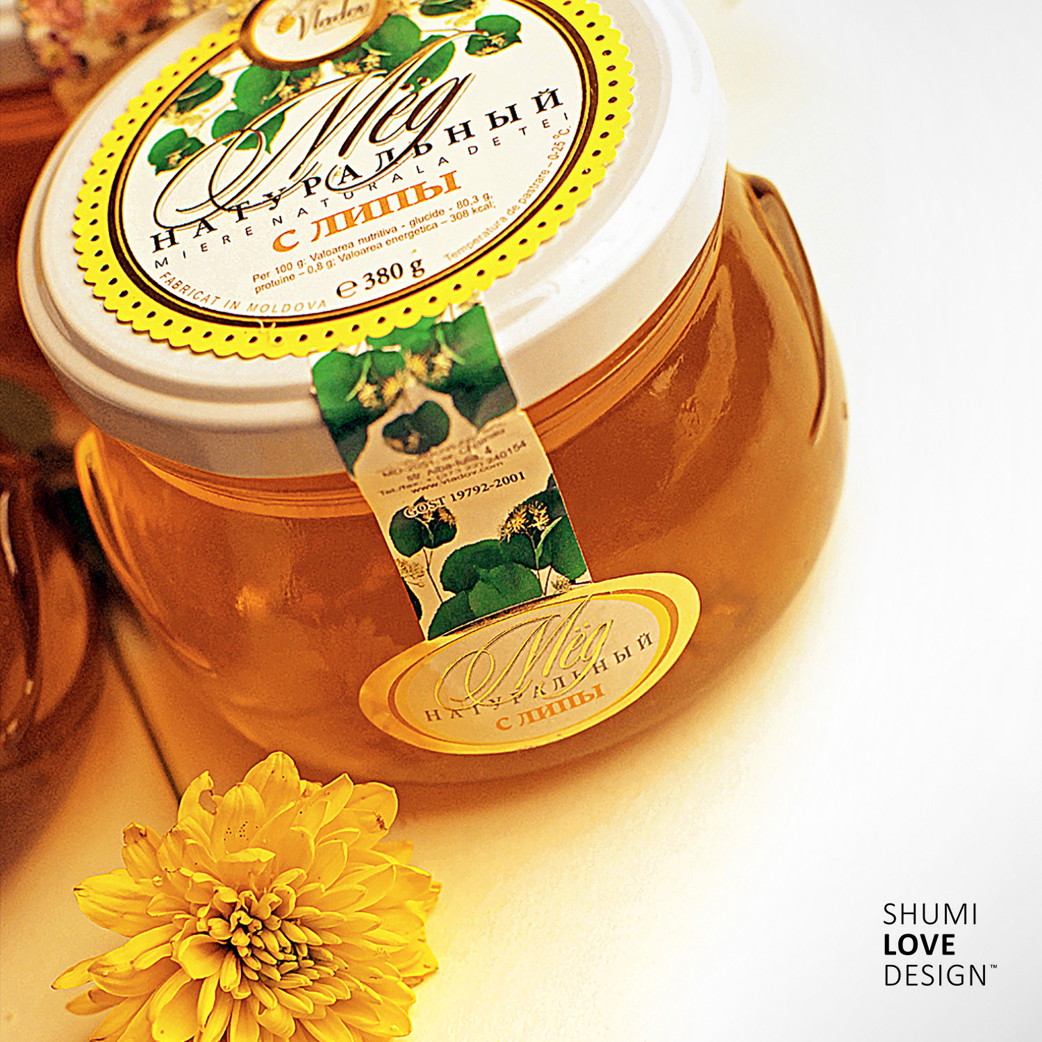
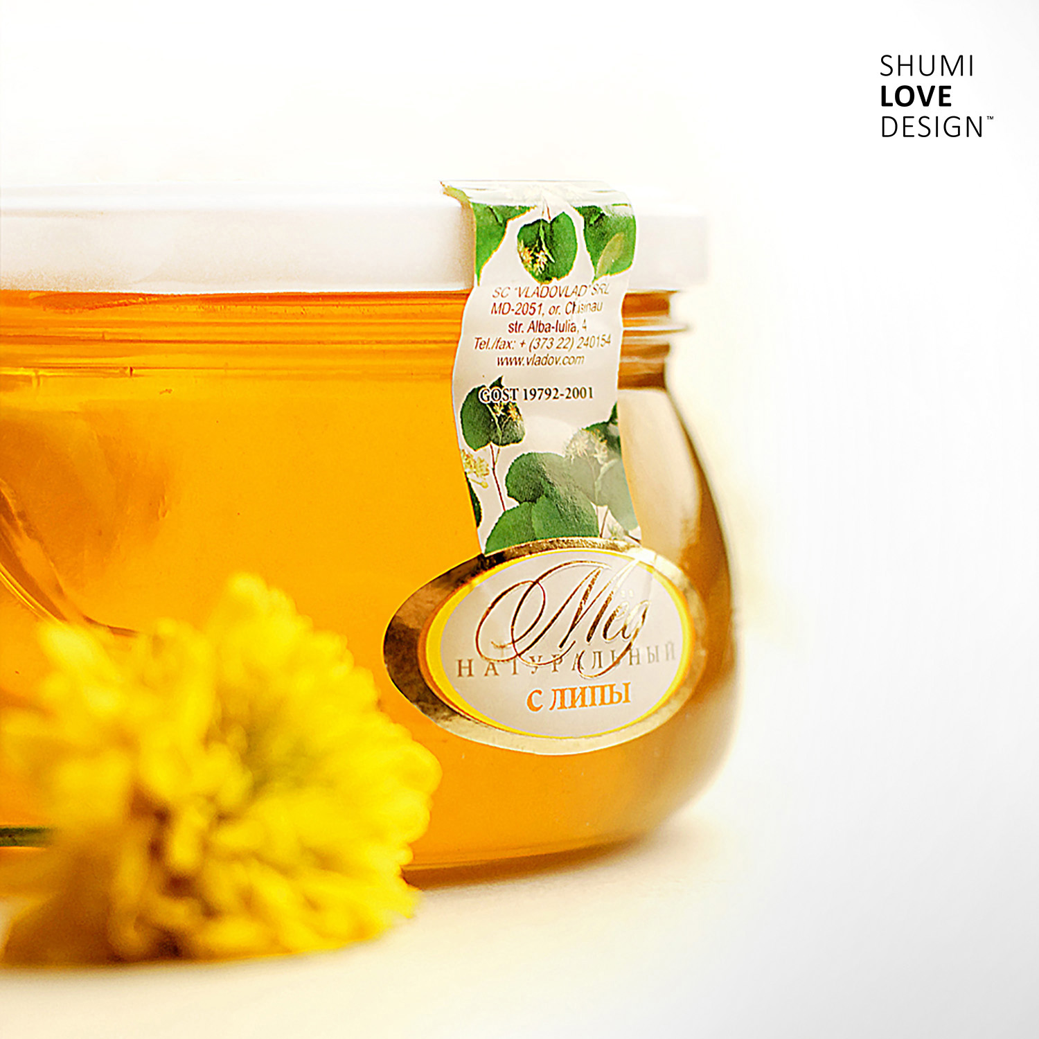
The challenge for this project was to design a series of labels for a line of honey-nut products by “Vladov” company.
SOLUTION
Considering the original character of the product, the agency’s designers have focused their efforts on creating a packing design concept that would make the unique property of the product more evident. And the best way to do it was by showing the product itself.
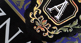
Instead of a big label covering the larger part of the packing, the specialists came up with a neat shaped label that takes up only a fraction of the can’s front. This way the label only emphasizes the product’s visual appeal, which is able to attract the consumer’s attention on its own.
The label looks like it flows down from the top to the front part of the packing, which creates a visual association with the honey inside. The overall elegance of fonts and visual elements amplifies the viscosity and sweetness of the product, while the image of the nuts corresponding to the ones contained in the product, serves as a neutral background and wields an informative function.