The comprehensive branding: bottle design / brand identity / logo design / packaging design
SOLUTION
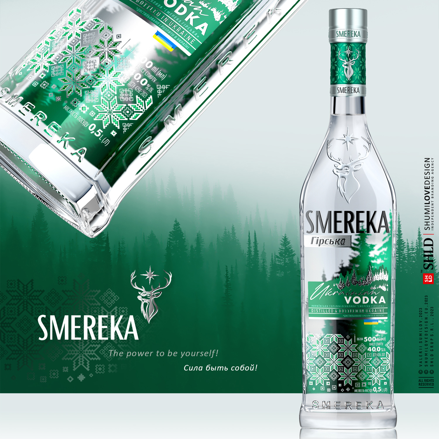
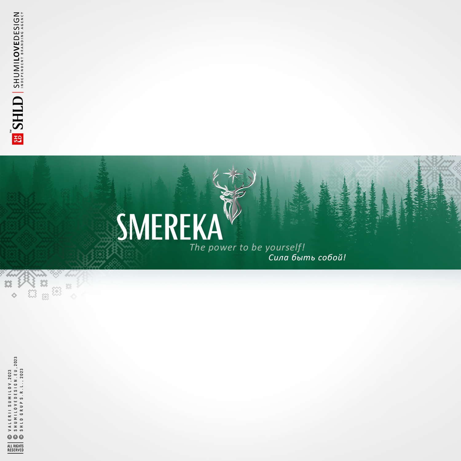
We are glad to present our new development: branding of Ukrainian vodka SMEREKA, which will not only please you with its taste, but also will surprise you visually.
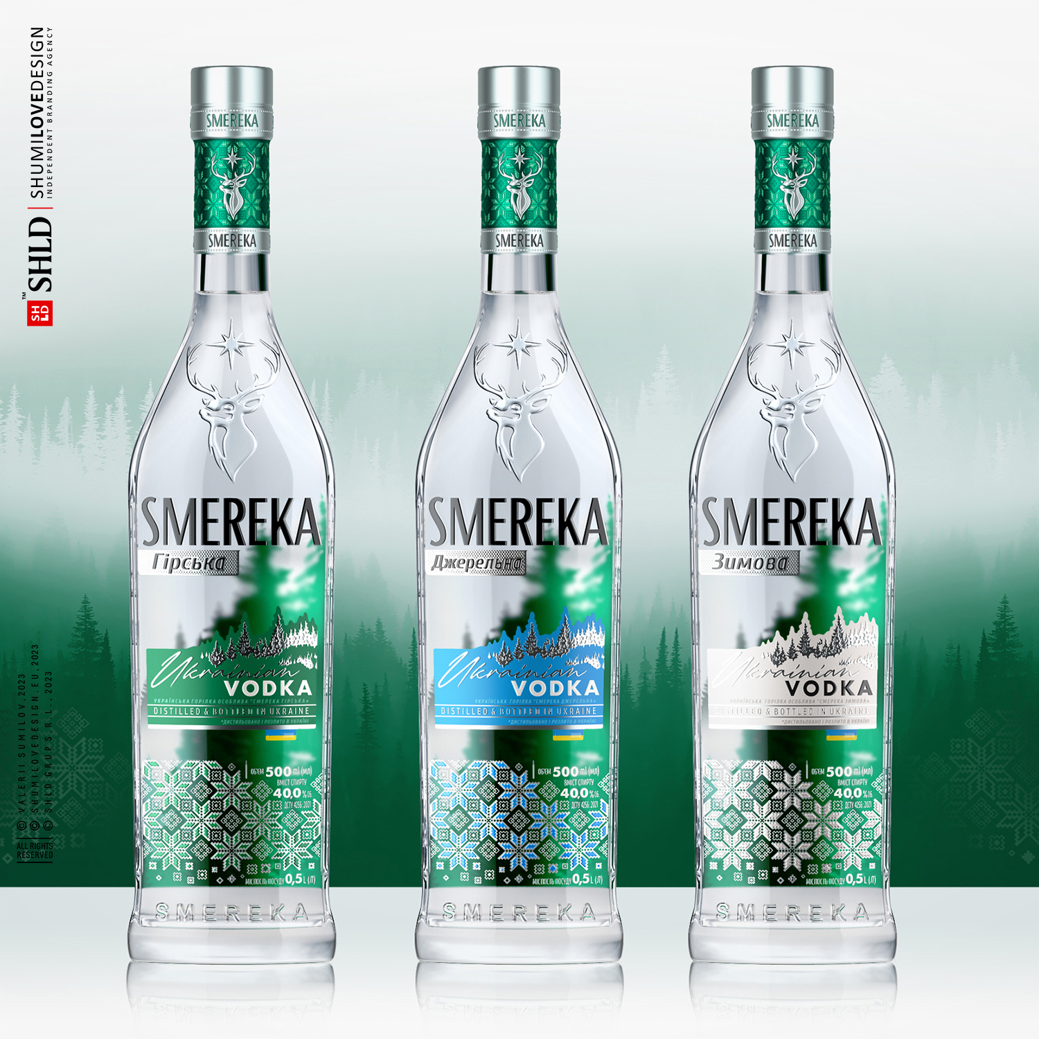
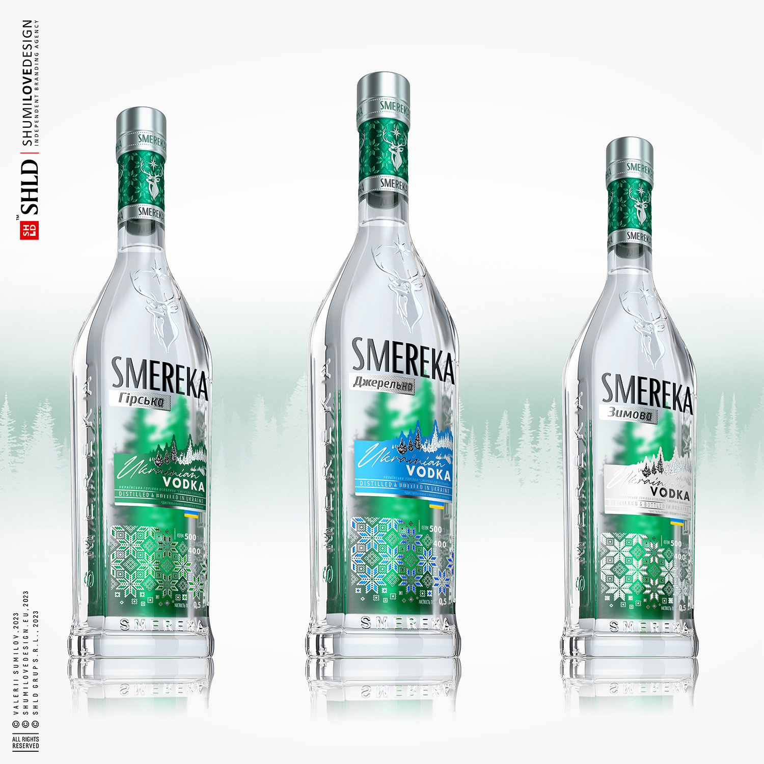
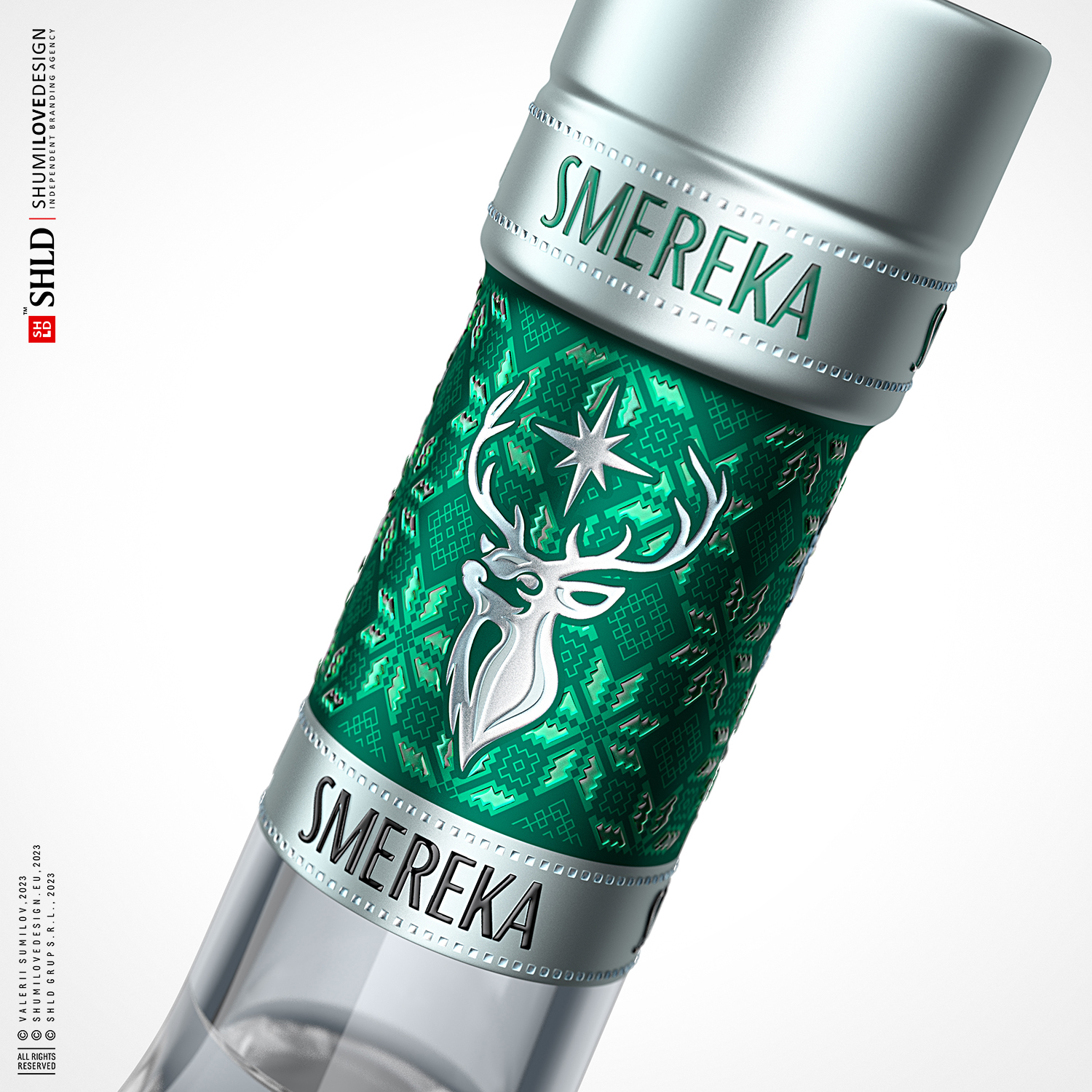
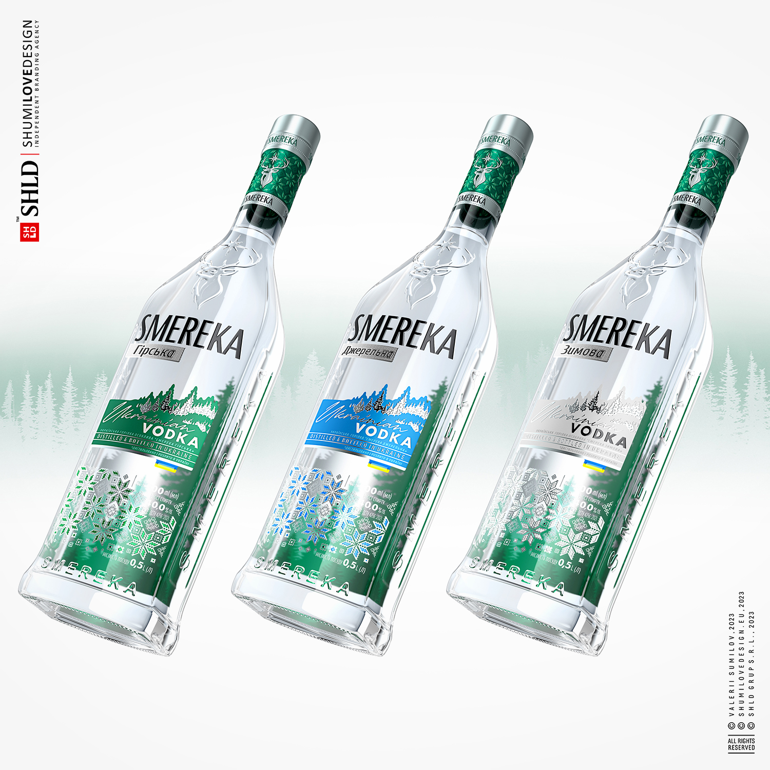
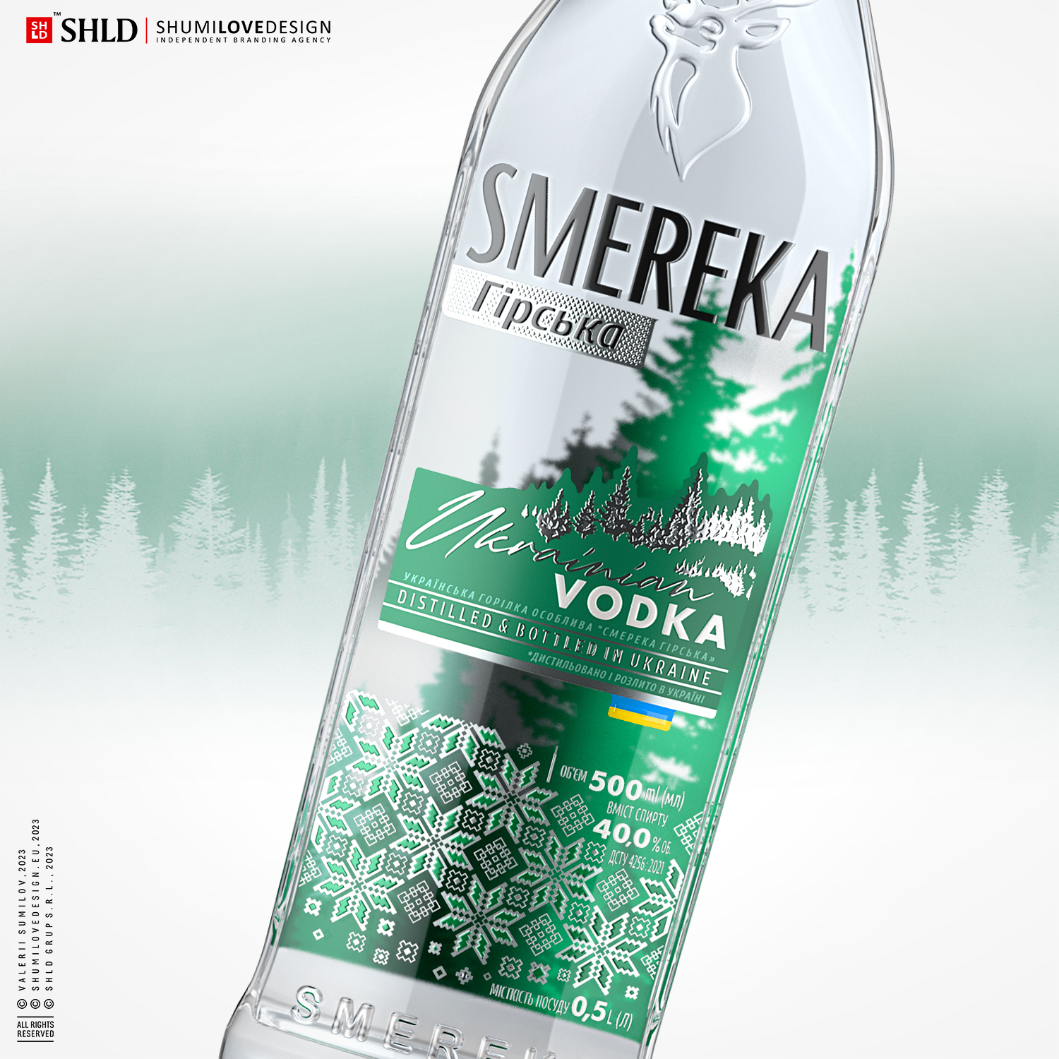
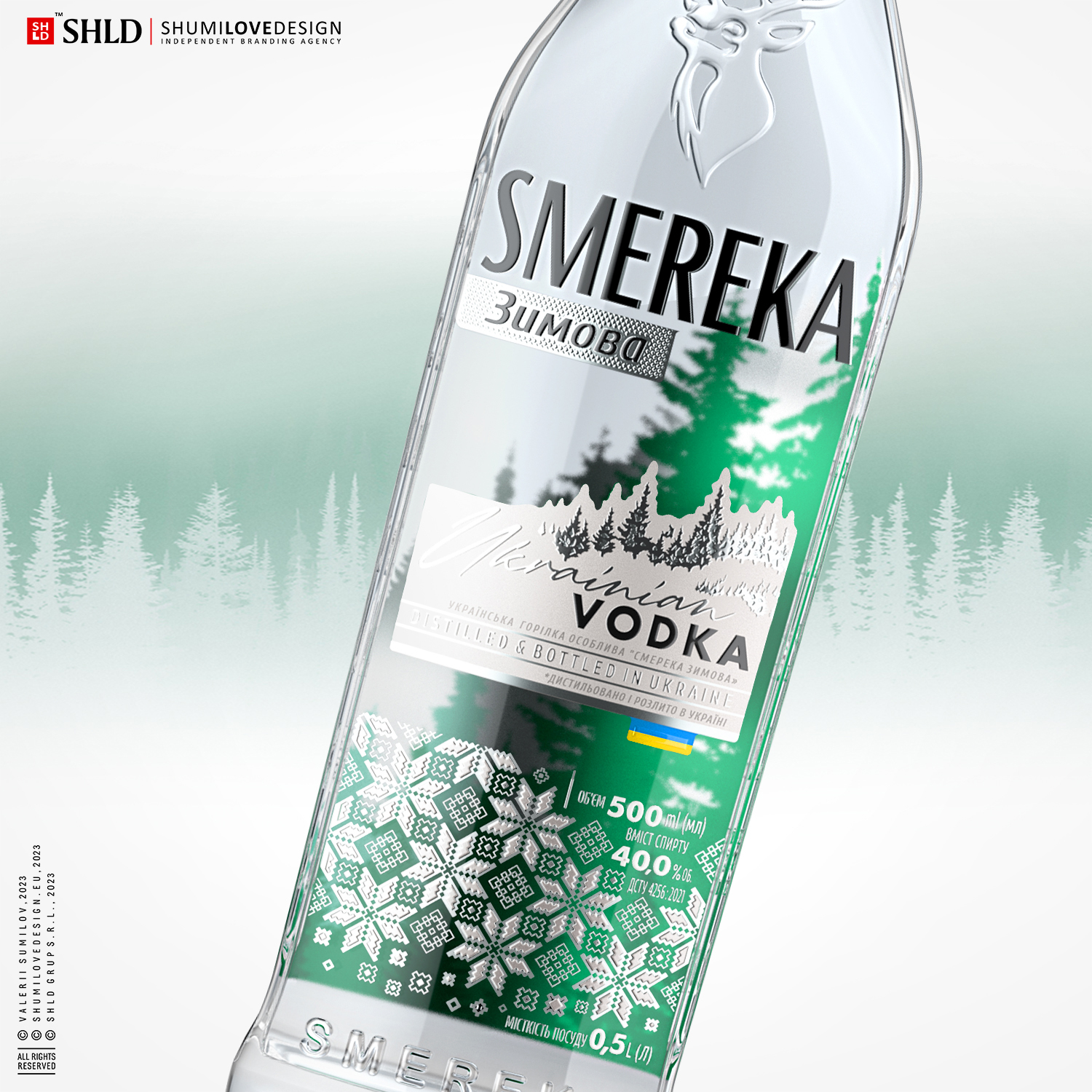
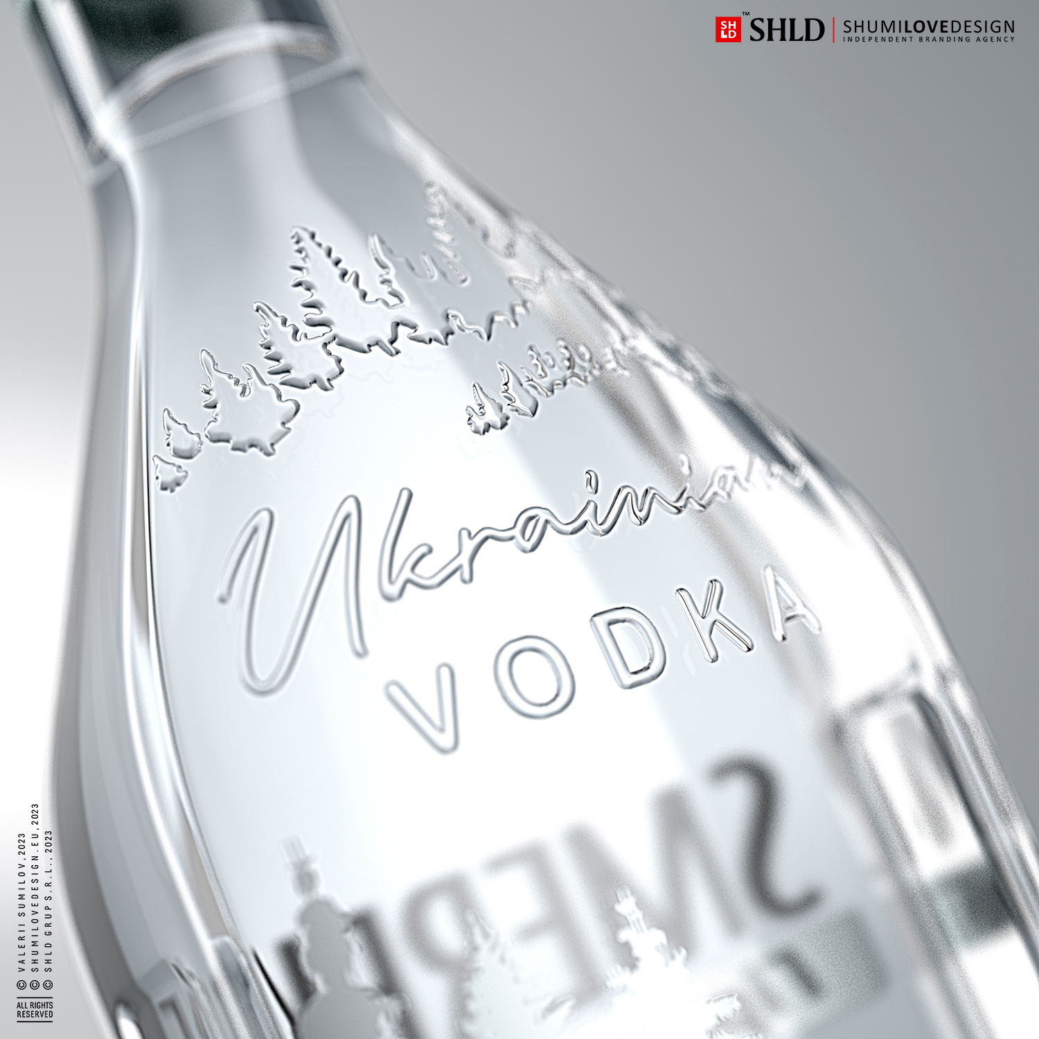
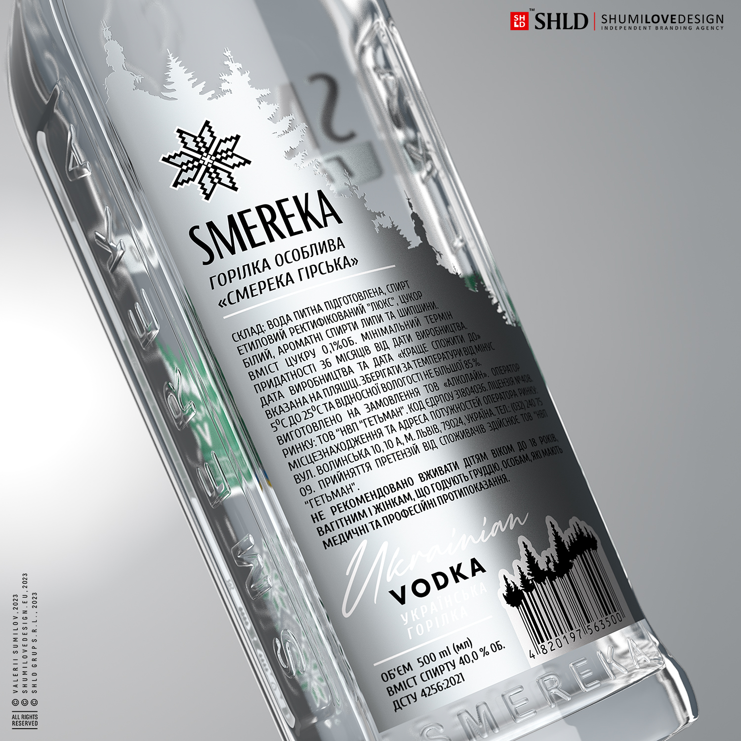
We paid a lot of attention to the design, so that every element was thought out to the smallest detail.Let's start with the bottle itself. It is a flattened rectangular shape with a smooth, soft and elegant shape. The bottle has a beautifully sturdy base and an elongated narrow neck. This shape makes the bottle attractive, as if it were carved from rock crystal or a solid piece of ice. On the bottle we used elements of the concept to enhance the overall branding effect. The vodka's name is embossed on the bottom of the bottle and debossed/embossed on the side edges, which gives the bottle extra volume and texture, creating a beautiful play of refractions. At the top, we decorated the bottle with a stylized image of a deer living in the Carpathian mountains. This symbol further supports the message of the product - Carpathian mountains, clean air, natural virginity and crystal mountain water. The recognizable and positive images used in branding make this vodka attractive and memorable.
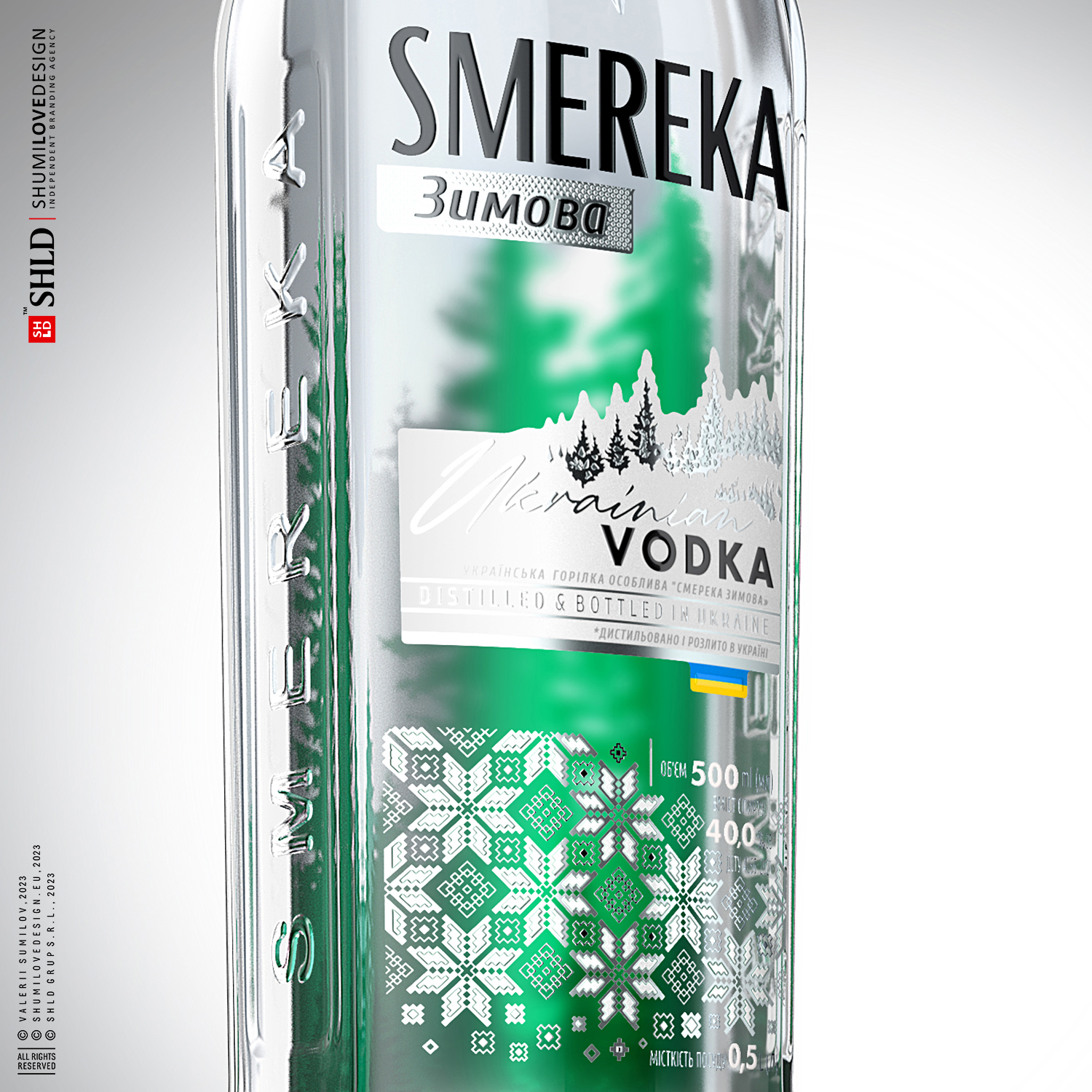
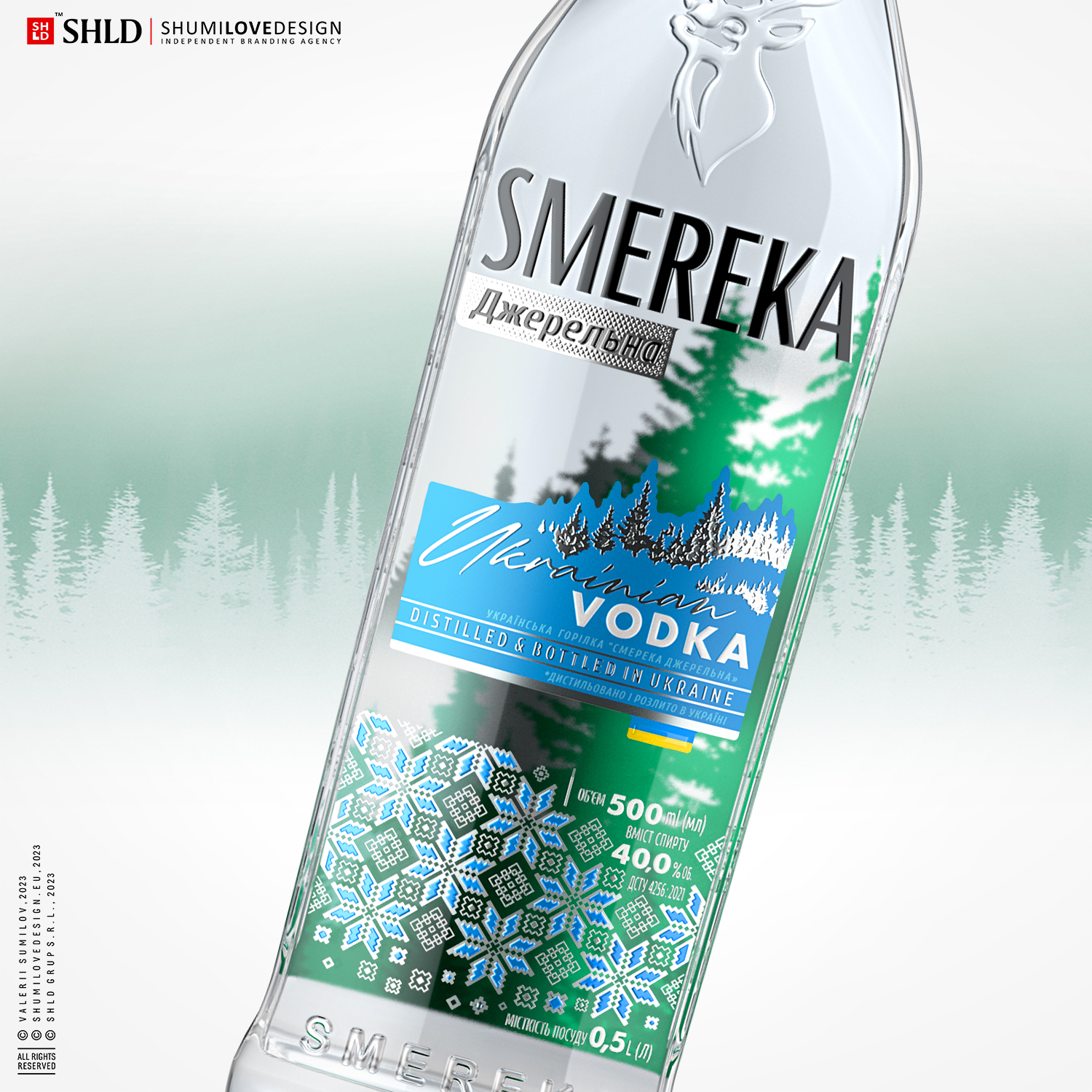
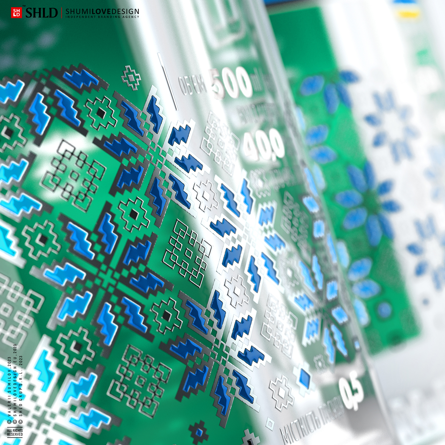
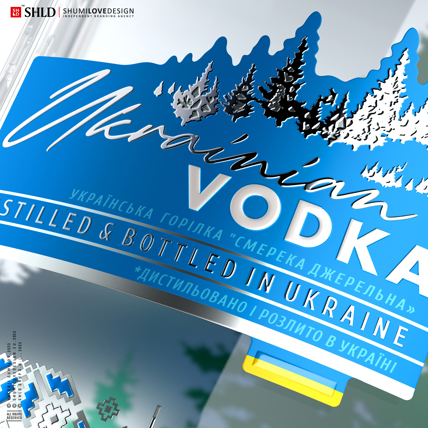
Our brand concept reflects the essence of product positioning - absolute naturalness, naturalness, purity and high quality. The main image of our communication is the spruce - the symbol of the Carpathian nature, which evokes the most positive and pleasant associations in the consumer's mind. The image of the spruce is seen not only on the front label, but also through the bottle, which creates a fascinating effect of freshness, coolness and purity.In the lower part of the label we used authentic ornaments traditional for Ukrainian embroidery, which serves as a marker of self-identification of the Ukrainian nation, its freedom and fortitude. Authentic Ukrainian embroidery ornaments include a variety of geometric shapes. These ornaments, made in the signature colors of each of the SKU, reflect the richness and diversity of Ukrainian culture and traditions. In our case we used the ornaments of vyshyvankas not only as a marker of national identity, but also as a reinforcing visual image of the brand concept - the image of snowflakes and ice crystals.
This additionally conveys a sense of frosty and cold vodka.All elements of our design concept were carefully thought out to convey the essence of the product and evoke the most pleasant associations with the consumer.
Copying and rewriting information, pictures, images, logo, design from the site www.shumilovedesign.ru / www.shumilovedesign.eu is prohibited .
Copyright for all texts, images, pictures, logo, website design www.shumilovedesign.ru / www.shumilovedesign.eu belong to the company SC "SHLD GRUP" SRL.