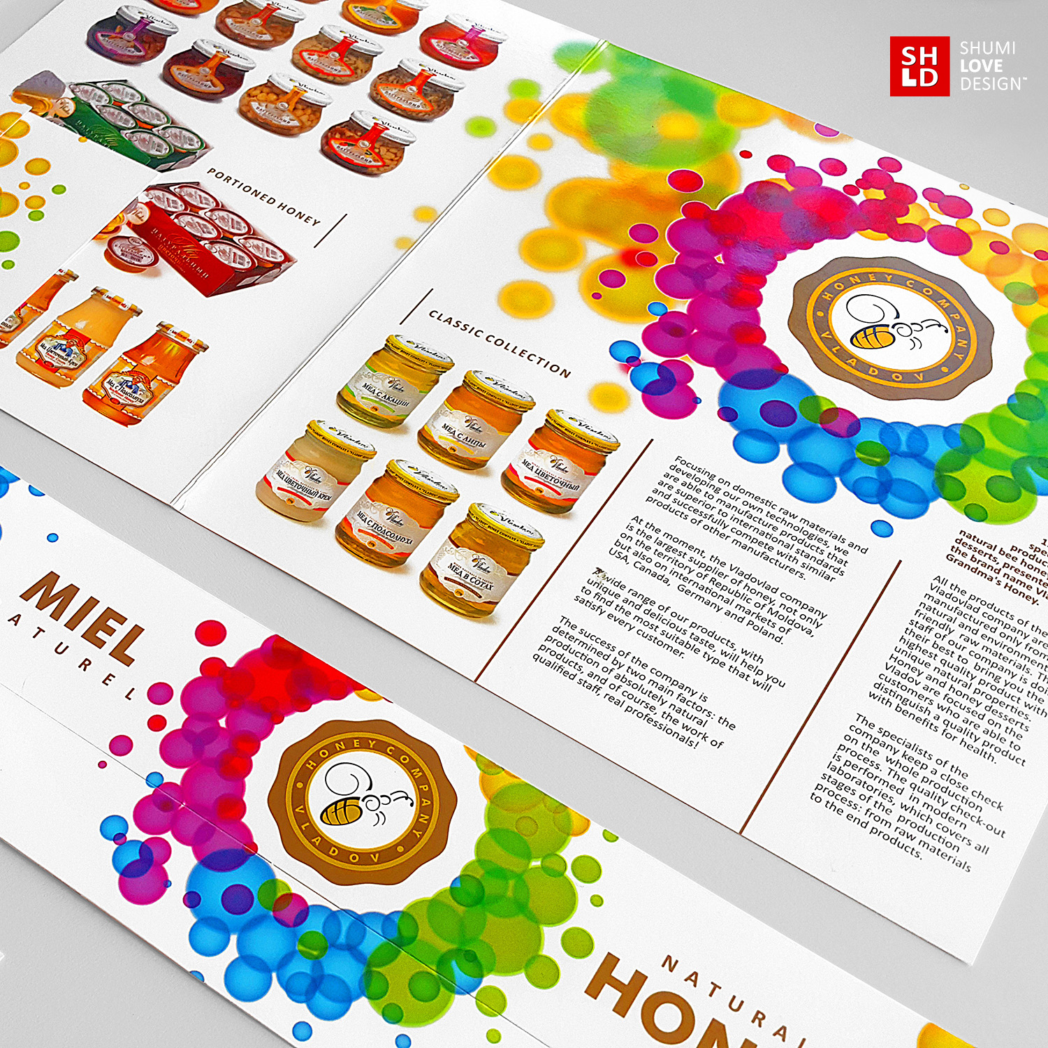
Due to the fact that the present brand is successfully present on the market for years, the agency’s specialists faced the task of maintaining its recognizability, while renewing the overall look and making the corporate identity more vibrant, juicy and corresponding to company’s main activity. Since the client is mainly involved in the production and distribution of honey and honey based products, the corporate identity had to be juicy, sweet, viscous and pleasant.
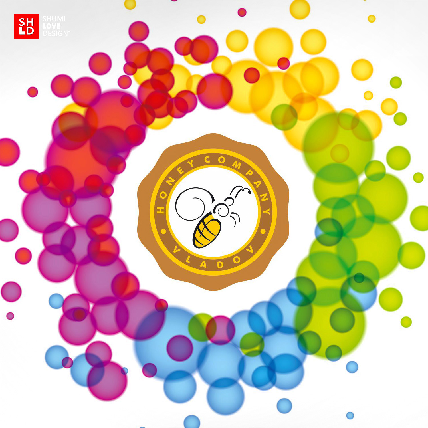
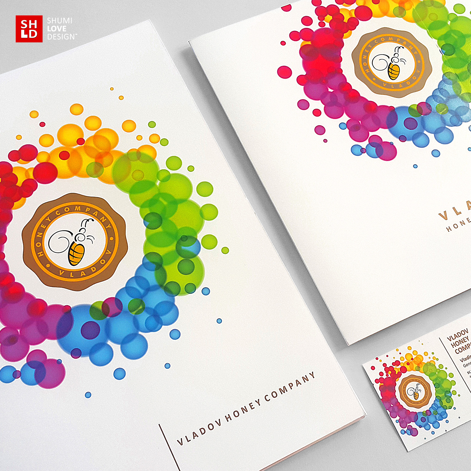
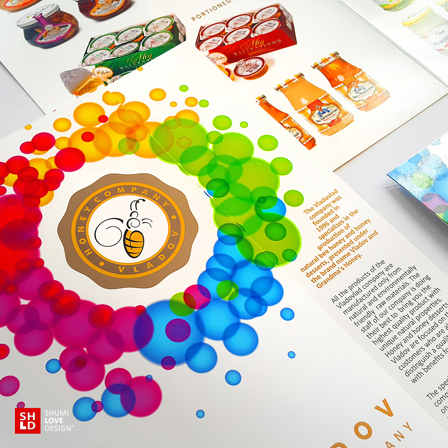
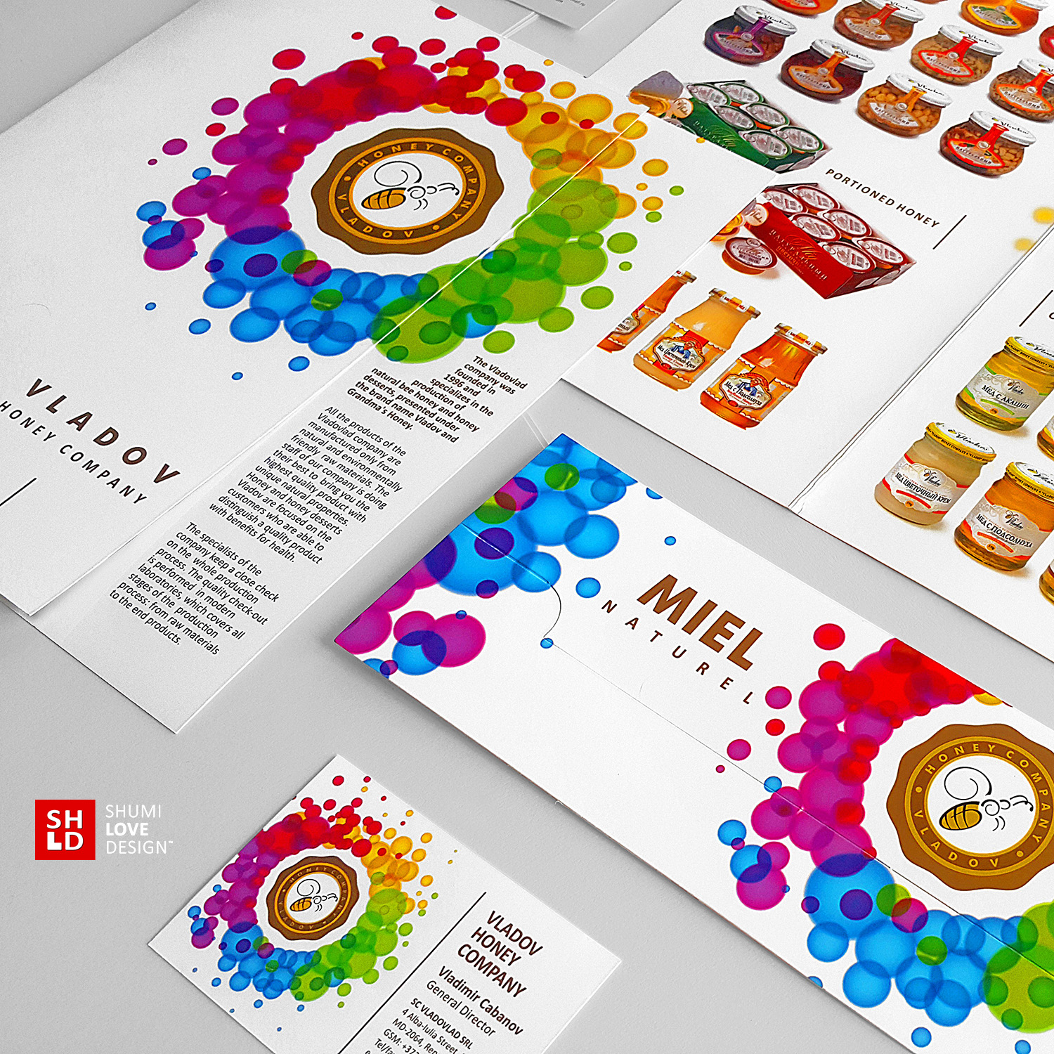
The main accent of the renewed identity is placed on the company logo, which wasn’t changed significantly. However, while leaving the logo’s core – a stylized image of a bee – intact, our specialists have enhanced it with an additional frame, stylized as a “honey” stamp, flowing outwards from the center. Besides the obvious associations with honey, the introduction of the stamp frame serves the purpose of increasing the logo’s status, making it a sort of quality insignia. Thus, the company’s domain of activity and status become apparent event at first glance – it flows like honey, amplifying the associations in consumer’s mind.
Additionally, the various elements of the corporate style have the logo accompanied by bright color spots stylized as watercolor spots, flowing through a spectrum of vibrant and juicy colors. Thanks to the use of these graphic elements, the overall identity style became more lively, vibrant and sweet, once again referring to the company’s domain of activity. Besides, this visual solution also serves the task of creating subtle associations with the natural source of the product – sun, flowers, nature.