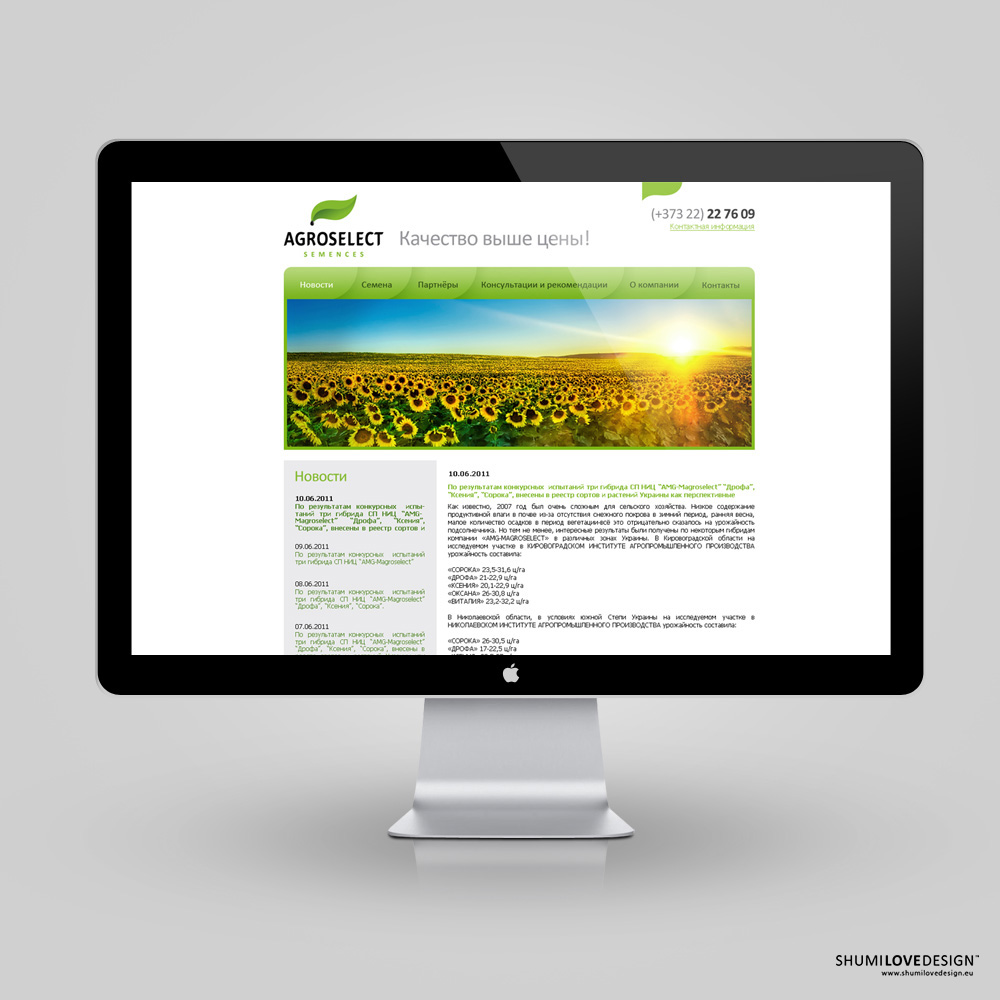
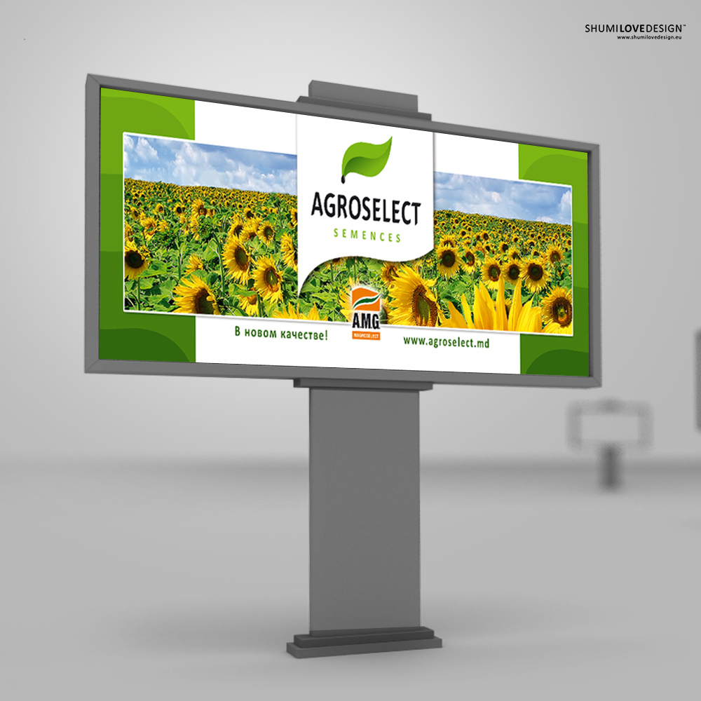
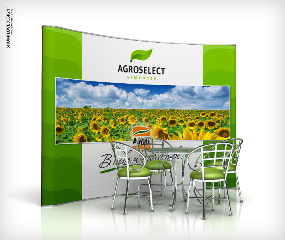
“Agroselect” company approached us with a request to design a modern and bright logo, which would give their traditional activity a more modern look. The company enters the international market of seed sales, thus they need a modern and attractive corporate identity.
The customer set a task of designing a logo and corporate identity, which would combine two opposite trends. On the one hand, the goal was to reflect some of the symbols that are traditional for agriculture, such as soil, sprout, leaf, etc. On the other hand, the customer wanted to outline his contemporary approach, use of new technologies and his active position on the international market. These two trends have become the basis for the final solution, which the studio presented to the customer.
SOLUTION
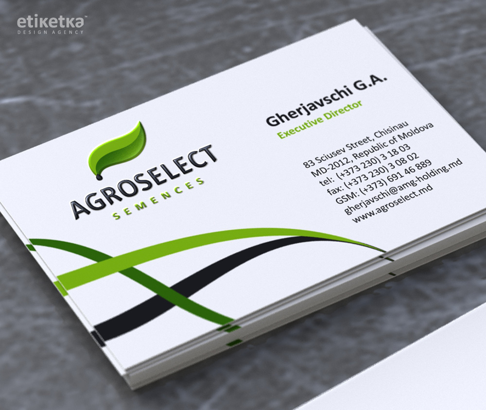
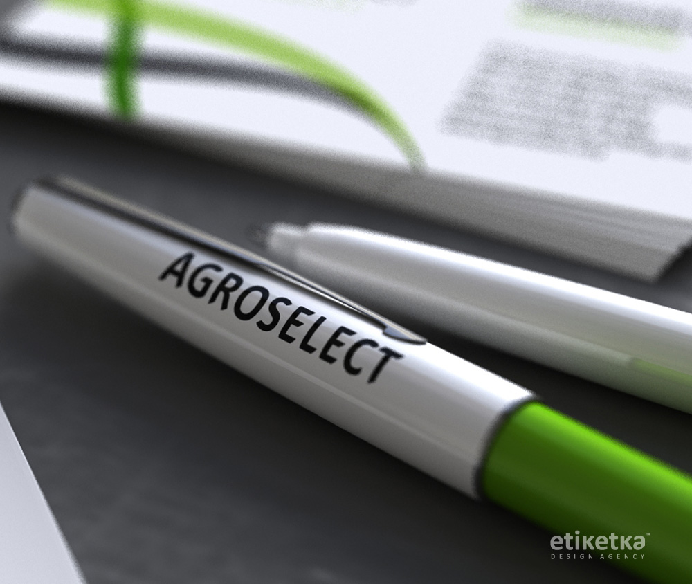
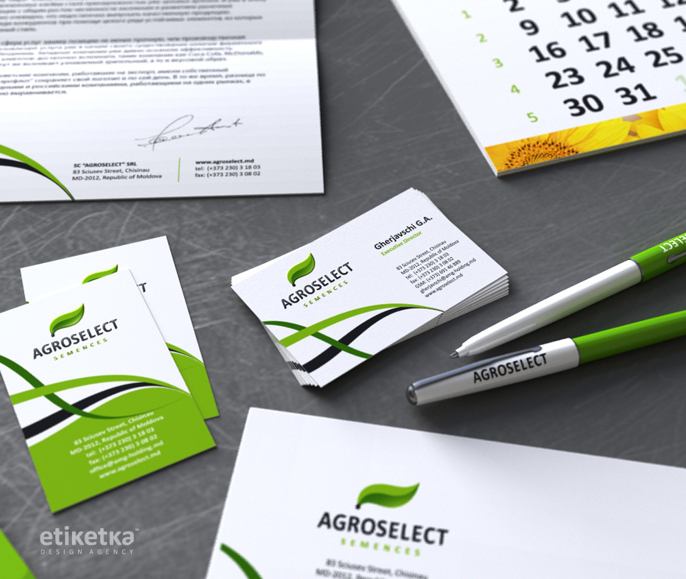
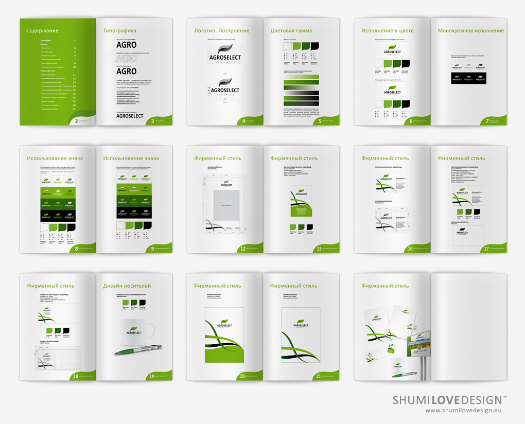
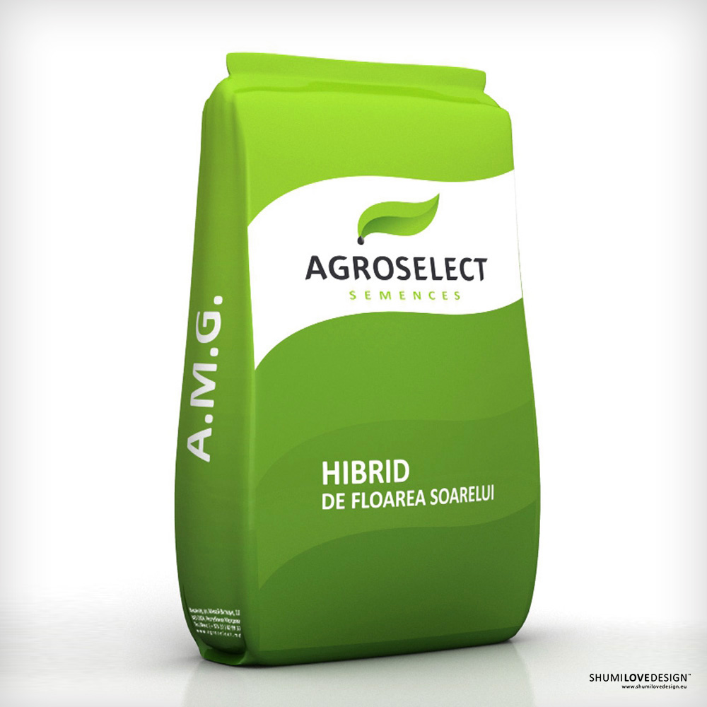
The basis for the new "Agroselect" logo comes in the form of certain symbols that are rather common in this industry: seed, soil and sprout. The main idea depicted in the logo is the image of a sprout growing out of a seed, which was presented in a rather dynamic form and a fresh color palette. This image serves as a point point for the entire brand book that was designed for the customer. During the production of the brand book several printing technologies were used, including digital printing and serigraphy. Certain post-print processes, such as stamping and UV varnishing, have also been applied in order to create a brighter and fresher impression of the product. As a result, each element of the brand book looks very juicy, bright and fresh – just as the customer has requested.