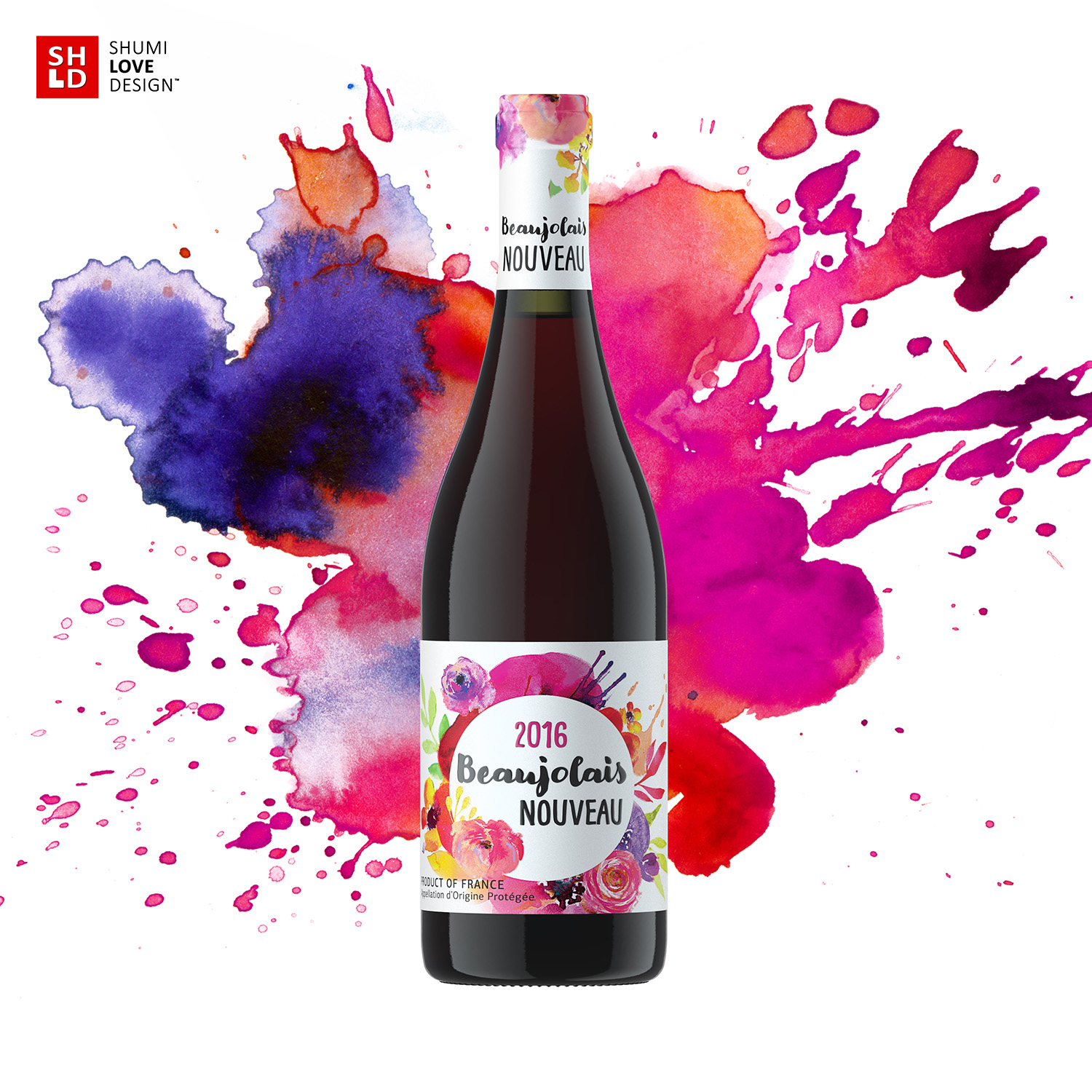
Lightness, bliss, taste of life – these were the concepts that had to be communicated through the packaging design for the new line of French wines with a distinct regional character. Since Beaujolais wines are known for their light taste compared to other traditional French wines, the agency’s specialists had to reflect this peculiarity through the visual aspect of the new product.
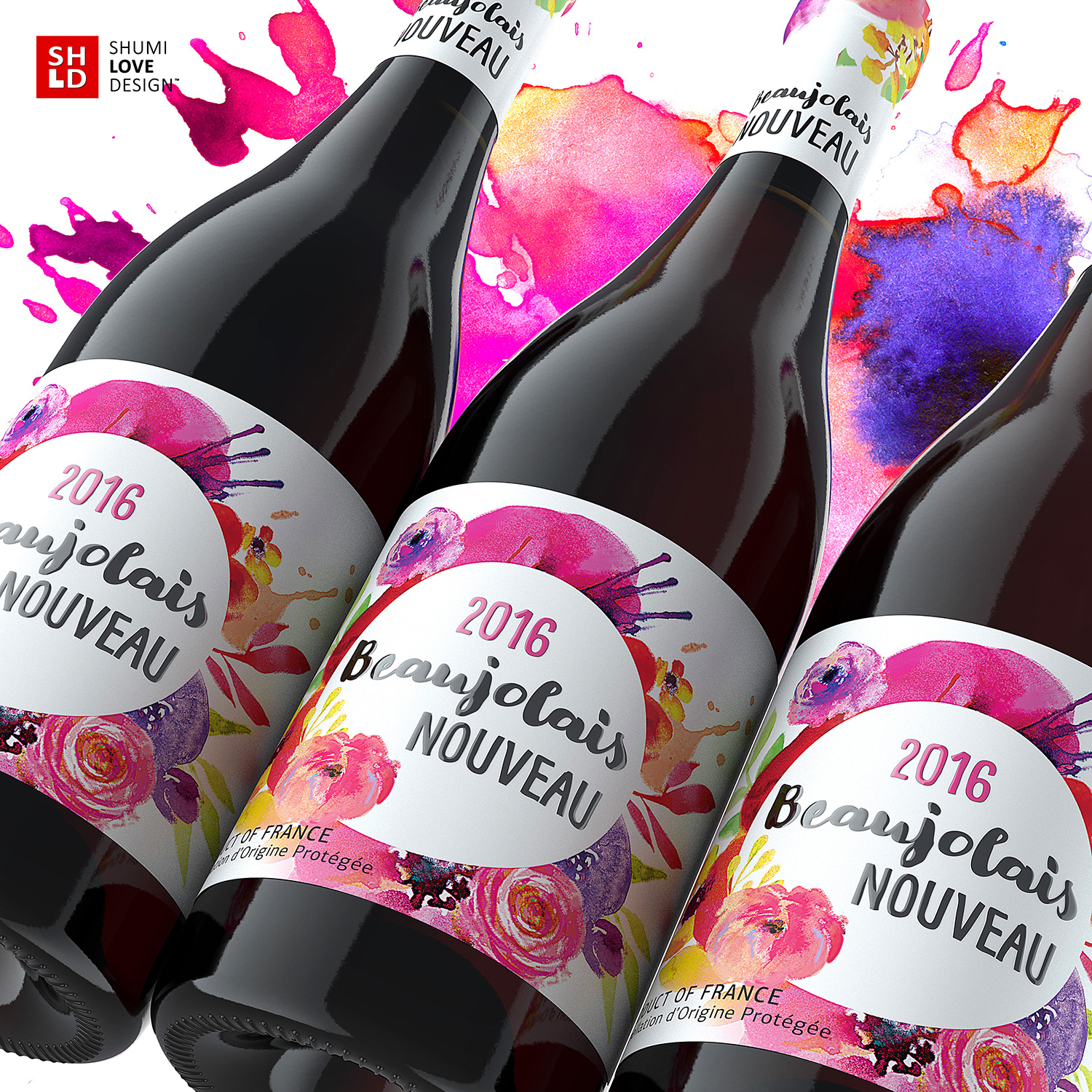
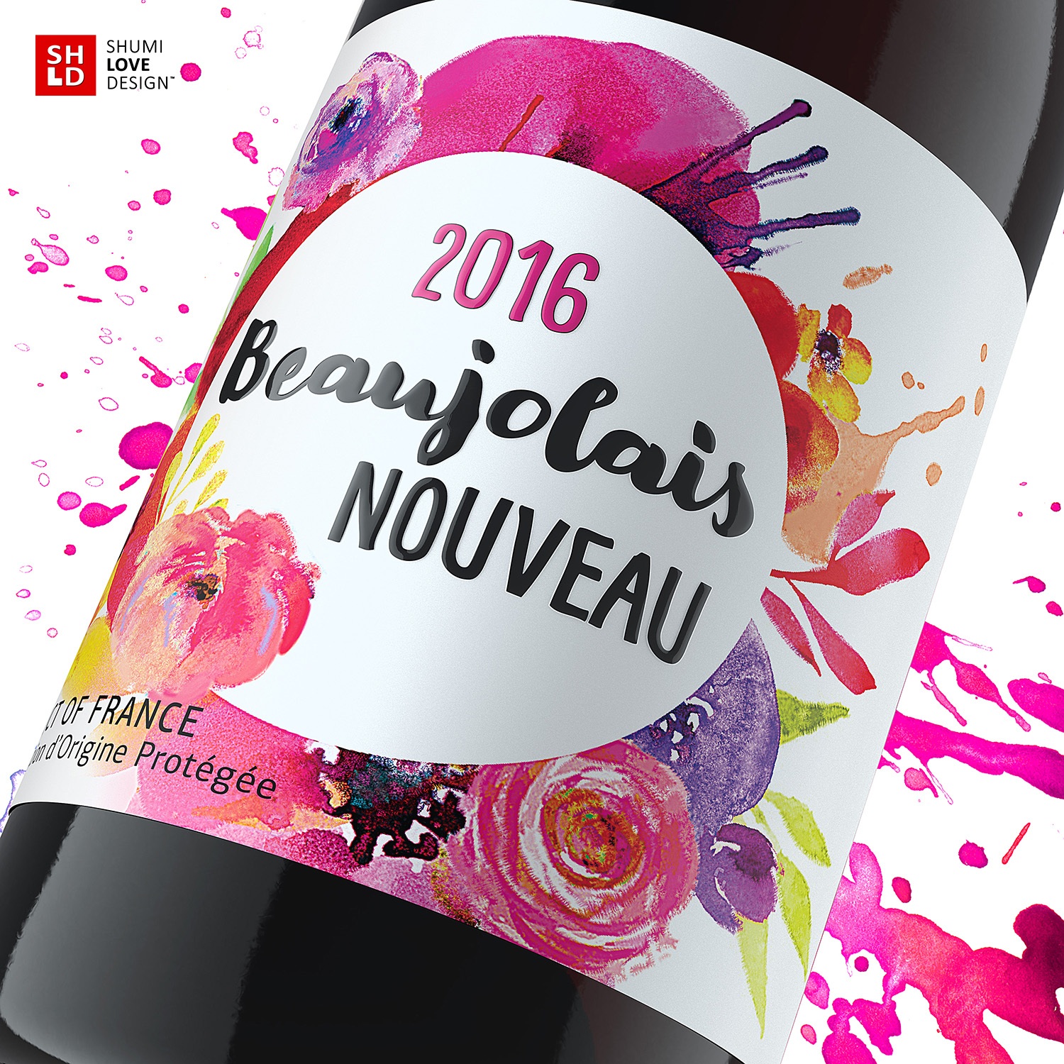
The overall style for the packaging can be described as bright, juicy and light at the same time. Thanks to the use of bright pastel shades on a white field, the label looks airy, light, playful and slightly giddily. The styling of color spots as flower drawings creates a feeling of summer bliss and lifts the mood even upon a quick glance on the label. The product’s name is framed by said color spots, emphasizing the accent, while the use of special font types amplifies the light and easy feel of the product.
Copying and rewriting information, pictures, images, logo, design from the site www.shumilovedesign.ru / www.shumilovedesign.eu is prohibited .
Copyright for all texts, images, designs, logo, website design www.shumilovedesign.ru / www.shumilovedesign.eu belong to the company SC "SHLD GRUP" SRL.