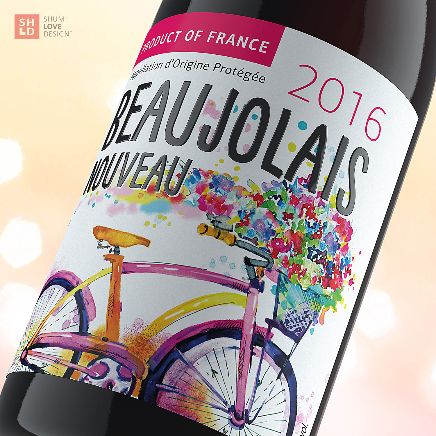
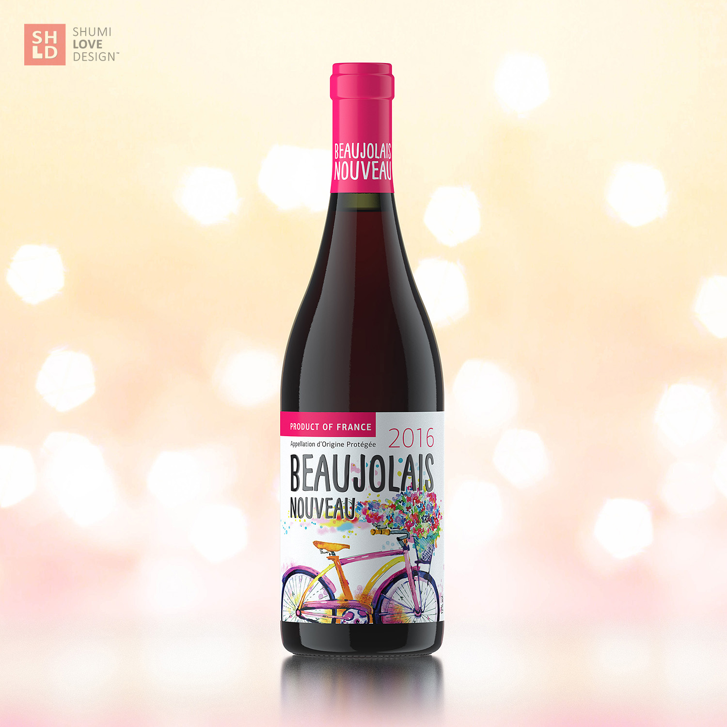
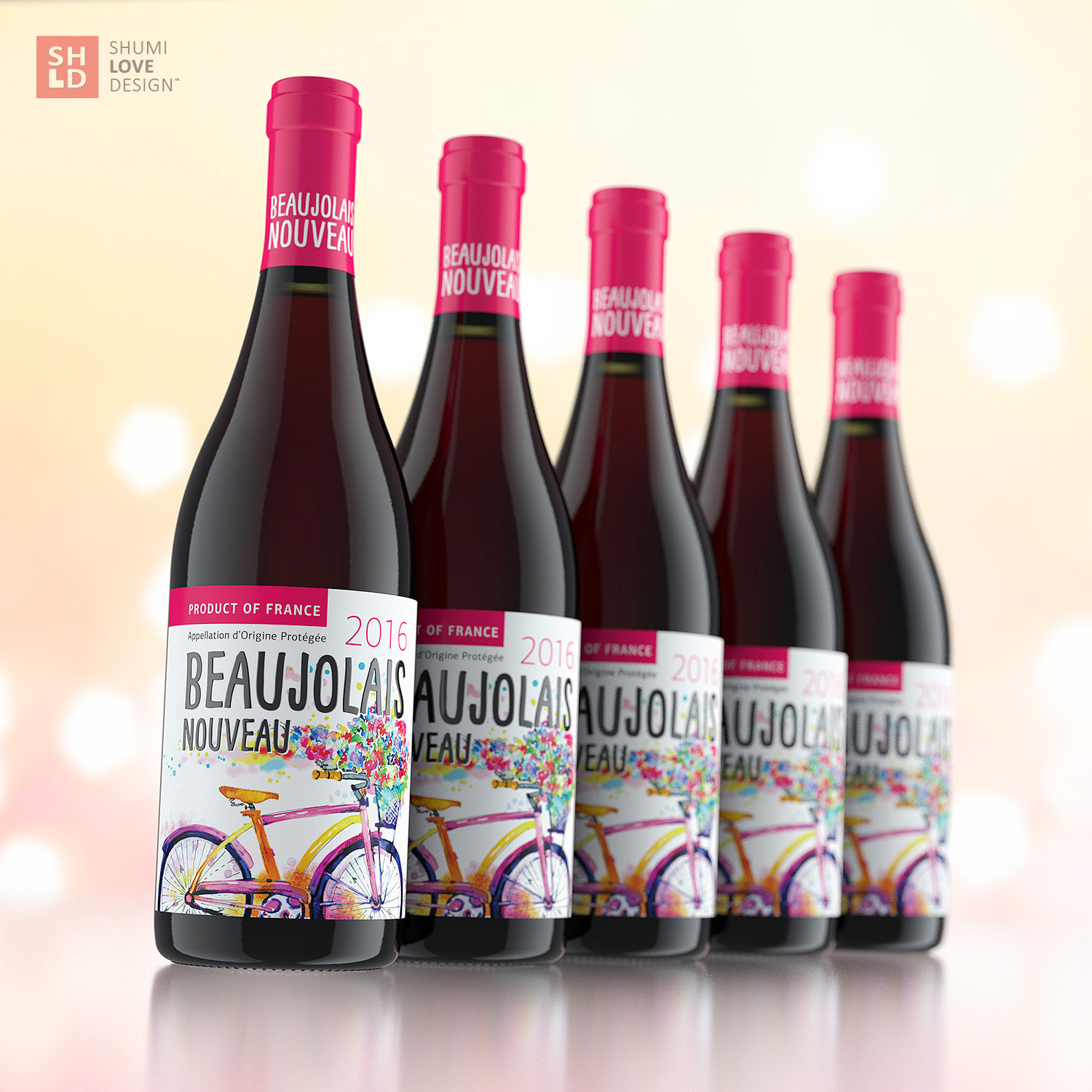
The visual aspect of this product had to communicate its light and pleasant character, as well as create a contrast to the more traditional and strict design common for French wines. That is why the agency’s specialists have focused on developing a light, colorful and pleasant design, which would drive one’s appetite for new impressions.
The light character of French Beaujolais can be felt even at a quick glance on the label developed by the agency. Light, aerial color spots, stylized as watercolor elements, flow through the plain white field, creating the feeling of freedom and ease. The stylized bike image gives birth to thoughts about a light romantic drive through the French countryside. The choice of font types emphasizes the spirit of carelessness and positivity, which is associated with this type of wines.
Copying and rewriting information, pictures, images, logo, design from the site www.shumilovedesign.ru / www.shumilovedesign.eu is prohibited .
Copyright for all texts, images, designs, logo, website design www.shumilovedesign.ru / www.shumilovedesign.eu belong to the company SC "SHLD GRUP" SRL.