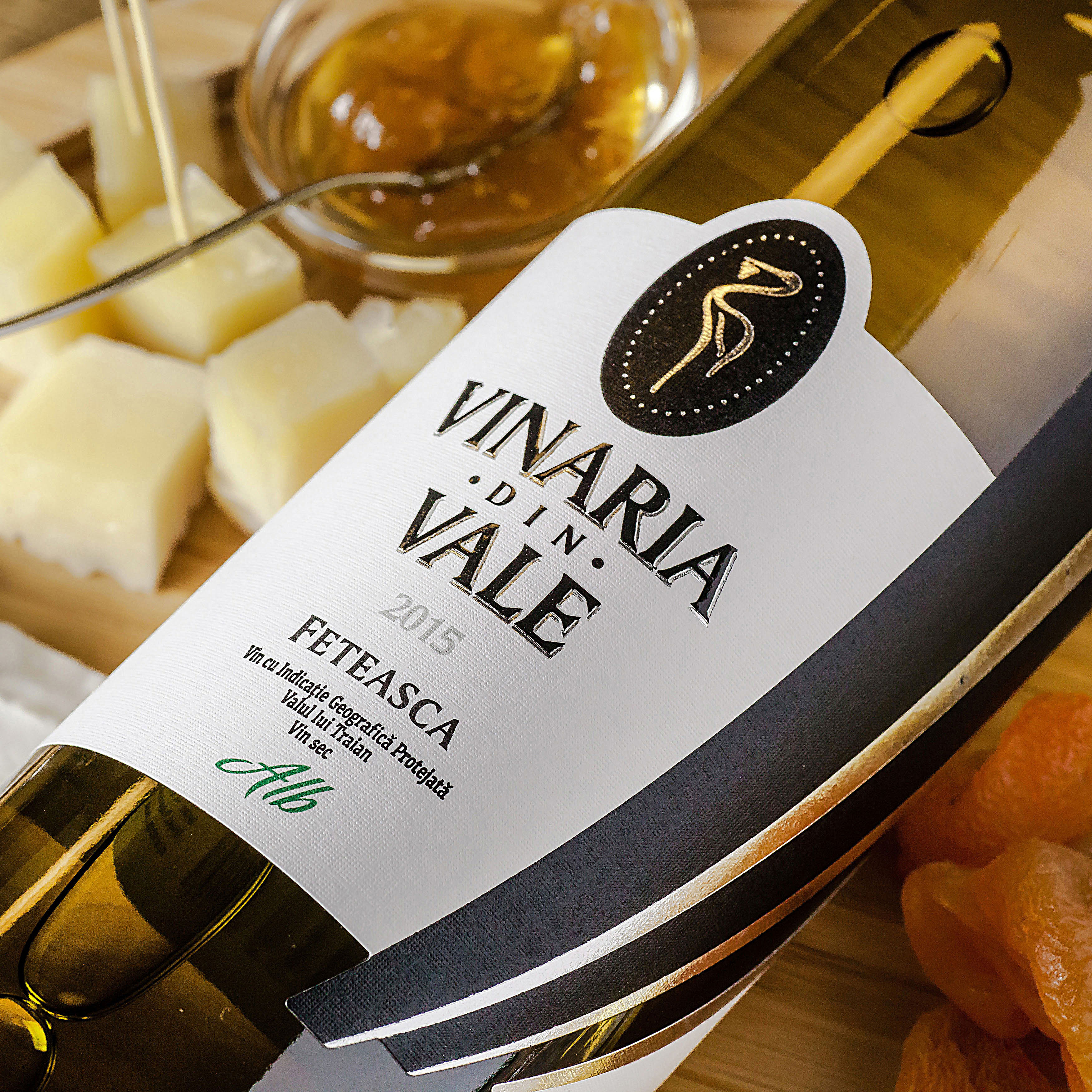
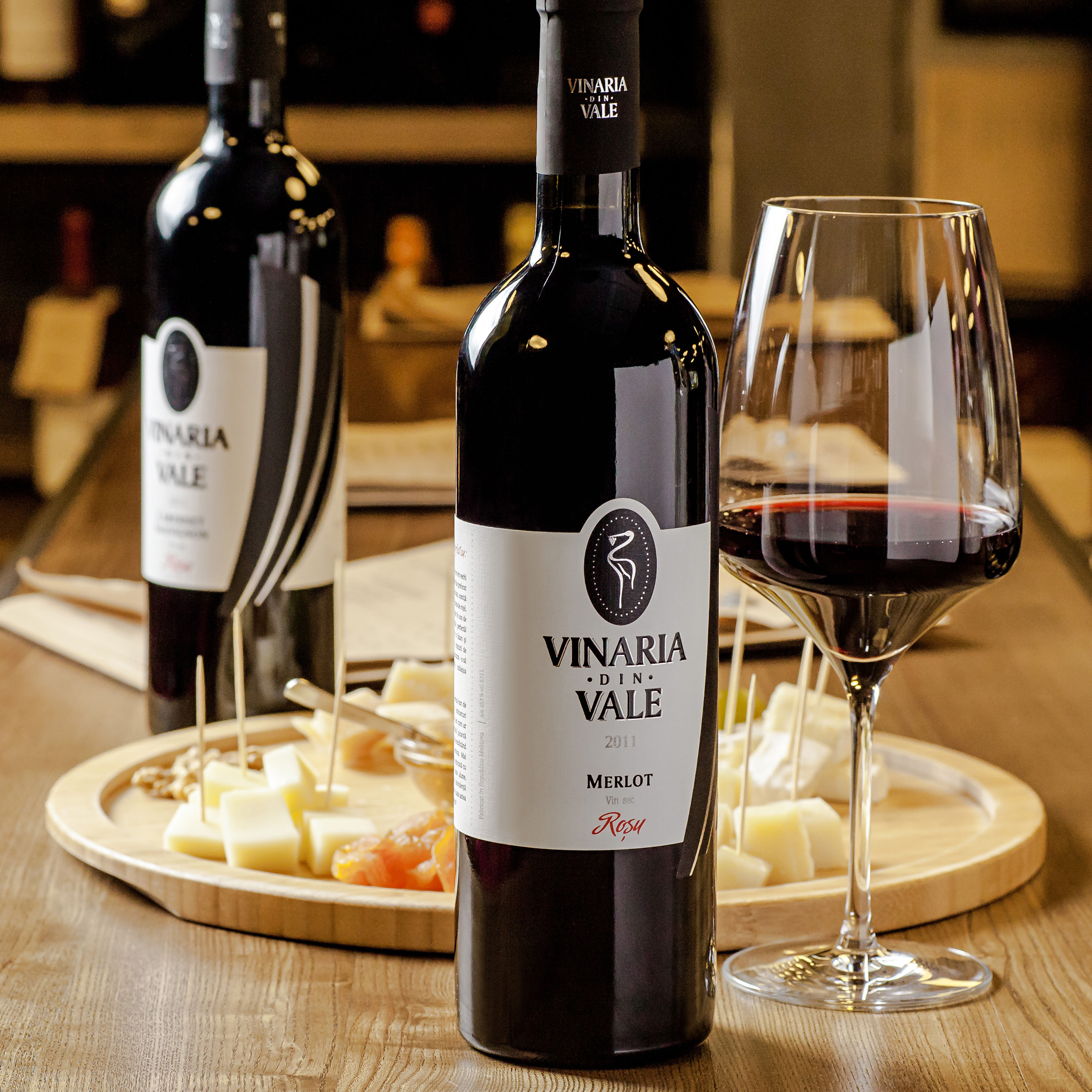
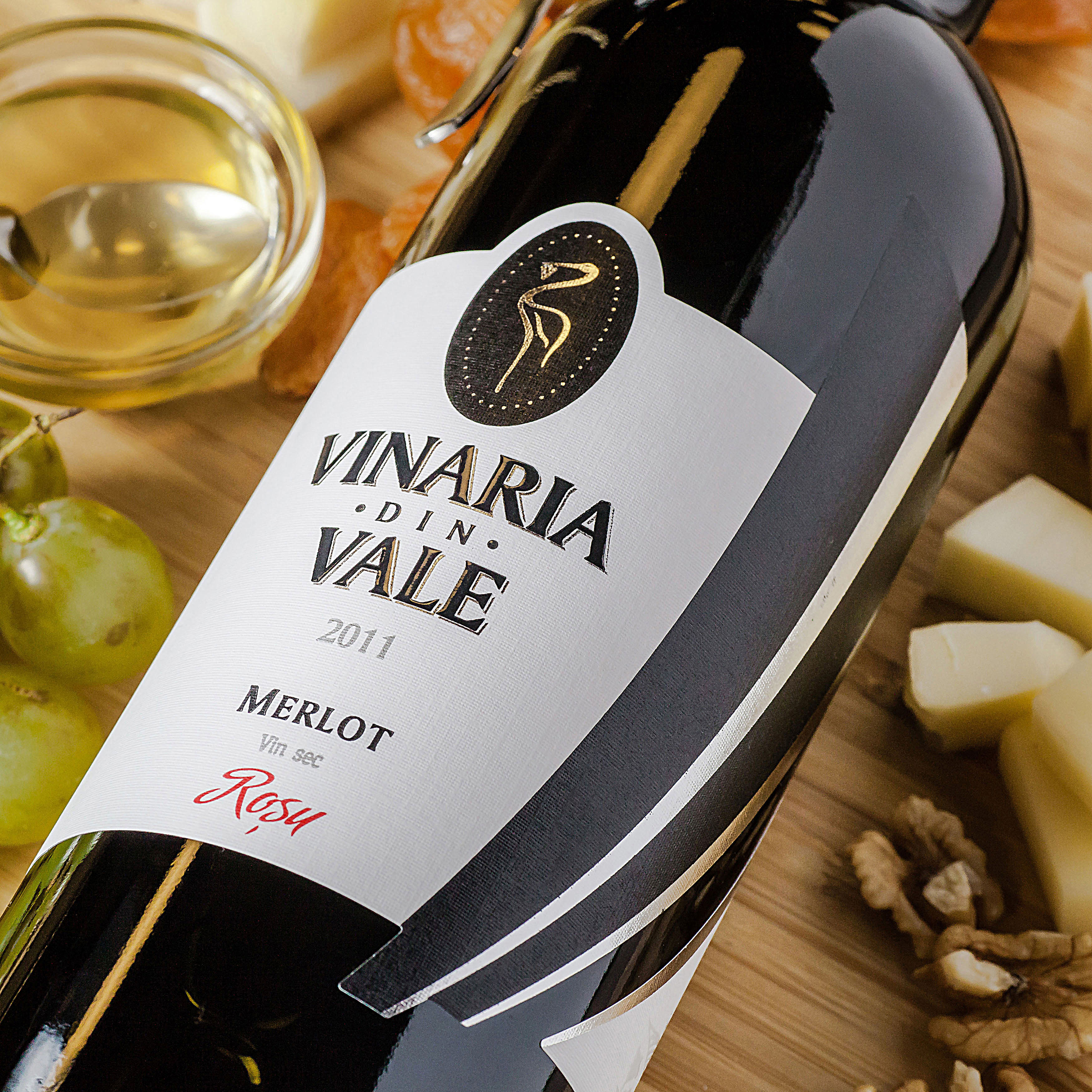
Vinaria din Vale
-
TASK
Redesign of an existing brand, amplification of visual accents, increase of packaging attractiveness
-
SOLUTION
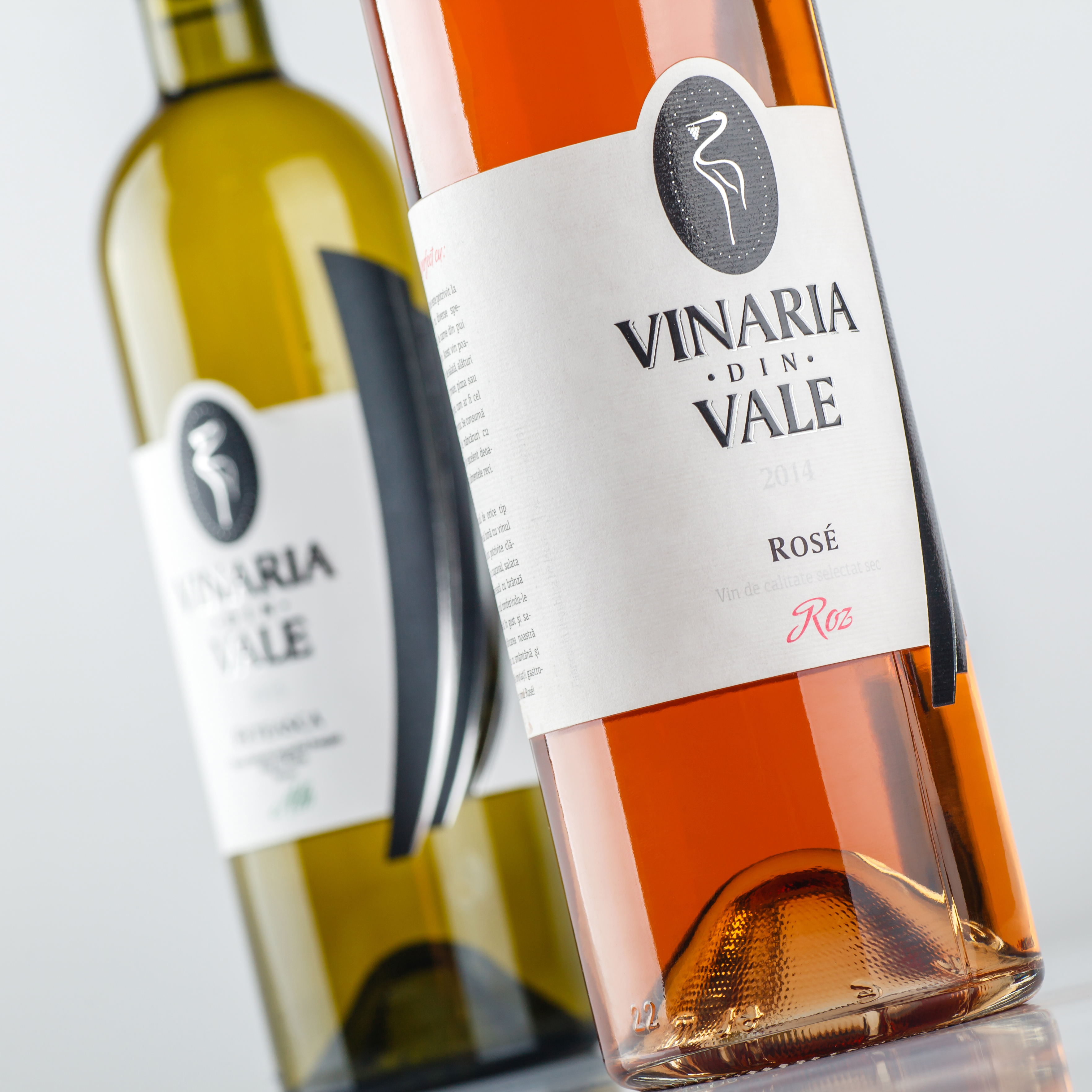
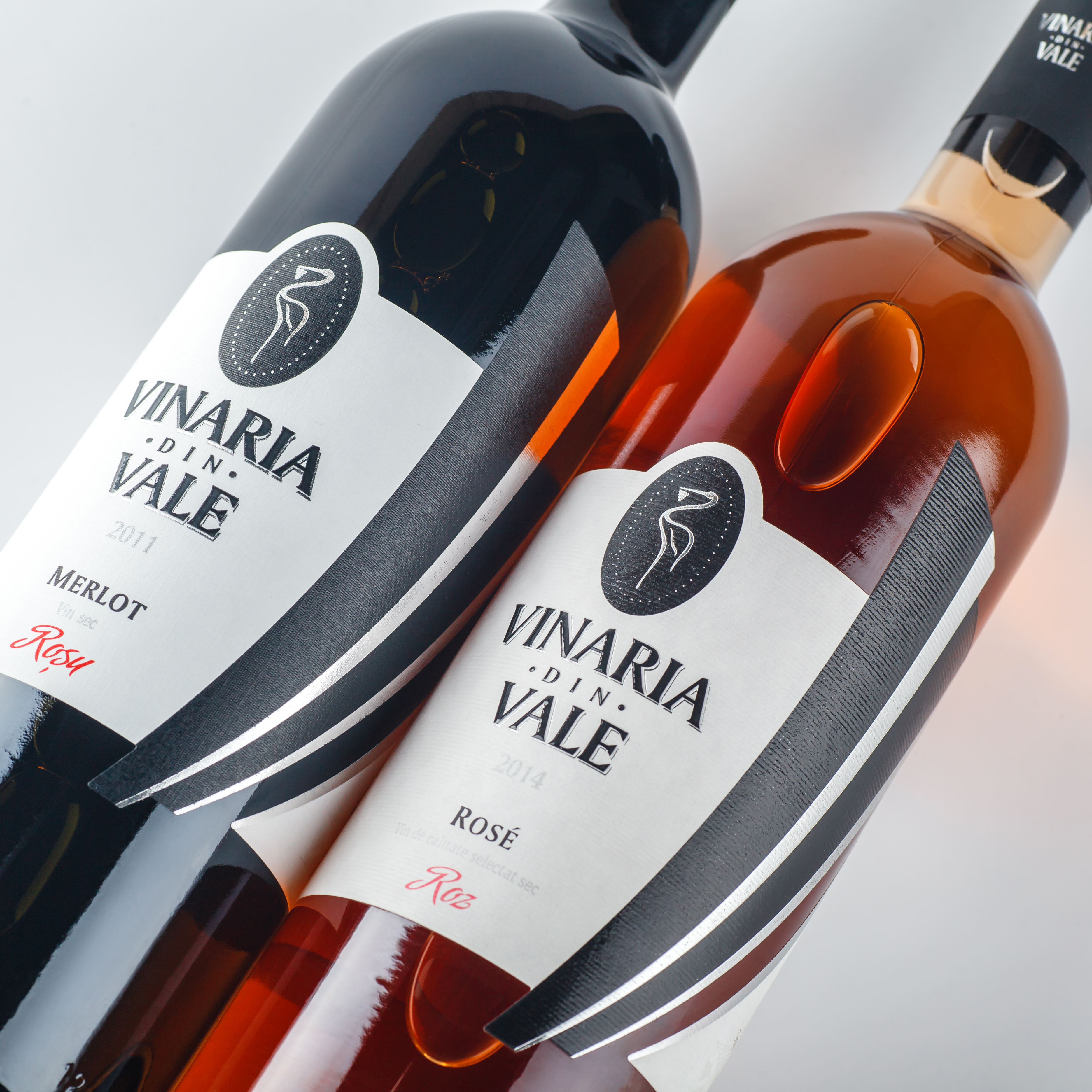
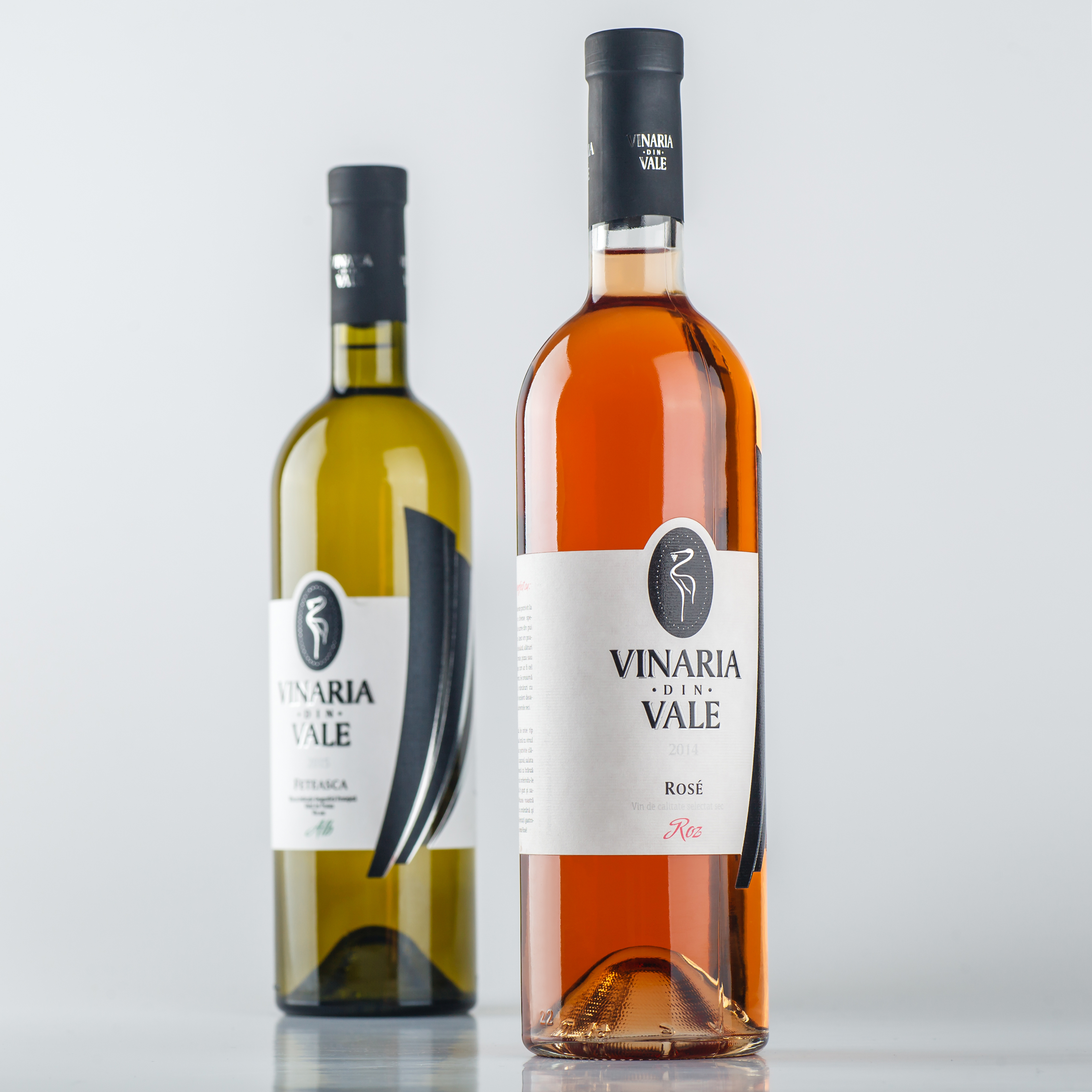
This project was initially developed by the agency several years ago and allowed the client take their niche quickly and effectively. However, as time passed it became evident that the design had to be optimized, made more informative, more attractive to the prospective buyer and different from other products on the shelf. This became the primary goal for this wine product redesign.
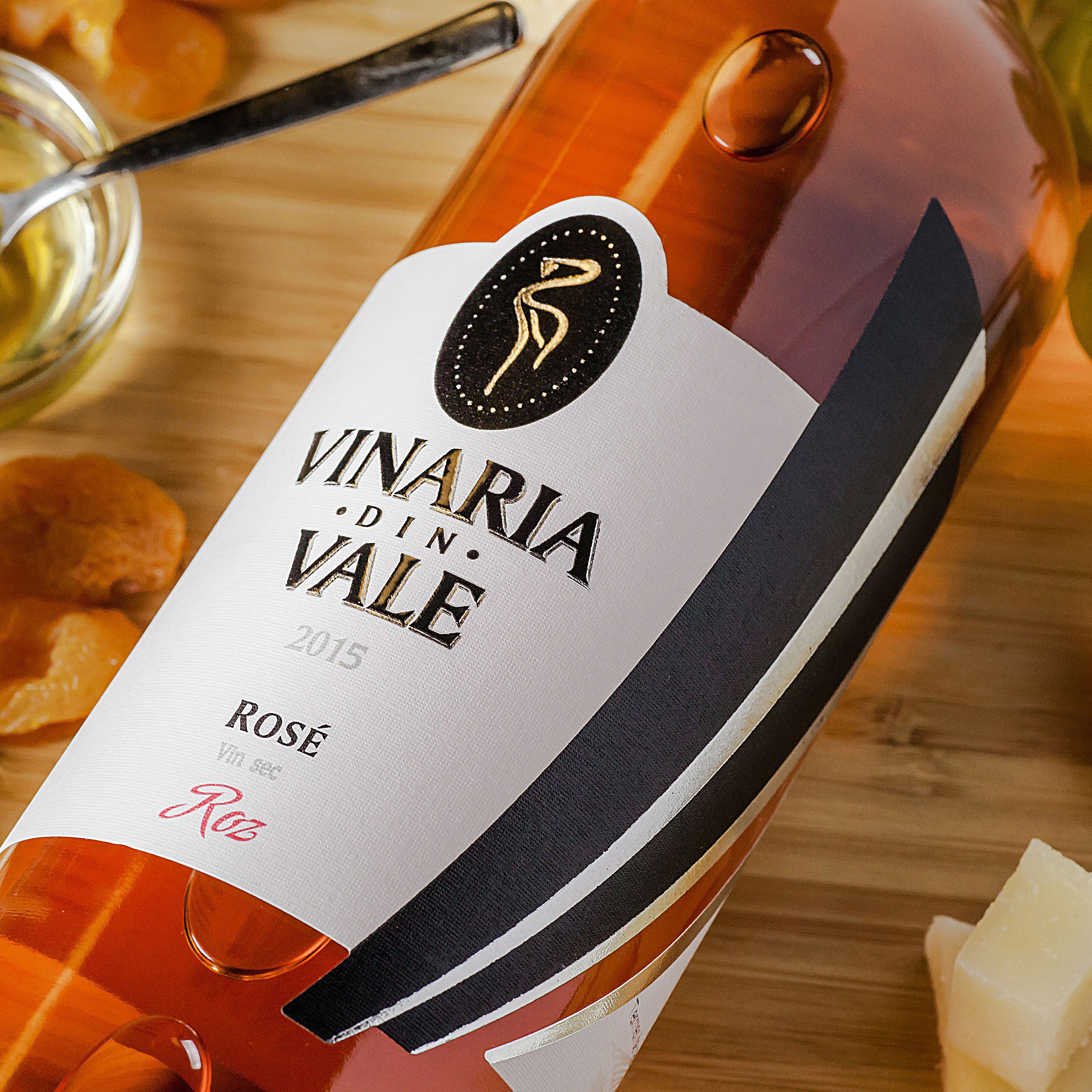
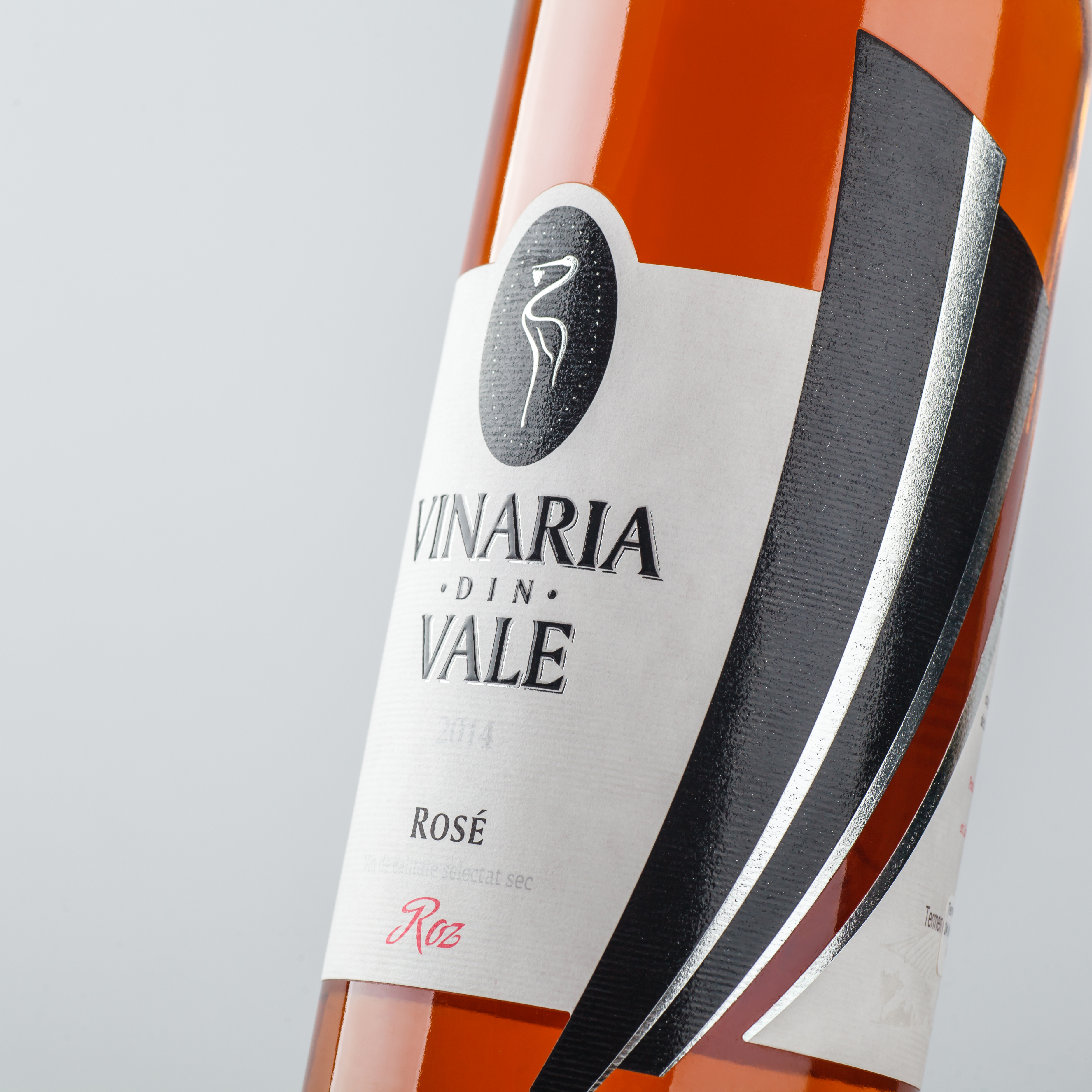
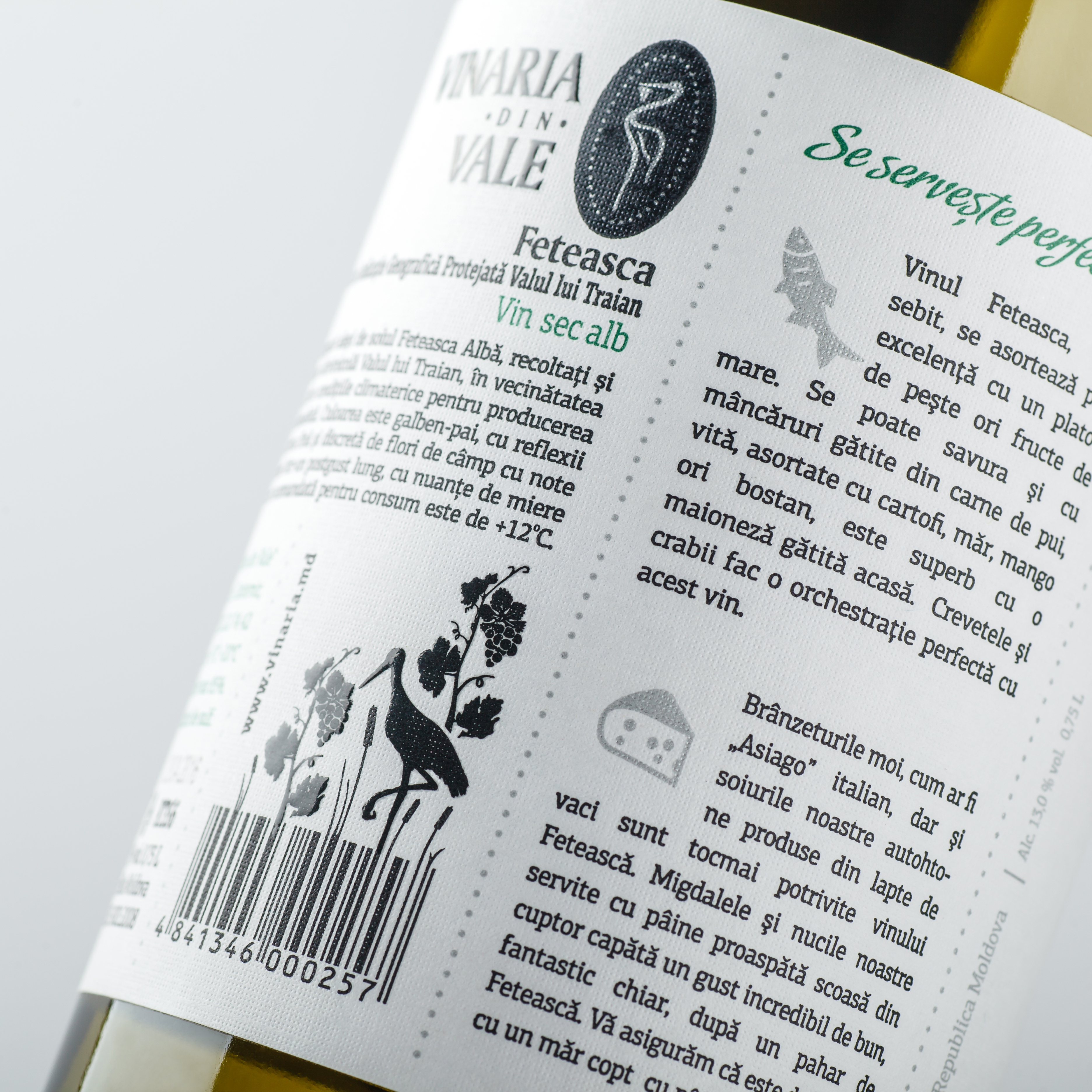
The main visual elements of the composition remained intact. The stylized image of a stork’s feather on the side, logo and name of the trademark – these details made the brand recognizable and easily identifiable, so the redesign didn’t include them. Significant changes were introduced to the informative part of the packing, placed in the back side. The informative blocks have been expanded and supplemented with stylized illustrations, which serve the purpose of making the descriptions more intuitive. Descriptions of serving and food pairing suggestions were also added. Thus the attractiveness and the informational content of the product were improved, while leaving the existing and recognizable image intact.
Copying and rewriting information, pictures, images, logo, design from the site www.shumilovedesign.ru / www.shumilovedesign.eu is prohibited .
Copyright for all texts, images, designs, logo, website design www.shumilovedesign.ru / www.shumilovedesign.eu belong to the company SC "SHLD GRUP" SRL.
All rights reserved.
© SHUMI LOVE DESIGN™, 2019
© VALERII SUMILOV, 2019
© SHLD GRUP SRL, 2019
- In the world