

"FLY" project
04-02-2014
The agency was given the task to create a complex design for a new product in the customer’s niche. The project includes the creation of the general brand concept, trademark design, label design, packing design, as well as advertising and P.O.S. material design.
While working on the concepts we’ve taken into account the following factors in order to maintain the correct brand positioning:
- To assess the target audience correctly, create a portrait of the consumer, understand and apply consumer insights in the design.
- To make an unknown product stand out from the range of competitors, and create a unique, individual identity for the new brand.
- To take our client’s technical abilities into account: requirements for label application and bottle design.
The client was presented with 3 concepts to choose from, each with its own deep foundation and further development in terms of promoting the new brand:
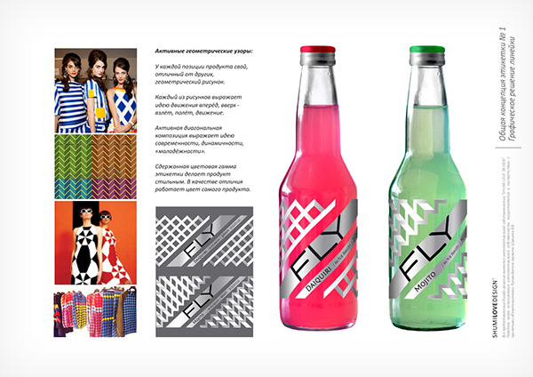
CONCEPT #1:
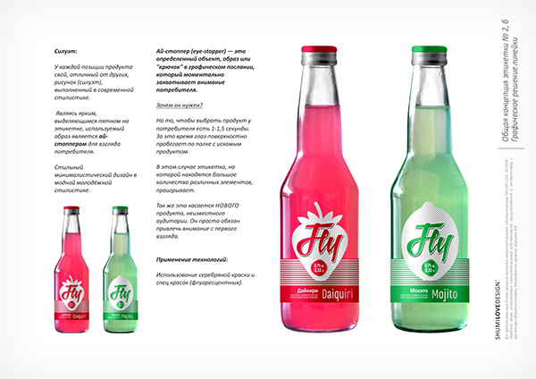
CONCEPT #2:
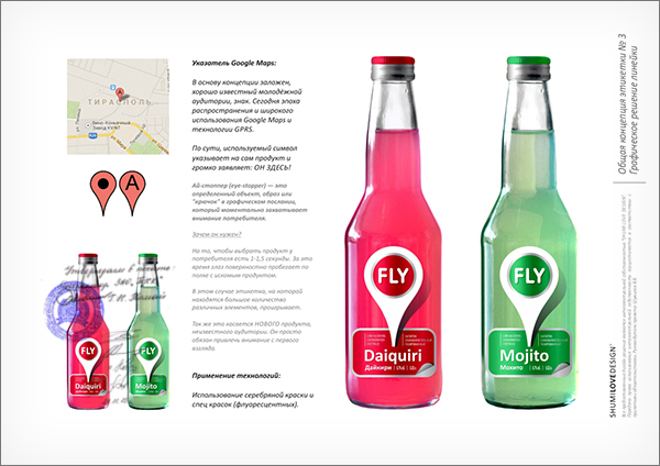
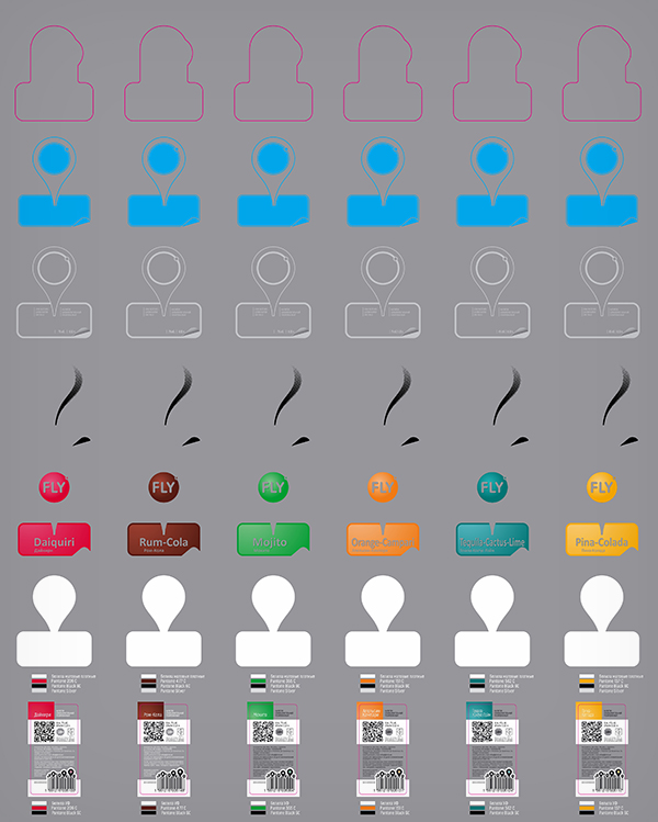
In accordance with current trends we’ve offered a version, which was chosen by the client. The base for this concept is a widely-used location symbol from the GoogleMap application. The use of this symbol delivered a set of marketing advantages to the product: :
- It’s a well-known, recognizable and positive sign
- It serves as an eye-stopper in the design, holding the attention
- It connects with the target audience, interacts with it and speaks the same language
CONCEPT #3:
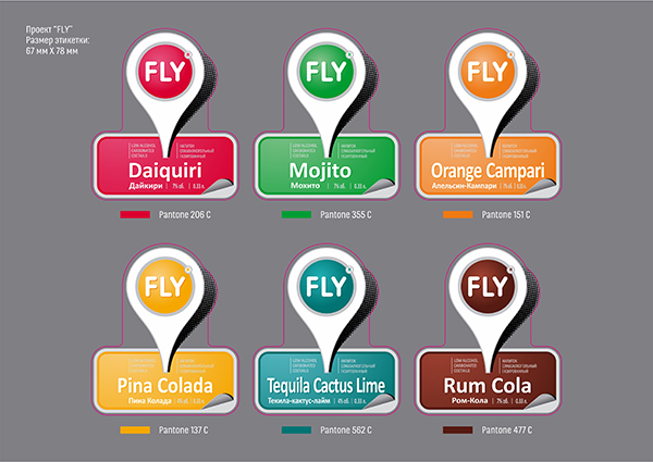
In the frame of the product line the chosen concept looks the following way:
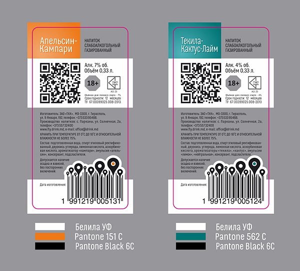
A detailed and laborious work was done for the back label design as well, in order to amplify the effect the product delivers and enhance the brand’s promotion. The solutions that were developed were used in the design of the back label. The use of QR code is employed in order to facilitate various promo campaigns and quicken the spread of information in various social networks such as Facebook, Odnoklassniki, VK and Instagram. Each design element aims at the buyer while the presentation of information looks very friendly:
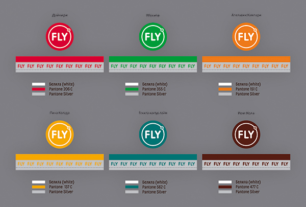
The bottle cap wasn’t left behind, as every brand personalization opportunity is used:
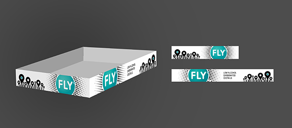
A special transportation tare was also developed, highlighting the product on the shelf:
During the pre-printing stage the agency has also planned the application of special printing and post-printing techniques for obtaining the maximum graphic and visual expressiveness:
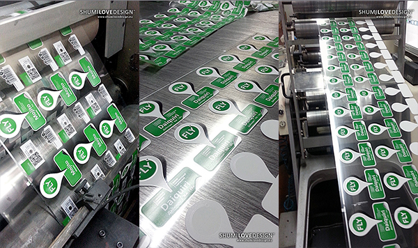
The agency’s workers were present during the printing process, controlling the quality of the printing execution, color balance and application of post-printing effects. This fruitful work was executed together with the specialists in the "SANIN" printing house:
SHARE: