Comprehensive branding: brand concept development / branding / trade mark design / package design.
SOLUTION
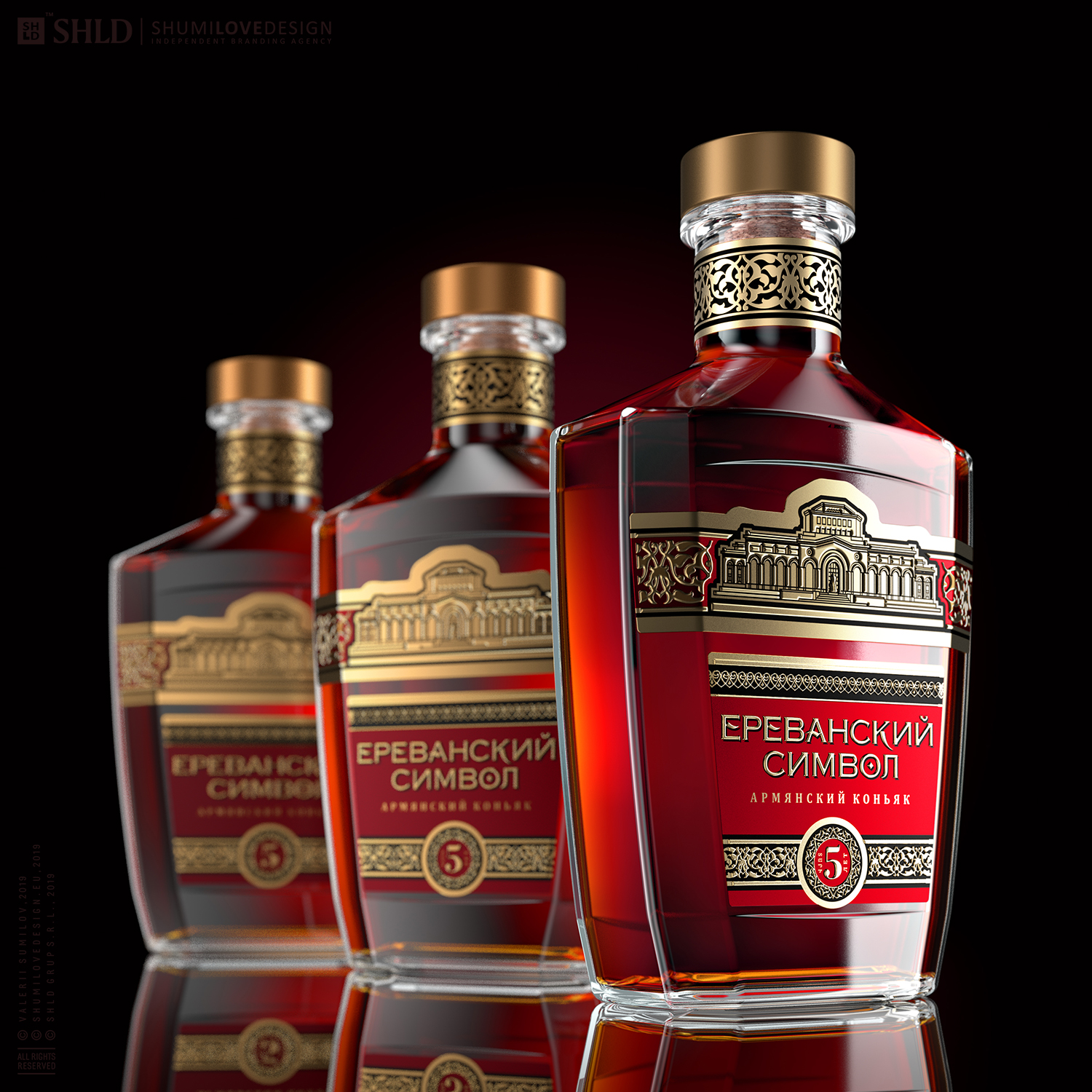
An Armenian manufacturer approached us seeking a complex branding for the Symbol of Yerevan range of brandies. We were assigned the task of developing a brand symbol and a comprehensive product design. The product is intended for the markets of Russia, Ukraine, Belarus, and other neighboring countries with high loyalty level to Armenian brandies.
There were several important aspects to this project that posed a professional challenge to us when working on it:
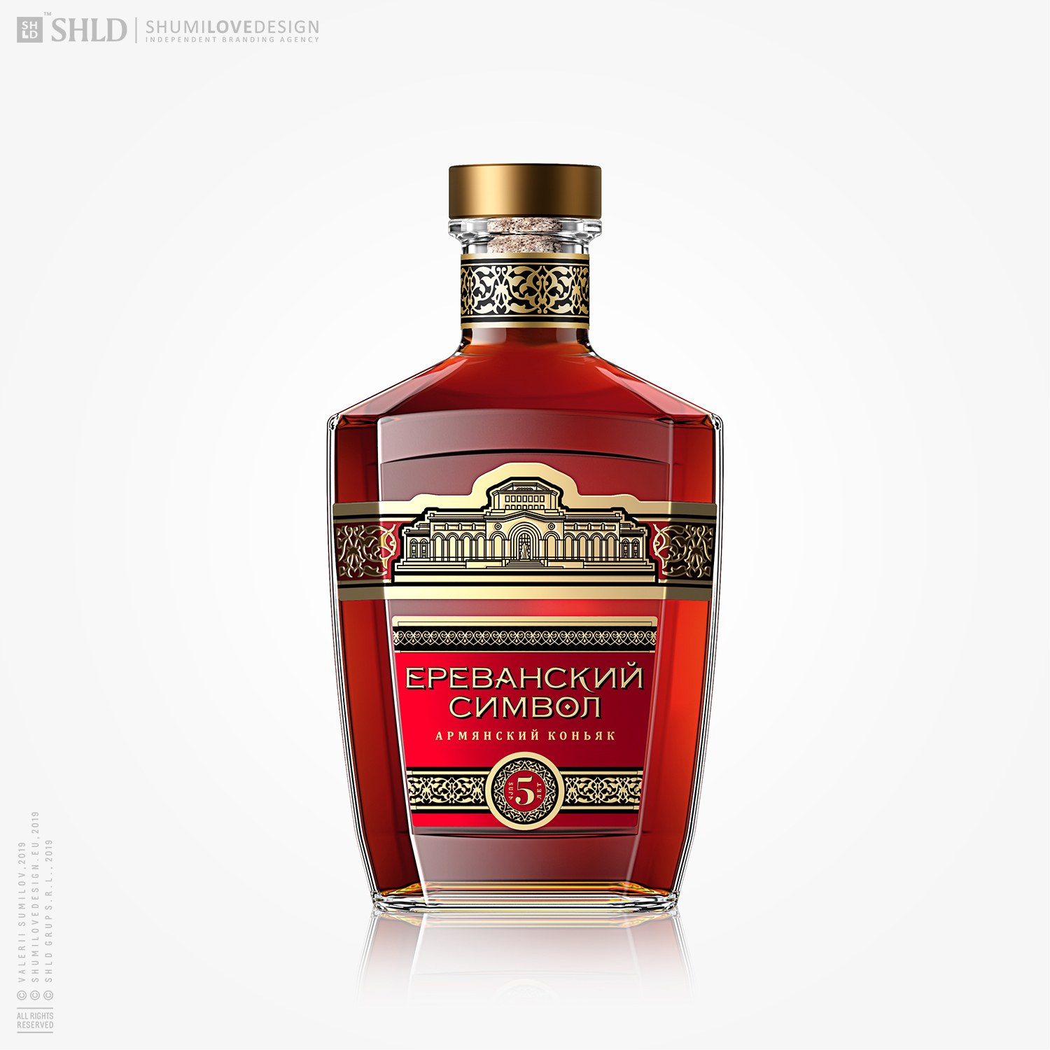
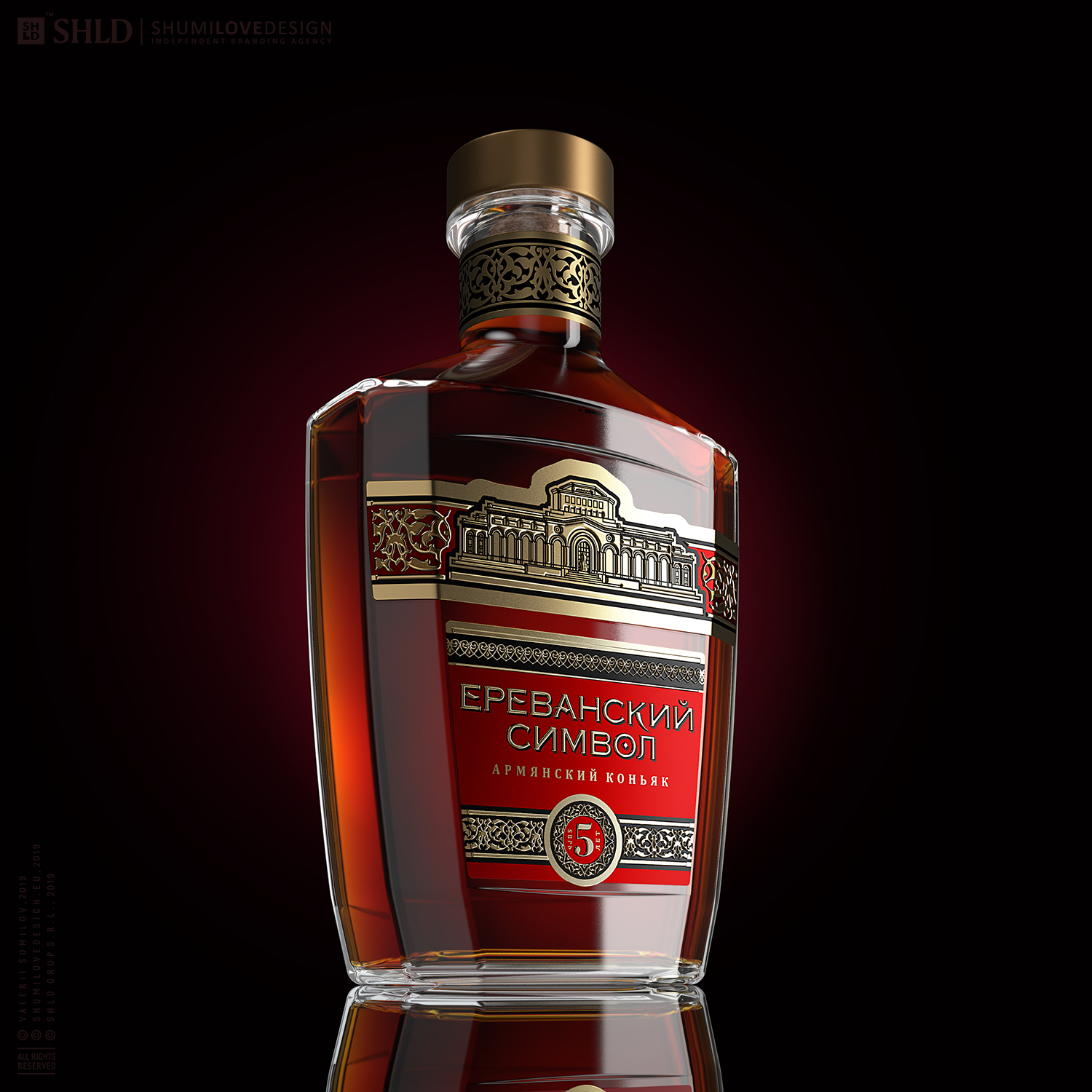
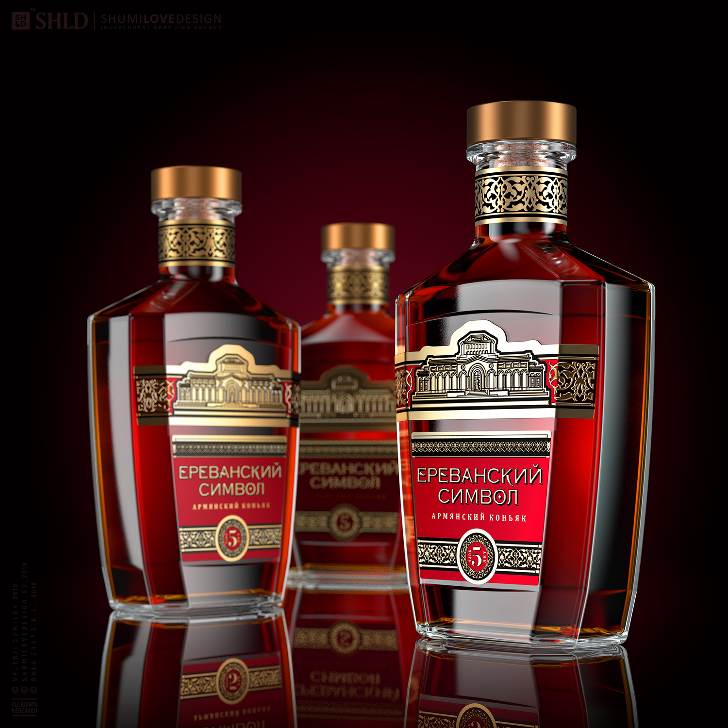
1. On the one hand, the manufacturer chose a rare, unique bottle, favorably different from those used in other Armenian brandies that are traditionally designed to stand on a shelf. At the same time, it significantly limited our leeway when designing the product. We were to come up with a solution to reflect the full range of the associations desired by the customer while working on a very small labeling field; we also had to preserve the product's graphically distinct look and its visibility on a store shelf.
2. In the brand concept we were developing, we strived to reflect the traditional Armenian spirit by using authenticity markers such as national ornaments or symbols. At the same time, we had to abstain from venturing into the kitschy territory, so simplicity, primitivism, and folk art were out of the question.
3. Another requirement was to reflect the status and positioning of the Symbol of Yerevan brand. While committed to fully reflect the geographical origin of the product, we had to emphasize the product's modern, ideologically European status.In the light of the above, commonplace design solutions for Armenian brandies such as images of mountains and arches, as well as the use of contrasting, vibrant colors were dismissed straight away.
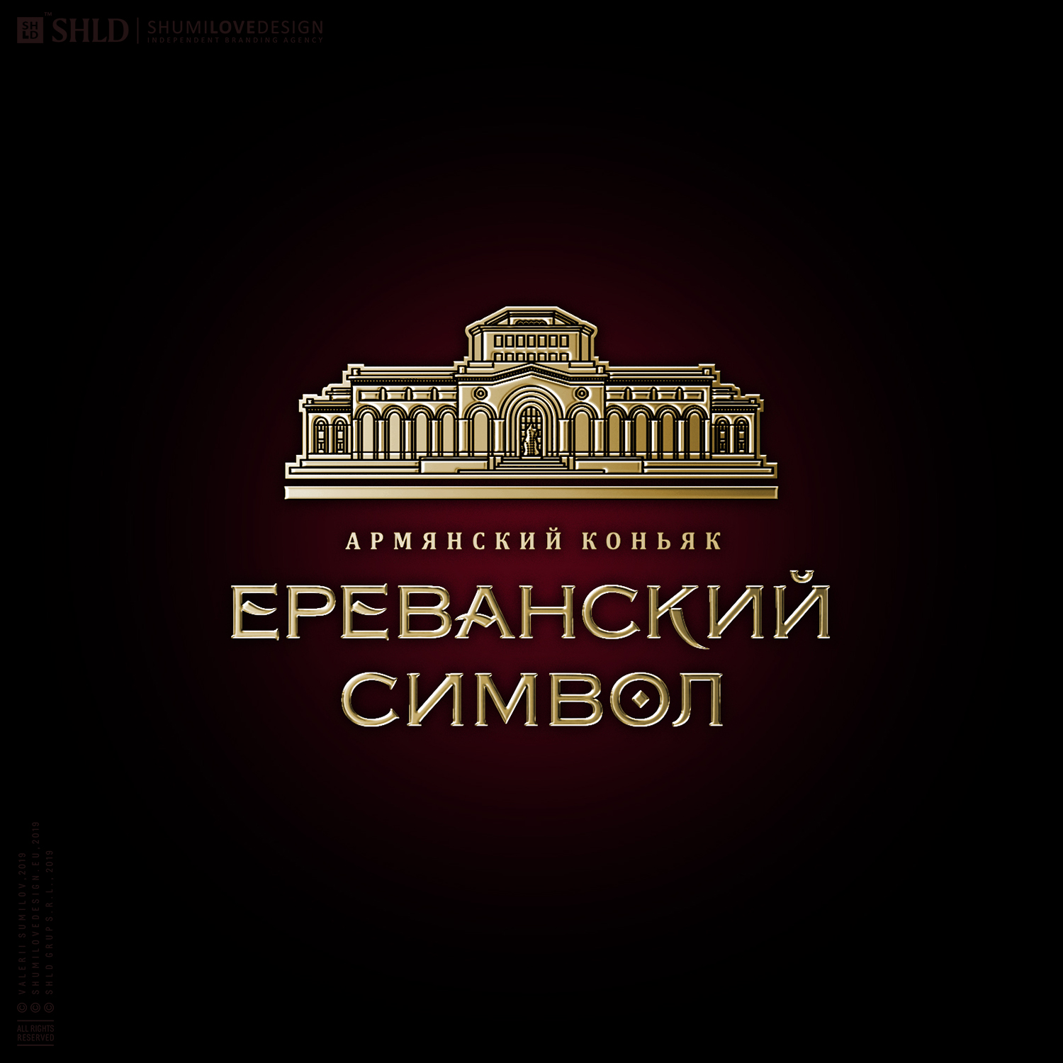
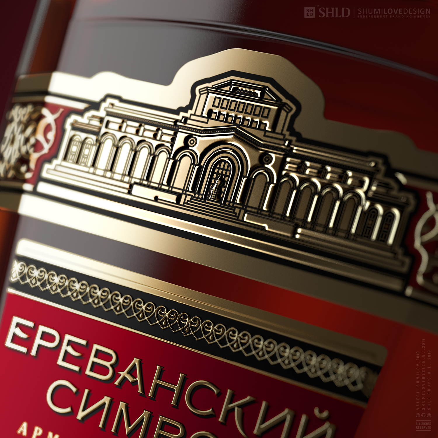
4. The building of the National History Museum of Armenia, one of the calling cards of Yerevan, became the basis for the brand symbol and served as an eye stopper. We took a creative approach to redesigning the facade of this building. The graphic aspect was executed so as to allow it to exist as a raised, three-dimensional gold-colored element made out of aluminum, separate from the main label in the set.
Thoughtfully placed design accents, a ringlet on the bottleneck that emphasizes the product's ethnic background, an image of the facade of the Museum of Armenia that imparts a respectable, valuable quality upon the product's appearance, a label top that breaks the pattern, and the bottle's outline - these are all the result of a carefully thought out branding strategy that we have implemented while working on this project.
Copying and rewriting information, pictures, images, logo, design from the site www.shumilovedesign.ru / www.shumilovedesign.eu is prohibited .
Copyright for all texts, images, designs, logo, website design www.shumilovedesign.ru / www.shumilovedesign.eu belong to the company SC "SHLD GRUP" SRL.